Unlock a world of possibilities! Login now and discover the exclusive benefits awaiting you.
- Qlik Community
- :
- Forums
- :
- Analytics
- :
- New to Qlik Analytics
- :
- Add Area behind bubble chart
- Subscribe to RSS Feed
- Mark Topic as New
- Mark Topic as Read
- Float this Topic for Current User
- Bookmark
- Subscribe
- Mute
- Printer Friendly Page
- Mark as New
- Bookmark
- Subscribe
- Mute
- Subscribe to RSS Feed
- Permalink
- Report Inappropriate Content
Add Area behind bubble chart
Hello Qlik Users,
I have a chart that I designed inside Excel and I'd Like to implement inside Qlik Sense.
I wan't to represent à population of data by using the Bubble chart. I have attached a picture with this post. As you can see,
First : I'd like to draw several areas behind in order to show to which area belongs each bubble.
Second : As you can see bubbles have different colors. I'd like to set them by a fonction like
if value in column X of this bubble > 1 and value in column Y of this bubble <1 then color is #xxxxxx
Does anybody can help me to do this ?
Very Warm regards.
Eric
- Mark as New
- Bookmark
- Subscribe
- Mute
- Subscribe to RSS Feed
- Permalink
- Report Inappropriate Content
Hello,
I have progress in my searchs. Here's in attachment
Attachment_1 : I have put thresold on x and on y axis.
Attachment_2 : is the result I'd like with area
Does anybody have any ideas ?
Best regards
Eric
- Mark as New
- Bookmark
- Subscribe
- Mute
- Subscribe to RSS Feed
- Permalink
- Report Inappropriate Content
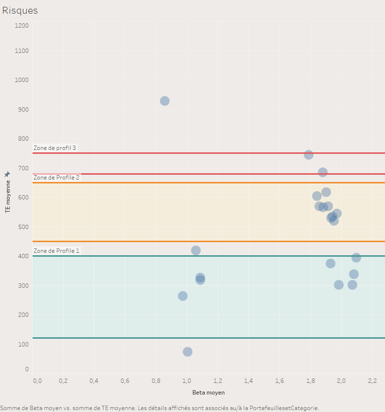
Hello all Qlik Users,
here you can see what I did inside Tableau Software. As you can see I succeeded in plot bands wich deals with Profile 1, 2 and 3. It's that I'd like to do inside Qlik Sense. If it speaks to anybody 😞
Regards