Unlock a world of possibilities! Login now and discover the exclusive benefits awaiting you.
- Qlik Community
- :
- Forums
- :
- Analytics
- :
- New to Qlik Analytics
- :
- Re: Add a second dimension to a bar chart of accum...
- Subscribe to RSS Feed
- Mark Topic as New
- Mark Topic as Read
- Float this Topic for Current User
- Bookmark
- Subscribe
- Mute
- Printer Friendly Page
- Mark as New
- Bookmark
- Subscribe
- Mute
- Subscribe to RSS Feed
- Permalink
- Report Inappropriate Content
Add a second dimension to a bar chart of accumulated values
Hello everyone,
I'm trying to add a new dimension to my bar chart of accumulated values with a "Month" dimension and a "Sales" measure. The new dimension I want to add is "Category" but when I do this, it doesn't seem to work.
My measure expression is the following:
AGGR(RANGESUM(ABOVE(SUM({<MONTH=>}SALES),0,RowNo())),MONTH)
Is there a way to do this?
🙂
- Subscribe by Topic:
-
above
-
accumulated
-
acumulado
-
Año
-
bar
-
barras
-
categoria
-
category
-
de
-
dimension
-
estado
-
expresion
-
expresiones
-
expresión
-
grafico
-
grafico de barras
-
gráfico
-
Gráfico de Barras
-
measure
-
medida
-
Mes
-
month
-
new
-
nueva
-
nueva dimension
-
nuevo campo
-
rowno
-
Sales
-
second dimension
-
segunda dimension
-
semana
-
values
-
ventas
-
week
-
year
- Mark as New
- Bookmark
- Subscribe
- Mute
- Subscribe to RSS Feed
- Permalink
- Report Inappropriate Content
Try this and see if this works
Aggr(
  RangeSum(Above(Sum({<MONTH>} SALES), 0, RowNo()))
, CATEGORY, MONTH)- Mark as New
- Bookmark
- Subscribe
- Mute
- Subscribe to RSS Feed
- Permalink
- Report Inappropriate Content
It doesn't seem to work. The accumulated values of the sales are lost and neither do the states accumulate from one month to another.
I also thought that this sentence would work but it didn't... 😞
Any more ideas?
- Mark as New
- Bookmark
- Subscribe
- Mute
- Subscribe to RSS Feed
- Permalink
- Report Inappropriate Content
I am sorry, but I am a little confused... can you please provide all the dimensions and expressions you are using in the chart?
- Mark as New
- Bookmark
- Subscribe
- Mute
- Subscribe to RSS Feed
- Permalink
- Report Inappropriate Content
Sure!
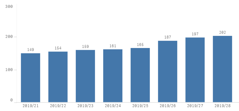
This is my bar chart before adding the "CATEGORY" dimension:
As you can see, the values are accumulating correctly. Now I want to add the CATEGORY dimension... (in red what I added in order to add the CATEGORY dimension)
My measure is the one you sent me:
=AGGR(RANGESUM(ABOVE(SUM({<WeekName=>}SALES),0,RowNo())), CATEGORY, WeekName)
The dimension is a date field that shows all weeks from week "21/2019" with the following expression:
=if(Year(WeekName) = Year(Today()) and Week(WeekName) >= 21, WeekName)
Now i added a second dimension which should be:
=CATEGORY
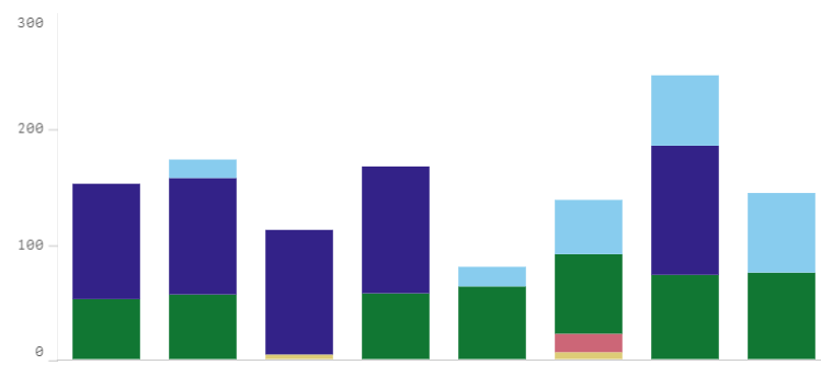
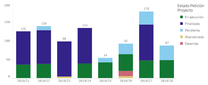
So the chart with all the previous expressions looks like this:
The bar chart is clearly not accumulating the values as it did before adding the second dimension...
I hope that i have expressed myself correctly 🙂
- Mark as New
- Bookmark
- Subscribe
- Mute
- Subscribe to RSS Feed
- Permalink
- Report Inappropriate Content
I would try using WeekName dimension instead of the calculated dimension and then use set analysis to restrict the duration you want to see. See if that fixes your issue
- Mark as New
- Bookmark
- Subscribe
- Mute
- Subscribe to RSS Feed
- Permalink
- Report Inappropriate Content
Thanks Sunny for your reply.
What you say has not worked either. I keep getting the same identical graph.
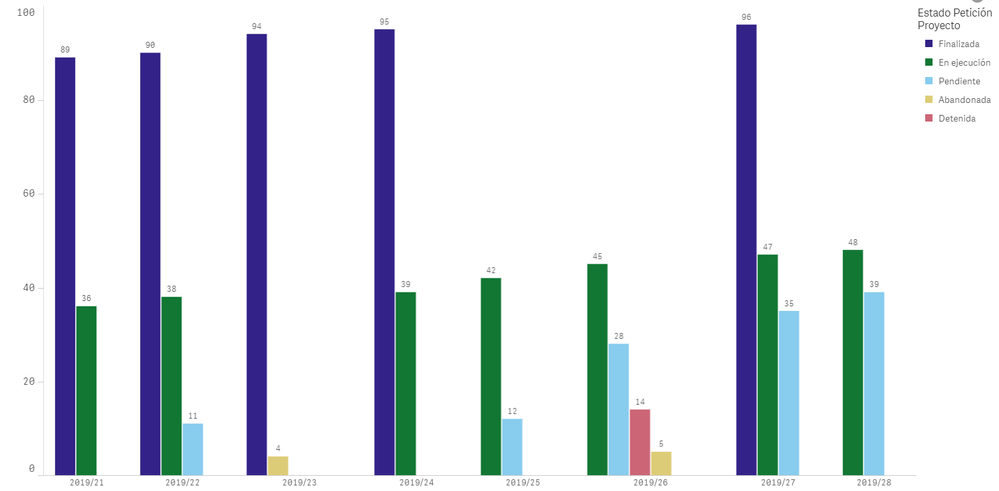
However, I have discovered what the graph I am getting does:
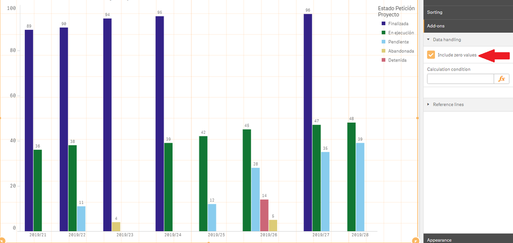
The graph correctly accumulates the values by category. However, when one of the categories is equal to 0, it does not show the cumulative for that category, as you can see in another view of the graph.
So my problem now is the following: How can I show all the accumulated ones even if one of them is equal to 0?
(for example, if the dark blue bar on 24/2019 shows 94, on 25/2019 also show that same bar with the value 94)
- Mark as New
- Bookmark
- Subscribe
- Mute
- Subscribe to RSS Feed
- Permalink
- Report Inappropriate Content
May be add the missing rows with 0 values?
- Mark as New
- Bookmark
- Subscribe
- Mute
- Subscribe to RSS Feed
- Permalink
- Report Inappropriate Content
You mean this checkbox?
It was already selected... 😞
- Mark as New
- Bookmark
- Subscribe
- Mute
- Subscribe to RSS Feed
- Permalink
- Report Inappropriate Content
No, I mean this -> Generate Missing Data
