Unlock a world of possibilities! Login now and discover the exclusive benefits awaiting you.
- Qlik Community
- :
- Forums
- :
- Analytics
- :
- New to Qlik Analytics
- :
- Re: Bar Chart for Trend Line Slope
- Subscribe to RSS Feed
- Mark Topic as New
- Mark Topic as Read
- Float this Topic for Current User
- Bookmark
- Subscribe
- Mute
- Printer Friendly Page
- Mark as New
- Bookmark
- Subscribe
- Mute
- Subscribe to RSS Feed
- Permalink
- Report Inappropriate Content
Bar Chart for Trend Line Slope
Hi All,
I am quite new to Qlik Sense. I need to create a bar chart with bars being slopes of the trend line for sales of the last 12months, rolling.
In Excel, slope is calculated by the formula SLOPE(known_y’s, known_x’s)
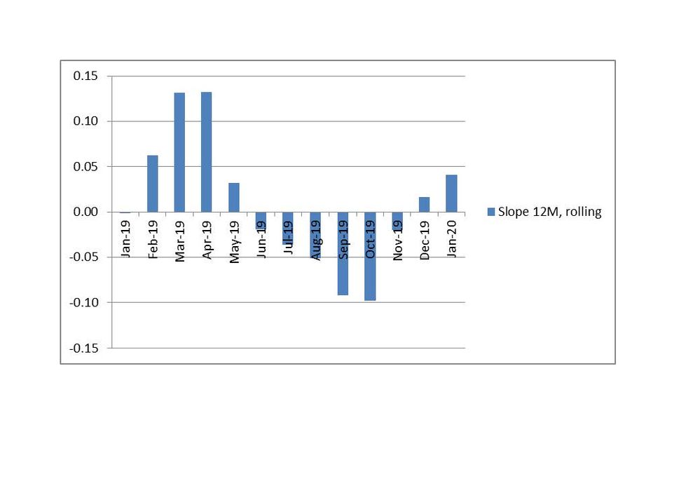
The graph would look like this:
Bar “Jan-20” shows the slope (measure) of the trend line for sales for the period Feb19-Jan20.
Bar “Dec-19” shows the slope of the trend line for sales for the period Jan19-Dec19, etc.
I know how to get the trendline for 12 months in Qlik Sense. In my case it is the following expression:
linest_m(total aggr(if(Sum({<is12M={1}, AsOfMonth={'$(=vMaxMonthNo)'}>}[Sales]),Sum({<is12M={1}, AsOfMonth={'$(=vMaxMonthNo)'}>}[Sales])),MonthYear),MonthYear)*only(MonthYear)+linest_b(total aggr(if(Sum({<is12M={1}, AsOfMonth={'$(=vMaxMonthNo)'}>}[Sales]),Sum({<is12M={1}, AsOfMonth={'$(=vMaxMonthNo)'}>}[Sales])),MonthYear),MonthYear))
To my understanding, the bold part is the slope. But how to calculated the slopes for rolling 12 months and put them all in one bar chart?
Any help on this is highly appreciated!
- « Previous Replies
- Next Replies »
Accepted Solutions
- Mark as New
- Bookmark
- Subscribe
- Mute
- Subscribe to RSS Feed
- Permalink
- Report Inappropriate Content
Try this please:
LinEst_M( aggr(sum({<is12M={1},AsOfMonth={">=12<=24"} >}[Sales]), MonthNo, AsOfMonthYear), aggr(Only({<is12M={1},AsOfMonth={">=12<=24"}>}MonthNo), MonthNo, AsOfMonthYear))
- Mark as New
- Bookmark
- Subscribe
- Mute
- Subscribe to RSS Feed
- Permalink
- Report Inappropriate Content
YES!!! It worked!! Amazing. Thank you so much!!! I highly appreciate your help!
Just to summarize the solution:
Dimension expression:
=aggr(ONLY({<MonthNo={'13','14','15','16','17','18','19','20','21','22','23','24'}>}AsOfMonthYear),AsOfMonthYear)
Measure expression:
=LinEst_M( aggr(sum({<is12M={1},AsOfMonth={">=12<=24"} >}[Sales]), MonthNo, AsOfMonthYear), aggr(Only({<is12M={1},AsOfMonth={">=12<=24"}>}MonthNo), MonthNo, AsOfMonthYear))
- Mark as New
- Bookmark
- Subscribe
- Mute
- Subscribe to RSS Feed
- Permalink
- Report Inappropriate Content
Can you share how your data is structured? How is the AsOfMonth field calculated?
It is possible to calculate a 12 month rolling average with linest_m; the only complication is that you have 2 lists of numbers to provide
- Mark as New
- Bookmark
- Subscribe
- Mute
- Subscribe to RSS Feed
- Permalink
- Report Inappropriate Content
Hi,
AsOfMonth is calculated as following:
DROP TABLE Temp;
AsOfMonthTmp:
LOAD DISTINCT MonthNo as AsOfMonth,
MonthYear as AsOfMonthYear
Resident DateCal;
JOIN (AsOfMonthTmp)
LOAD DISTINCT MonthNo
Resident DateCal;
AsOfMonth:
LOAD IF(TimeFrame<=3, 1) as is3M,
IF(TimeFrame<=6, 1) as is6M,
IF(TimeFrame<=12, 1) as is12M,
*
WHERE TimeFrame>0;
LOAD DISTINCT AsOfMonth-MonthNo+1 as TimeFrame,
AsOfMonth,
AsOfMonthYear,
MonthNo
WHERE MonthNo;
LOAD AsOfMonth,
MonthNo,
AsOfMonthYear
Resident AsOfMonthTmp
Order By AsOfMonth desc;
DROP TABLE AsOfMonthTmp;
Let me know what exactly you need to know re. the data structure?
There is a file with data (the field "Sales" comes from this file).
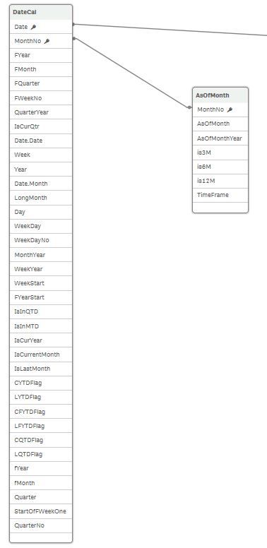
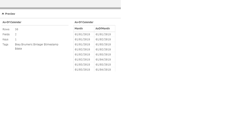
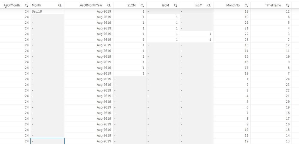
In addition to that, the calculated calendar has the following fields:
Thanks.
- Mark as New
- Bookmark
- Subscribe
- Mute
- Subscribe to RSS Feed
- Permalink
- Report Inappropriate Content
If your AsOfMonthYear has a 3 month rolling period, then it should be straight forward; your expression will be something like:
LinEst_M( aggr(sum(Sale), Month, AsOfMonth), aggr(Only(Month), Month, AsOfMonth))
See also attached sample dashboard; also be careful on how months are sorted; in your script looks like they are sorted in descending order. You might need to sort the aggregation with a structured parameter on Month
- Mark as New
- Bookmark
- Subscribe
- Mute
- Subscribe to RSS Feed
- Permalink
- Report Inappropriate Content
Hi,
Thank you. I tried as you suggested.
I used AsOfMonthYear as a dimension (because AsOfMonth is a number, not a date).
As a measure I used the expression you suggested with AsOfMonth.
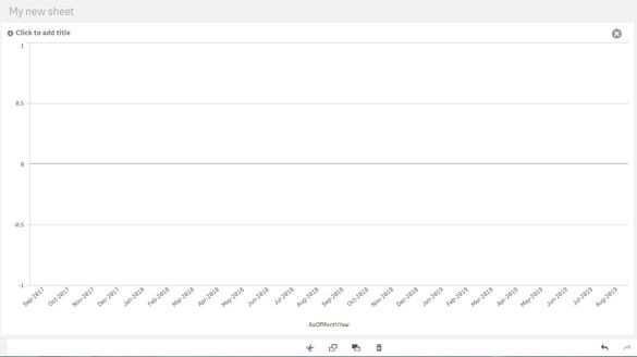
Unfortunately, the chart is empty.
I need 12 months rolling, not 3.
This is what I get:
Thanks.
- Mark as New
- Bookmark
- Subscribe
- Mute
- Subscribe to RSS Feed
- Permalink
- Report Inappropriate Content
It really depends on how your as of table is structured. Is the is3M flag used for rolling 3 months? Can you please paste the function you have used?
- Mark as New
- Bookmark
- Subscribe
- Mute
- Subscribe to RSS Feed
- Permalink
- Report Inappropriate Content
Hi,
is3M is the flag for the last 3 months (in my case June, July, Aug 2019).
I've sent you the script for the AsOf above . Do you need anything else?
As Measure I used LinEst_M( aggr(sum([Sales]), Month, AsOfMonth), aggr(Only(Month), Month, AsOfMonth))
Thanks.
- Mark as New
- Bookmark
- Subscribe
- Mute
- Subscribe to RSS Feed
- Permalink
- Report Inappropriate Content
Try this; maybe create a table rather than a bar chart just so that it would be easier to see what's happening
LinEst_M( aggr(sum({<is3M={1}>}[Sales]), MonthYear, AsOfMonthYear), aggr(Only({<is3M={1}>}MonthYear), MonthYear, AsOfMonthYear))
Can you also post a screenshot of the preview of the AsOfMonth table taken from the data model viewer? Just to see exactly how the data is structured
- Mark as New
- Bookmark
- Subscribe
- Mute
- Subscribe to RSS Feed
- Permalink
- Report Inappropriate Content
Hi,
Thanks! I tried this expression but replaced "is3M" with "is12M".
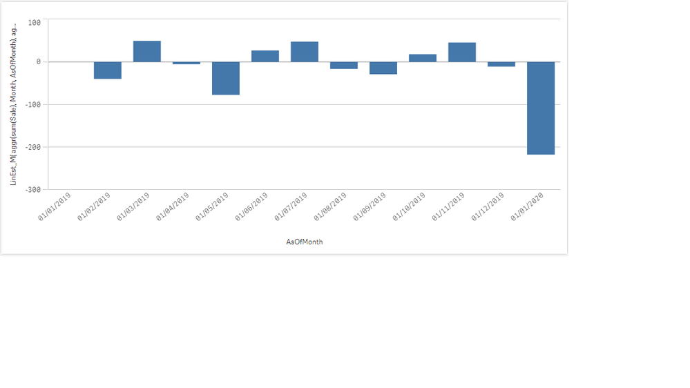
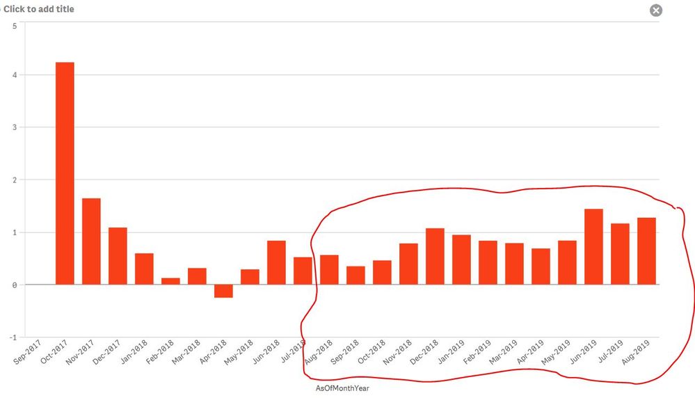
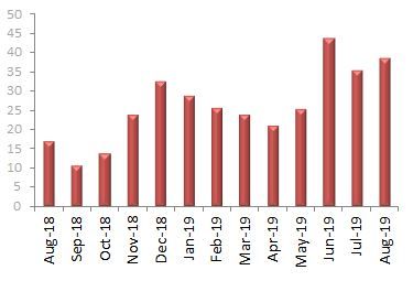
It kind of worked - the trend looks very similar to what is needed but the scale ( measures on the y-axis) is different. Also, it shows all 24 months on the chart, but it should be Aug.18 to Aug 19.
This is what comes out:
This is how it needs to look like (as I said, the trend is similar):
Here are the printscreens of the AsOf table structure. It is quite a big table. I did a printscreen of the beginning of it and the end. I hope, this helps.
Many thanks.
- Mark as New
- Bookmark
- Subscribe
- Mute
- Subscribe to RSS Feed
- Permalink
- Report Inappropriate Content
I keep getting confused between 3 and 12 months; you actually need 12 so you correctly used is12M
Regarding wanting to see from Aug 18 to Aug 19, looking at your table, I'd modify the set expression and filter on AsOfMonth (we can change it later if needed); the slope looks fine, just the scale is off as you might be using in Excel a different x axis in the slope formula; can you check what fields are you using for the formula in excel?
LinEst_M( aggr(sum({<is3M={1}, AsOfMonth={>=12<=24} >}[Sales]), MonthYear, AsOfMonthYear), aggr(Only({<is3M={1}, AsOfMonth={>=12<=24}>}MonthYear), MonthYear, AsOfMonthYear))
- « Previous Replies
- Next Replies »
