Unlock a world of possibilities! Login now and discover the exclusive benefits awaiting you.
- Qlik Community
- :
- Forums
- :
- Analytics
- :
- New to Qlik Analytics
- :
- Re: Bar Chart
- Subscribe to RSS Feed
- Mark Topic as New
- Mark Topic as Read
- Float this Topic for Current User
- Bookmark
- Subscribe
- Mute
- Printer Friendly Page
- Mark as New
- Bookmark
- Subscribe
- Mute
- Subscribe to RSS Feed
- Permalink
- Report Inappropriate Content
Bar Chart
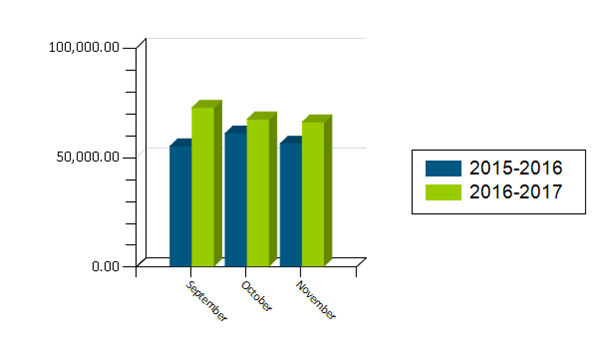
I want to create a bar chart that has 2 dimensions, but can't see how to do it. I want to create a bar chart like the following:

- « Previous Replies
-
- 1
- 2
- Next Replies »
Accepted Solutions
- Mark as New
- Bookmark
- Subscribe
- Mute
- Subscribe to RSS Feed
- Permalink
- Report Inappropriate Content
Thank you Very Much ![]()
- Mark as New
- Bookmark
- Subscribe
- Mute
- Subscribe to RSS Feed
- Permalink
- Report Inappropriate Content
I guess create MonthName as your 1st dimension and Fiscal Year as your 2nd dimension and you should be able to get this? If you still have issues, would you be able to share a sample?
- Mark as New
- Bookmark
- Subscribe
- Mute
- Subscribe to RSS Feed
- Permalink
- Report Inappropriate Content
I'm not able to add a "2nd dimension". When I add another dimension, it is called an "Alternative" dimension and nothing changes on the bar chart. How would you like me to share the sample?
- Mark as New
- Bookmark
- Subscribe
- Mute
- Subscribe to RSS Feed
- Permalink
- Report Inappropriate Content
Hi dear cseward1963
You need create a bar graph with one dimnesion (Month) with Two Expressions (QlikView) or Two Measures (QlikSense) , the formula for this two is
Measure 1 - 2015 - 2016: Sum({<YearField = {2016,2015}>} ValueMesureField)
Measure 2 - 2016 - 2017: Sum({<YearField = {2017,2016}>} ValueMesureField)
let me know if works for you
- Mark as New
- Bookmark
- Subscribe
- Mute
- Subscribe to RSS Feed
- Permalink
- Report Inappropriate Content
the 2015-2016 and 2016-2017 values are called school_year and are text fields and can't be summed in any way, they are not a "measure".
For each month and school year, there is a billed amount. Below is the dataset that i use for the bar graph.
| school year | Month | bill amt |
| 2015-2016 | September | 54,748.70 |
| 2015-2016 | October | 60,584.00 |
| 2015-2016 | November | 55,916.28 |
| 2016-2017 | September | 72,337.60 |
| 2016-2017 | October | 67,034.96 |
| 2016-2017 | November | 65,750.16 |
- Mark as New
- Bookmark
- Subscribe
- Mute
- Subscribe to RSS Feed
- Permalink
- Report Inappropriate Content
Sample will be great
- Mark as New
- Bookmark
- Subscribe
- Mute
- Subscribe to RSS Feed
- Permalink
- Report Inappropriate Content
I want to compare billed amounts by month for 2 school years side by side as in the chart I posted in the beginning of this thread. I can't see a way to do this in Qlik Sense Cloud. It allows for an alternative measure so that you can look at billed amounts by school year or billed amounts by month - this does not accomplish what I want. Please help.
- Mark as New
- Bookmark
- Subscribe
- Mute
- Subscribe to RSS Feed
- Permalink
- Report Inappropriate Content
Are in QlikSense or Qlikview? The question is for build a sample for you
- Mark as New
- Bookmark
- Subscribe
- Mute
- Subscribe to RSS Feed
- Permalink
- Report Inappropriate Content
qlik Sense cloud
- Mark as New
- Bookmark
- Subscribe
- Mute
- Subscribe to RSS Feed
- Permalink
- Report Inappropriate Content
Hi Dear Celia
Plase ee the attachement with the sample
- « Previous Replies
-
- 1
- 2
- Next Replies »