Unlock a world of possibilities! Login now and discover the exclusive benefits awaiting you.
- Qlik Community
- :
- Forums
- :
- Analytics
- :
- New to Qlik Analytics
- :
- Re: Calculate Responses based on the min and max d...
- Subscribe to RSS Feed
- Mark Topic as New
- Mark Topic as Read
- Float this Topic for Current User
- Bookmark
- Subscribe
- Mute
- Printer Friendly Page
- Mark as New
- Bookmark
- Subscribe
- Mute
- Subscribe to RSS Feed
- Permalink
- Report Inappropriate Content
Calculate Responses based on the min and max date
Hi
I have the following data in a straight table:
ID Employee ID Question Response Date Response
1441 4554 80 2021-08-26
1441 4554 84 2021-08-30
1441 4554 98 2021-09-01
1441 4554 102 2021-10-01
What I want is another straight table with the following data
ID Employee ID Question T1 T2
1441 4554 1 0
T1 is the count of Response < 100 on the minimum date i.e. 2021-08-26
T2 is the count of Response < 100 on the maximum date i.e. 2021-10-01 (since value is 102 which is greater than 100)
Please help me achieve this. I would later use the calculated field in the graph to show the bar chart
Regards
- Subscribe by Topic:
-
Developers
-
expression
-
General Question
-
Script
-
Set Analysis
-
Visualization
Accepted Solutions
- Mark as New
- Bookmark
- Subscribe
- Mute
- Subscribe to RSS Feed
- Permalink
- Report Inappropriate Content
Try
T1 =Count(DISTINCT{<[Date Response] = {"=Aggr(nodistinct Min([Date Response]), [ID Employee], [ID Question]) = [Date Response]"}, Response={"< 100"}>} Response)
T2 =Count(DISTINCT{<[Date Response] = {"=Aggr(nodistinct Max([Date Response]),[ID Employee], [ID Question]) = [Date Response]"}, Response={"< 100"}>} Response)
- Mark as New
- Bookmark
- Subscribe
- Mute
- Subscribe to RSS Feed
- Permalink
- Report Inappropriate Content
@rubenmarin Hope you are doing good. Can you please look into this and help like always? Thanks.
- Mark as New
- Bookmark
- Subscribe
- Mute
- Subscribe to RSS Feed
- Permalink
- Report Inappropriate Content
Try
T1 =Count(DISTINCT{<[Date Response] = {"=Aggr(nodistinct Min([Date Response]), [ID Employee], [ID Question]) = [Date Response]"}, Response={"< 100"}>} Response)
T2 =Count(DISTINCT{<[Date Response] = {"=Aggr(nodistinct Max([Date Response]),[ID Employee], [ID Question]) = [Date Response]"}, Response={"< 100"}>} Response)
- Mark as New
- Bookmark
- Subscribe
- Mute
- Subscribe to RSS Feed
- Permalink
- Report Inappropriate Content
Hi, This didnt work. It actually took of the question from the table i.e. 4554 question wasn't displayed in the table.
- Mark as New
- Bookmark
- Subscribe
- Mute
- Subscribe to RSS Feed
- Permalink
- Report Inappropriate Content
- Mark as New
- Bookmark
- Subscribe
- Mute
- Subscribe to RSS Feed
- Permalink
- Report Inappropriate Content
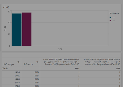
Thanks @BrunPierre and @rubenmarin I got it worked. There was an issue that my column for "Response" was having both numeric and text values. I have corrected it out. But strange is when I apply it in bar graph I am, getting a very different picture than what the straight table is showing (which is correct)
When I change the totals of the straight table to "Auto" it matches the figure of the graph.
Any idea why is happening?
Regards.
- Mark as New
- Bookmark
- Subscribe
- Mute
- Subscribe to RSS Feed
- Permalink
- Report Inappropriate Content
Hi, this might happen becuse of the different dimensions used in both objects. In example, if the tables gives the correct result using a sum of rows you'll need to add an aggr to split the expression between the differnt dimension values and then sum all the values:
Sum(Aggr([YourCurrentExpression],[ID Employee],[ID Question]))
- Mark as New
- Bookmark
- Subscribe
- Mute
- Subscribe to RSS Feed
- Permalink
- Report Inappropriate Content
Thanks. I will try this out. I however resolve the issue at script level by creating the joins and using all my SQL knowledge but I want to resolve this at chart level as well so that there I don't have to do script changes if another type of question comes over in future.

