Unlock a world of possibilities! Login now and discover the exclusive benefits awaiting you.
- Qlik Community
- :
- Forums
- :
- Analytics
- :
- New to Qlik Analytics
- :
- Re: Change Color by Measure - Qlik Sense
- Subscribe to RSS Feed
- Mark Topic as New
- Mark Topic as Read
- Float this Topic for Current User
- Bookmark
- Subscribe
- Mute
- Printer Friendly Page
- Mark as New
- Bookmark
- Subscribe
- Mute
- Subscribe to RSS Feed
- Permalink
- Report Inappropriate Content
Change Color by Measure - Qlik Sense
Hi Qlik Techies,
We have a color option (Color by Measure). It gives a the color variation like below I attached,
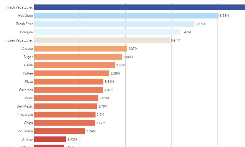
But my scenario is, instead of the blue I need to change the color as Green. So, it should get varies from green to red.
Is it possible..??
- « Previous Replies
-
- 1
- 2
- Next Replies »
- Mark as New
- Bookmark
- Subscribe
- Mute
- Subscribe to RSS Feed
- Permalink
- Report Inappropriate Content
- Mark as New
- Bookmark
- Subscribe
- Mute
- Subscribe to RSS Feed
- Permalink
- Report Inappropriate Content
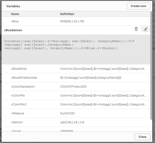
I always seem to find this thread when trying to figure out how to adjust the colors for a gradient by measure. So I'm posting this example code here. I tried to make it pretty simple so I can just change it up when I have a new chart:
Colormix1((
[Expression]
-$(=min(aggr(
[Expression]
,
[Category]
))))
/$(=(max(aggr(
[Expression]
,
[Category]
))
-min(aggr(
[Expression]
,
[Category]
)))),
[min_color]
,
[max_color]
)
How I used it:
Colormix1((
sum([Sales Quantity]*[Sales Price])
-$(=min(aggr(
sum([Sales Quantity]*[Sales Price])
,
[Product Sub Group Desc]
))))
/$(=(max(aggr(
sum([Sales Quantity]*[Sales Price])
,
[Product Sub Group Desc]
))
-min(aggr(
sum([Sales Quantity]*[Sales Price])
,
[Product Sub Group Desc]
)))),
magenta()
,
yellow()
)
- Mark as New
- Bookmark
- Subscribe
- Mute
- Subscribe to RSS Feed
- Permalink
- Report Inappropriate Content
Please use the Colormix1 or colormix2 function to achieve this functionality.
More details and sample file available in the below link.
Qlik Sense Color Range Theme Approach
The approach aims to use an expression that doesn't need to be rewritten each time the measure changes and can be copied across different objects without changes.
- Mark as New
- Bookmark
- Subscribe
- Mute
- Subscribe to RSS Feed
- Permalink
- Report Inappropriate Content
Try like this, may be:
Here's what I did. I made a bar chart...
First dimension:
Field: Segment
Label: Segment
Added a second dimension:
Field: ValueList('Sales','Quota','Expenses')
Label: Account Type
Added a measure:
Field:
if(ValueList('Sales','Quota','Expenses')='Sales'
,Sum(Sales)
,if(ValueList('Sales','Quota','Expenses')='Quota'
,Sum(Quota)
,Sum(Expenses)
)
)
Label: Amount
Sorting in this example is by Segment then by Account Type then by Amount, with Account Type as descending alphabetical.
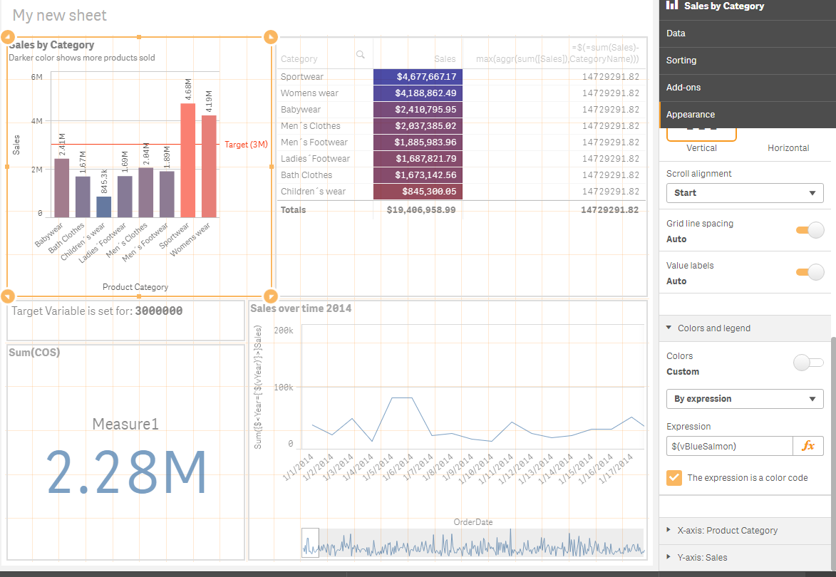
Now to set the colors. I went to "Appearance" then "Colors and Legend", then turned off Auto for Colors. In the dropdown, selected "By expression". I entered this expression:
if(ValueList('Sales','Quota','Expenses')='Sales'
,rgb(0,192,0)
,if(ValueList('Sales','Quota','Expenses')='Quota'
,rgb(0,0,192)
,rgb(192,0,0)
)
)
I made sure the check box was checked for "The expression is a color code".
Qlik Sense: How to set custom colors by measure in a bar chart
- Mark as New
- Bookmark
- Subscribe
- Mute
- Subscribe to RSS Feed
- Permalink
- Report Inappropriate Content
@drudd75077 I love you. I have spent the last hour getting so frustrated that something so simple required so much digging, but your code worked perfectly for what I wanted. Thanks for sharing!!!
- Mark as New
- Bookmark
- Subscribe
- Mute
- Subscribe to RSS Feed
- Permalink
- Report Inappropriate Content
you should take a look at this help article which describes how to add custom colour scales and palettes, it is a colour scale which is used by "colour by measure"
- Mark as New
- Bookmark
- Subscribe
- Mute
- Subscribe to RSS Feed
- Permalink
- Report Inappropriate Content
thanks for the link but what we are looking for is defining ranges of a single measure with different colours. For example say the measure is [age]. range 0 - 12 colour red, range 13 - 20 colour amber, 21 and above colour green.
- Mark as New
- Bookmark
- Subscribe
- Mute
- Subscribe to RSS Feed
- Permalink
- Report Inappropriate Content

if(RowNo()=1,rgb(69, 179, 157),
if(RowNo()=2,rgb(232, 246, 243),
if(RowNo()=3,rgb(213, 245, 227),
if(RowNo()=4,rgb(242, 215, 213) ,
if(RowNo()=5,rgb(230, 176, 170),
if(RowNo()=6,rgb(241, 148, 138),
if(RowNo()=7,rgb(231, 76, 60 ),
if(RowNo()=8,rgb(192, 57, 43),
if(RowNo()=9,rgb(123, 36, 28),
if(RowNo()=10,rgb(123, 36, 28)))))))))))
- « Previous Replies
-
- 1
- 2
- Next Replies »