Unlock a world of possibilities! Login now and discover the exclusive benefits awaiting you.
- Qlik Community
- :
- Forums
- :
- Analytics
- :
- New to Qlik Analytics
- :
- Change barplot color in generic dates dashboard
- Subscribe to RSS Feed
- Mark Topic as New
- Mark Topic as Read
- Float this Topic for Current User
- Bookmark
- Subscribe
- Mute
- Printer Friendly Page
- Mark as New
- Bookmark
- Subscribe
- Mute
- Subscribe to RSS Feed
- Permalink
- Report Inappropriate Content
Change barplot color in generic dates dashboard
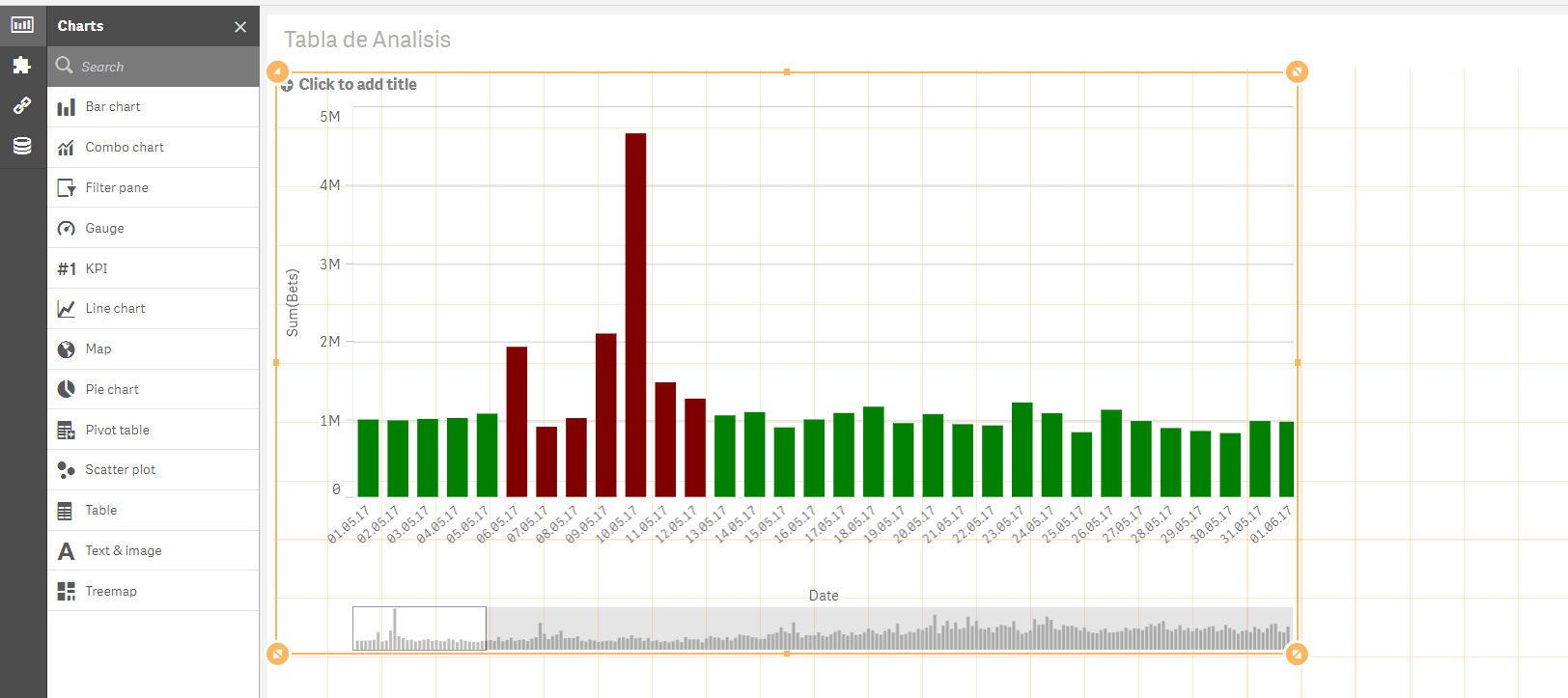
I am trying to change the color of one of the bars of my barplot without success. I am uploading a sample app to facilitate help from Qlik Sense comunity colleagues. It is well documented in this forum how to do it in more simple types of graphs (color by expression - QlikSense). It is done going to the "Appearance" tab, then clicking in "Colors and Legend", and changing the tab "Colors Custom" from "Auto" to "By Expression". Then in the "Fx" field entering: if(Date> '05.05.17' and Date< '13.05.17', Red(), Green()) for example. As below in my illustration:

Now, I have a more complicated chart where users enter dates through 6 variable extensions in the app ("BeforeMin", "BeforeMax", "DuringMin", "DuringMax", "AfterMin", and "AfterMax"). And a barplot with 3 periods is created: "Before", "During", "After". The dimension is created with the following expression:
if((Date>=date(date#('$(vBDA_1)','DD.MM.YY'),'DD.MM.YY')) and
(Date<=date(date#('$(vBDA_2)','DD.MM.YY'),'DD.MM.YY')), 'Before',
if((Date>=date(date#('$(vBDA_3)','DD.MM.YY'),'DD.MM.YY')) and
(Date<=date(date#('$(vBDA_4)','DD.MM.YY'),'DD.MM.YY')), 'During',
if((Date>=date(date#('$(vBDA_5)','DD.MM.YY'),'DD.MM.YY')) and
(Date<=date(date#('$(vBDA_6)','DD.MM.YY'),'DD.MM.YY')), 'After'
)
)
)
The values I entered in each empty space of the Varaibles Extension boxes were:
BeforeMin = 02.05.17
BeforeMax = 03.05.17
DuringMin = 04.05.17
DuringMax = 05.05.17
AfterMin = 06.05.17
AfterMax = 07.05.17
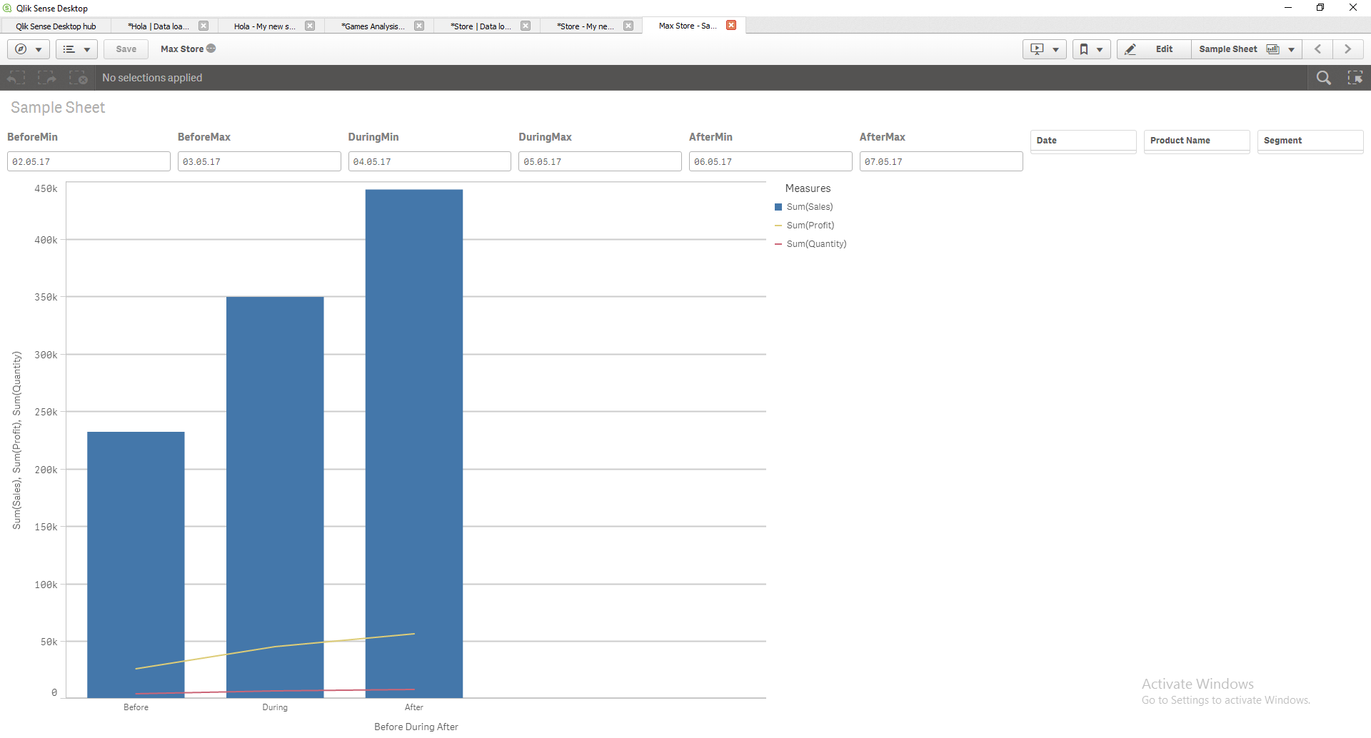
Resulting:

What I want is painting the bar of the middle (the one that receives the name "During") red, and the others green; but had no success. Have tried going to: >Appearance, >Colors, >By Expression; and entering;
if((Date>=date(date#('$(vBDA_1)','DD.MM.YY'),'DD.MM.YY')) and
(Date<=date(date#('$(vBDA_2)','DD.MM.YY'),'DD.MM.YY')),Green(),
if((Date>=date(date#('$(vBDA_3)','DD.MM.YY'),'DD.MM.YY')) and
(Date<=date(date#('$(vBDA_4)','DD.MM.YY'),'DD.MM.YY')),Red(),
if((Date>=date(date#('$(vBDA_5)','DD.MM.YY'),'DD.MM.YY')) and
(Date<=date(date#('$(vBDA_6)','DD.MM.YY'),'DD.MM.YY')),Green()
)
)
)
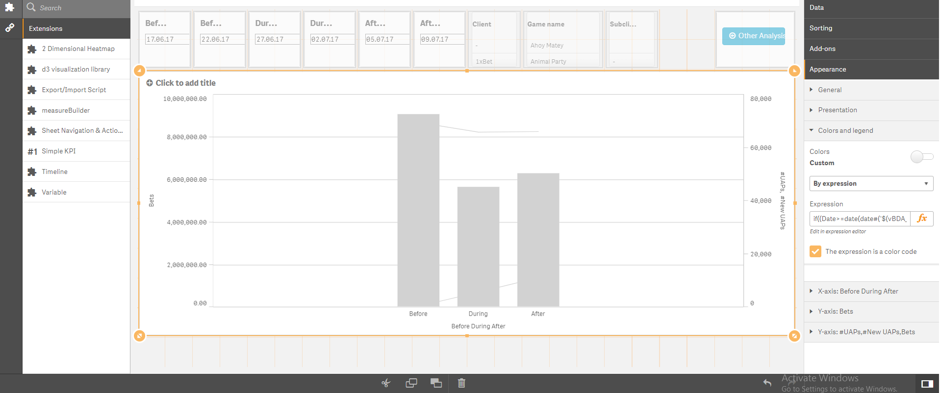
But it gives error:

Tried as well to asign the whole first chunk of code to "During" and then painting the bar red, else painting it green; but it also doesn´t work and shows the same grey chart above.
I thank you very much if you could provide some help. Anibal.
Accepted Solutions
- Mark as New
- Bookmark
- Subscribe
- Mute
- Subscribe to RSS Feed
- Permalink
- Report Inappropriate Content
- Mark as New
- Bookmark
- Subscribe
- Mute
- Subscribe to RSS Feed
- Permalink
- Report Inappropriate Content
I suggest you to convert all variables to numeric value.
- Mark as New
- Bookmark
- Subscribe
- Mute
- Subscribe to RSS Feed
- Permalink
- Report Inappropriate Content
Hi Andrea, thank you for your quick response.
I do not understand what do you mean by changing my variables to numeric, and what is its goal. Could you please widen a little bit on what it is required and why should I do this change? Maybe changing "Before", "During", "After" to 1, 2, 3? Or maybe eliminating the simple quote from the dates ('DD.MM.YY' to DD.MM.YY)?
How would you write the final expression on "Appearance" to change the color on the "During" bar with your suggested change?
Thanks in advance, Anibal.
- Mark as New
- Bookmark
- Subscribe
- Mute
- Subscribe to RSS Feed
- Permalink
- Report Inappropriate Content
could you post a sample app with fake data ?
- Mark as New
- Bookmark
- Subscribe
- Mute
- Subscribe to RSS Feed
- Permalink
- Report Inappropriate Content
Hi Andrea,
Yes. I am uploading a Qlik App that I created exclusively to solve this question. I will edit my question and adapt it to my sample app. The goal is still the same: converting the color of the "During" bar to red for example, and leaving the other 2 ("Before" and "After" on color green).
In order to watch correctly the graphic please type the following values in each of the 6 empty spaces of the boxes of Variable Extension at the top of the app:
BeforeMin = 02.05.17
BeforeMax = 03.05.17
DuringMin = 04.05.17
DuringMax = 05.05.17
AfterMin = 06.05.17
AfterMax = 07.05.17
Thanks for your help!
Anibal
The File is called "Max Store"
- Mark as New
- Bookmark
- Subscribe
- Mute
- Subscribe to RSS Feed
- Permalink
- Report Inappropriate Content
Hi Anibal,
Check the app attached and let me know.
Regards
Andrea
- Mark as New
- Bookmark
- Subscribe
- Mute
- Subscribe to RSS Feed
- Permalink
- Report Inappropriate Content
Thank you for your answer Andrea! It is the correct answer and woks perfectly.
From now on I will have the habit to upload a 100% reproducible sample App with my questions, due to your reply.
Thanks a lot. Anibal.