Unlock a world of possibilities! Login now and discover the exclusive benefits awaiting you.
- Qlik Community
- :
- Forums
- :
- Analytics
- :
- New to Qlik Analytics
- :
- Re: Colour 2 Measures on a bar graph by expression...
- Subscribe to RSS Feed
- Mark Topic as New
- Mark Topic as Read
- Float this Topic for Current User
- Bookmark
- Subscribe
- Mute
- Printer Friendly Page
- Mark as New
- Bookmark
- Subscribe
- Mute
- Subscribe to RSS Feed
- Permalink
- Report Inappropriate Content
Colour 2 Measures on a bar graph by expression and not values
Afternoon all,
I have searched for a good hour on the solution and only found answers where they are colouring a bar graph based on values.
I have a bar graph. It has 1x Dimension - Regions (North,South,East, West) and 2x Measures Red & Amber
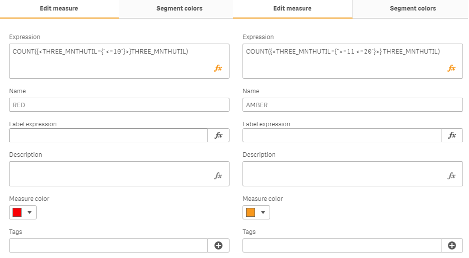
Red expression = COUNT({<THREE_MNTHUTIL={"<=10"}>}THREE_MNTHUTIL)
Amber expression = COUNT({<THREE_MNTHUTIL={">=11 <=20"}>} THREE_MNTHUTIL)
On my graph I'm just wanting the Red value whatever it is to colour it RED and Amber to colour it Orange.
I have tried created 2x Master Measures and putting the expression inside this however when I drag onto graph its still not working.
Thanks in advance
Accepted Solutions
- Mark as New
- Bookmark
- Subscribe
- Mute
- Subscribe to RSS Feed
- Permalink
- Report Inappropriate Content
Discovered how to achieve this.
- Go to your graph and select the measure you want to add a colour to.
- Where Master Item is, it will say “Add New” – Click this
- Select Colour you want under “Measure Colour” and press Create.
- Repeat this for each measure.
- Now go to Appearance then Colours & Legend.
- Change Colours off Auto
- Change Single colour to Multicoloured.
- Change “Use library tools” to Measure.
- Mark as New
- Bookmark
- Subscribe
- Mute
- Subscribe to RSS Feed
- Permalink
- Report Inappropriate Content
Hello,
For most of the things you are already on the right path.
1. Create a master measure for COUNT({<THREE_MNTHUTIL={"<=10"}>}THREE_MNTHUTIL) and set the measure color to Red.
2. Create a master measure for COUNT({<THREE_MNTHUTIL={">=11 <=20"}>} THREE_MNTHUTIL)
and set the measure color to Amber.
3. Add these master measures to the needed bar chart.
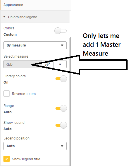
4. Once your graph is ready as expected go to Appearance > Colors > and turn on the library colors.
This will give you the expected graph behavior.
Regards,
Sourabh
- Tags:
- e al
- Mark as New
- Bookmark
- Subscribe
- Mute
- Subscribe to RSS Feed
- Permalink
- Report Inappropriate Content
I have carried out the above and please see attached for output. Still not working. 😞
- Mark as New
- Bookmark
- Subscribe
- Mute
- Subscribe to RSS Feed
- Permalink
- Report Inappropriate Content
Discovered how to achieve this.
- Go to your graph and select the measure you want to add a colour to.
- Where Master Item is, it will say “Add New” – Click this
- Select Colour you want under “Measure Colour” and press Create.
- Repeat this for each measure.
- Now go to Appearance then Colours & Legend.
- Change Colours off Auto
- Change Single colour to Multicoloured.
- Change “Use library tools” to Measure.
- Mark as New
- Bookmark
- Subscribe
- Mute
- Subscribe to RSS Feed
- Permalink
- Report Inappropriate Content
I understand, your answer been a while, but I want to thank you from the bottom of my heart!
I'm so happy that I found the question and the answer!!!
Thanks!
- Mark as New
- Bookmark
- Subscribe
- Mute
- Subscribe to RSS Feed
- Permalink
- Report Inappropriate Content
Thanks for you question dude! U saved my ss)))