Unlock a world of possibilities! Login now and discover the exclusive benefits awaiting you.
- Qlik Community
- :
- Forums
- :
- Analytics
- :
- New to Qlik Analytics
- :
- Re: Combined bar chart adding data instead of usin...
- Subscribe to RSS Feed
- Mark Topic as New
- Mark Topic as Read
- Float this Topic for Current User
- Bookmark
- Subscribe
- Mute
- Printer Friendly Page
- Mark as New
- Bookmark
- Subscribe
- Mute
- Subscribe to RSS Feed
- Permalink
- Report Inappropriate Content
Combined bar chart adding data instead of using percentage
Hello. I am working on a project for my company and I am new to Qlik. I'm trying to create a combo bar chart that shows the Ceiling (Total) value of a government contract and the Spending to Date of this contract. However, when I graph them, it ADDS the two values together. An example is the contract highlighted in the Excel sheet at the top row number 1385, and on the Qlik attachment the contract is called "BAMS UAS Maritime Surveillance", (they are the contract name and number respectively, you can't see the name in the Excel attachment because there are about 20 columns and the screen is moved over). The J column is the Total Ceiling Value of the Contract and the K column is the spending to date. As you can see, the contract is almost fully "spent." However, when I graph into Qlik (see attached) it ADDS the two values and the bar on the graph represents over $5 M instead of the contract being $2.9 M total with $2.8 M spent. How do I fix this?
In addition, column L on the Excel spreadsheet is "Percentage of Ceiling Value Spent" but the graph doesn't work when I try to graph this as a measure.
Ultimately, I want the bar graph to show that the contract's full value is $2.9 million and that $2.7 has been spent. So, looking at the attached screenshot, the BAMS UAS bar should stop at $2.9 million and most of it should be red because $2.7 has been spent, instead of Qlik adding both and making the bar seem like it's $5.85 M total.
.png)
- Mark as New
- Bookmark
- Subscribe
- Mute
- Subscribe to RSS Feed
- Permalink
- Report Inappropriate Content
Why don't you unstack them? If you fill the bar with red, there won't be a visual distinction between a stacked bar and a filled bar. You could explain this but it's not intuitive.
Another option is to change one of the measures to an icon like a diamond.
What are your thoughts on those options?
- Mark as New
- Bookmark
- Subscribe
- Mute
- Subscribe to RSS Feed
- Permalink
- Report Inappropriate Content
how do I change the measures to an icon like a diamond?
- Mark as New
- Bookmark
- Subscribe
- Mute
- Subscribe to RSS Feed
- Permalink
- Report Inappropriate Content
You need to change the chart type to a combo chart. It will be an option under the measures tab.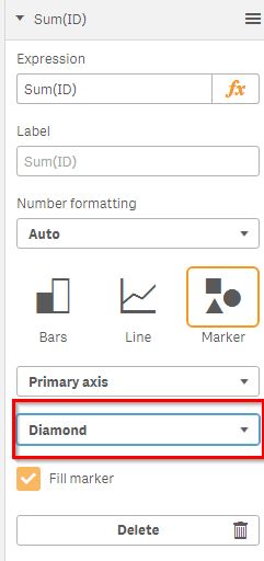
- Mark as New
- Bookmark
- Subscribe
- Mute
- Subscribe to RSS Feed
- Permalink
- Report Inappropriate Content
Oh I do not have that option on my pane?
- Mark as New
- Bookmark
- Subscribe
- Mute
- Subscribe to RSS Feed
- Permalink
- Report Inappropriate Content
you have to use a combo chart not a bar chart