Unlock a world of possibilities! Login now and discover the exclusive benefits awaiting you.
Announcements
Join us at Qlik Connect for 3 magical days of learning, networking,and inspiration! REGISTER TODAY and save!
- Qlik Community
- :
- Forums
- :
- Analytics
- :
- New to Qlik Analytics
- :
- Combo Bar Chart with number of Projects by Start /...
Options
- Subscribe to RSS Feed
- Mark Topic as New
- Mark Topic as Read
- Float this Topic for Current User
- Bookmark
- Subscribe
- Mute
- Printer Friendly Page
Turn on suggestions
Auto-suggest helps you quickly narrow down your search results by suggesting possible matches as you type.
Showing results for
Contributor III
2017-07-03
11:31 AM
- Mark as New
- Bookmark
- Subscribe
- Mute
- Subscribe to RSS Feed
- Permalink
- Report Inappropriate Content
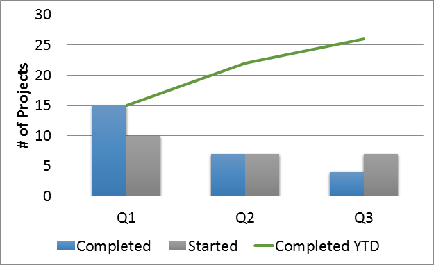
Combo Bar Chart with number of Projects by Start / Finish dates
For some reason I just seem to be stuck in brain fog with this chart.
My data contains Unique Project names , Start and Finish dates. I need to be able to display the counts of unique project started and finished by a time reference such as Quarter/Month/Year , etc. I can use a range function to get the cumulative total line for Completed projects. But, I am just not getting 2 bar grouping as in the referenced graph below.
This should pretty easy, but, I am getting stuck.

221 Views
0 Replies
Community Browser