Unlock a world of possibilities! Login now and discover the exclusive benefits awaiting you.
- Qlik Community
- :
- Forums
- :
- Analytics
- :
- New to Qlik Analytics
- :
- Combo Chart with 3 measures
- Subscribe to RSS Feed
- Mark Topic as New
- Mark Topic as Read
- Float this Topic for Current User
- Bookmark
- Subscribe
- Mute
- Printer Friendly Page
- Mark as New
- Bookmark
- Subscribe
- Mute
- Subscribe to RSS Feed
- Permalink
- Report Inappropriate Content
Combo Chart with 3 measures
Hi All,
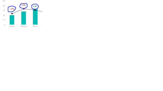
I have a requirement where in I have a combo chart as shown below:

Here I have 1 month dimension, and 3 measures.
1st measure is Actual value which is on bar, 2nd measure is Projected value which is shown on line and the 3rd one is the difference which should be as value on the chart like 12%, -14% etc (Marked in the image above).
Can this be achieved in Qlik Sense using out of the box charts, and if not possible using out of the box charts, then by using any extension??
Currently we are using Qlik Sense Feb 2019 version.
Need help..
Thanks,
Sampada
- Mark as New
- Bookmark
- Subscribe
- Mute
- Subscribe to RSS Feed
- Permalink
- Report Inappropriate Content
yes it is possible
- Mark as New
- Bookmark
- Subscribe
- Mute
- Subscribe to RSS Feed
- Permalink
- Report Inappropriate Content
How? By using which chart..? Can you please explain in detail..
- Mark as New
- Bookmark
- Subscribe
- Mute
- Subscribe to RSS Feed
- Permalink
- Report Inappropriate Content
one measure for Bar
second measure for ;Line
3rd measure for DOT's
add all 3 measures and in each measure property you can set axis and type of (line,bar or dot)
find attach