Unlock a world of possibilities! Login now and discover the exclusive benefits awaiting you.
- Qlik Community
- :
- Forums
- :
- Analytics
- :
- New to Qlik Analytics
- :
- Re: Combo Line and bar chart
- Subscribe to RSS Feed
- Mark Topic as New
- Mark Topic as Read
- Float this Topic for Current User
- Bookmark
- Subscribe
- Mute
- Printer Friendly Page
- Mark as New
- Bookmark
- Subscribe
- Mute
- Subscribe to RSS Feed
- Permalink
- Report Inappropriate Content
Combo Line and bar chart
Hi,
I'm am trying to recreate this Excel chart in Qlik Sense 3.1.
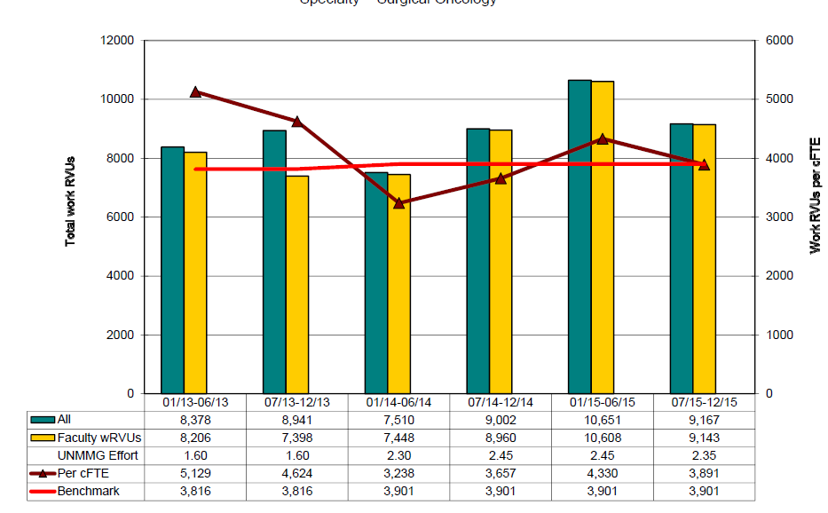
Each bar represents a group. I want to show each group over time, with the line chart above. The line chart has a secondary Y axis.
In Qlik, I can get a single bar which is the sum of the two groups and the line or the two bars but not the line.


I've tried using the bar chart and the combo chart, but neither works.
Accepted Solutions
- Mark as New
- Bookmark
- Subscribe
- Mute
- Subscribe to RSS Feed
- Permalink
- Report Inappropriate Content
I am able to do this kind of chart, can you please elaborate more on what you need ?
- Mark as New
- Bookmark
- Subscribe
- Mute
- Subscribe to RSS Feed
- Permalink
- Report Inappropriate Content
In Combo chart you can achieve this.
Can you share qvf?
or what the measures you have used for this?
- Mark as New
- Bookmark
- Subscribe
- Mute
- Subscribe to RSS Feed
- Permalink
- Report Inappropriate Content
I am able to do this kind of chart, can you please elaborate more on what you need ?
- Mark as New
- Bookmark
- Subscribe
- Mute
- Subscribe to RSS Feed
- Permalink
- Report Inappropriate Content
Hi,
I want a bar for Dr. A and a bar for Dr. B that is the sum for each of their wRVUs.
Then I want a line for the sum of the wRVU / Clinical effort for both providers.
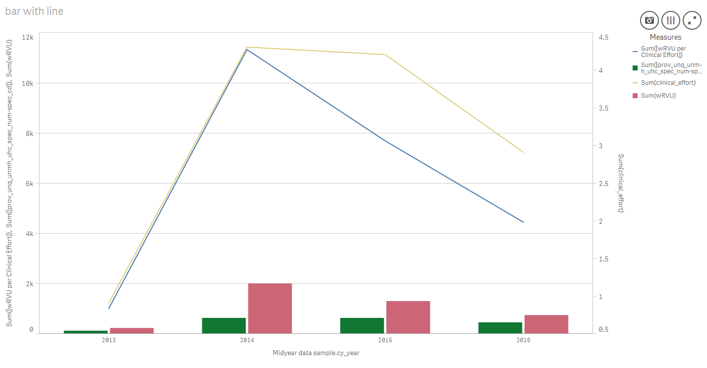
On the chart above, the green bar is the sum of specialty code. and the yellow line is the sum of their clinical effort.
thanks for getting back to me.
Diane
- Mark as New
- Bookmark
- Subscribe
- Mute
- Subscribe to RSS Feed
- Permalink
- Report Inappropriate Content
Hi,
I'll try loading the file again.
I appreciate any help.
- Mark as New
- Bookmark
- Subscribe
- Mute
- Subscribe to RSS Feed
- Permalink
- Report Inappropriate Content
Hi,
I loaded the file again. It's currently being moderated.
I noted below that I want a bar for each Dr..
The line should be the total wRVU per clinical effort.
thanks,
Diane
- Mark as New
- Bookmark
- Subscribe
- Mute
- Subscribe to RSS Feed
- Permalink
- Report Inappropriate Content
Hi Diane,
Please share the methods as steps, that we be very helpful for me.
Thanks in advance