Unlock a world of possibilities! Login now and discover the exclusive benefits awaiting you.
- Qlik Community
- :
- Forums
- :
- Analytics
- :
- New to Qlik Analytics
- :
- Re: Create a Scatter Chart
- Subscribe to RSS Feed
- Mark Topic as New
- Mark Topic as Read
- Float this Topic for Current User
- Bookmark
- Subscribe
- Mute
- Printer Friendly Page
- Mark as New
- Bookmark
- Subscribe
- Mute
- Subscribe to RSS Feed
- Permalink
- Report Inappropriate Content
Create a Scatter Chart
Hi,
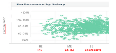
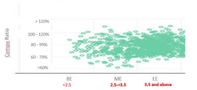
I want to create a Scatter Chart on behalf of attached xls data. I need the count of employee which fall in between X - Axis and Y - Axis. Below is Output.
Thanks
- Mark as New
- Bookmark
- Subscribe
- Mute
- Subscribe to RSS Feed
- Permalink
- Report Inappropriate Content
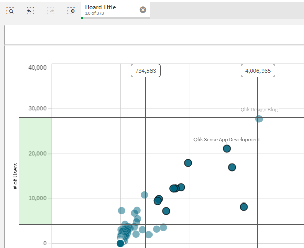
The help for a Scatter Plot can be found here. To create a Scatter Plot as you will see in the help you simply choose a Dimension (like your Employee ID) and then use 2 measures like Rate and Ratio: https://help.qlik.com/en-US/sense/February2021/Subsystems/Hub/Content/Sense_Hub/Visualizations/Scatt...
The chart doesn't filter values on Zoom. It simply zooms in or out because it is responsive to the volume of data as you will see in the help. If you want to be able to count the items you are looking at you can select by clicking and holding your mouse in either or both axis. That will filter your values and any KPI's you have will then reflect those values, and the dimension you used will show the # of values in the selection bar.
- Mark as New
- Bookmark
- Subscribe
- Mute
- Subscribe to RSS Feed
- Permalink
- Report Inappropriate Content
Thanks Dalton.
I accept it, Do me a favor, Can you create a scatter on the attached xls. Already the desired output I shared. If Y - Axis in bucket is not possible than make it 0%, 10%, 20% ...... So On. For an idea.
Thanks
- Mark as New
- Bookmark
- Subscribe
- Mute
- Subscribe to RSS Feed
- Permalink
- Report Inappropriate Content
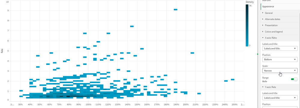
Here it is. I simply changed the Axis Scale.
You have too many points to show every point so it shows a Density Map first.
As you begin zooming it will show the number of points in a range, then it will show the actual points. The Axis labels will continue changing as you zoom in. So although it starts at 10% when fully expanded it will shrink to single % numbers when you get more and more zoomed in.
- Mark as New
- Bookmark
- Subscribe
- Mute
- Subscribe to RSS Feed
- Permalink
- Report Inappropriate Content
First of all thanks to you Dalton.
Excatly, The same I need as a output. Please share QVF, So I can check it and continue the same.
Thanks Again. Please share the QVF. 🙂
- Mark as New
- Bookmark
- Subscribe
- Mute
- Subscribe to RSS Feed
- Permalink
- Report Inappropriate Content
Can you share the QVF, So I can proceed for the same?
Thanks
- Mark as New
- Bookmark
- Subscribe
- Mute
- Subscribe to RSS Feed
- Permalink
- Report Inappropriate Content
Hi Dalton,
Can you share the same QVF, So I can create and proceed for next for further analysis for next possibilities.
Thanks.


