Unlock a world of possibilities! Login now and discover the exclusive benefits awaiting you.
- Qlik Community
- :
- Forums
- :
- Analytics
- :
- New to Qlik Analytics
- :
- Re: Distribution plot help
- Subscribe to RSS Feed
- Mark Topic as New
- Mark Topic as Read
- Float this Topic for Current User
- Bookmark
- Subscribe
- Mute
- Printer Friendly Page
- Mark as New
- Bookmark
- Subscribe
- Mute
- Subscribe to RSS Feed
- Permalink
- Report Inappropriate Content
Distribution plot help
Hi all
I really hope that someone can help - it is driving me crazy! I have a data set with a lot of data which can be simplified to something like the table below:
| Client | Inspection | Score |
| Client_A | Health | 1 |
| Client_B | Health | 9 |
| Client_C | Health | 7 |
| Client_A | Safety | 1 |
| Client_B | Safety | 8 |
| Client_C | Safety | 1 |
| Client_A | Security | 5 |
| Client_B | Security | 2 |
| Client_C | Security | 7 |
| Client_A | Environment | 2 |
| Client_B | Environment | 6 |
| Client_C | Environment | 7 |
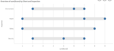
I would like to show the Min and Max for each Inspection (Health, Safety, Security and Environment - disregarding any selections) and then I also want to show the average for the clients selected as another dot on a distribution plot. I also need the bands to be shown. Something like the graph below (it is the wrong data, but it is just to give you an idea):

I tried making Inspection my Y-axis, ValueList('Min','Max','Avg') my Points and my X-axis (measure) the following:
If(ValueList('Min','Max','Avg')='Min',
Min({1}Score),
If(ValueList('Min','Max','Avg')='Max',
Max({1}Score),
If(ValueList('Min','Max','Avg')='Avg',
Avg(Score)
)
)
)
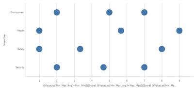
It gives me the correct data, but the bands disappear like in the screenshot below:

Like I said, the data is fine, but the layout not as I don't get the bands anymore (which is an explicit requirement). I have spent hours on this and really hope there is a simple answer. I cannot show all the data points as my actual data set will have way more than 100 scores for each inspection. I have attached* the sample app.
Any help would be greatly appreciated (other suggestions also welcome, but I am not allowed to use a Box Plot).
Regards,
Mauritz
PS. I have tried doing this with a stacked combo chart and tried to make the bottom bar transparent, but I cannot use ARGB colours as part of my master measure colours and the white doesn't look good![]() .
.
- « Previous Replies
-
- 1
- 2
- Next Replies »
- Mark as New
- Bookmark
- Subscribe
- Mute
- Subscribe to RSS Feed
- Permalink
- Report Inappropriate Content
Great to hear!
I'll spend some time to try to reproduce it, but I have a feeling it's something in the data that didn't go well together.
Regards,
Patrik.
- Mark as New
- Bookmark
- Subscribe
- Mute
- Subscribe to RSS Feed
- Permalink
- Report Inappropriate Content
@Patrik_Lundblad , thanks again! And yes, it was a kind of bad data or a memory bug or something...
Take care,
~Demian
- « Previous Replies
-
- 1
- 2
- Next Replies »