Unlock a world of possibilities! Login now and discover the exclusive benefits awaiting you.
- Qlik Community
- :
- Forums
- :
- Analytics
- :
- New to Qlik Analytics
- :
- Donut Chart to show as per the Expression percenta...
- Subscribe to RSS Feed
- Mark Topic as New
- Mark Topic as Read
- Float this Topic for Current User
- Bookmark
- Subscribe
- Mute
- Printer Friendly Page
- Mark as New
- Bookmark
- Subscribe
- Mute
- Subscribe to RSS Feed
- Permalink
- Report Inappropriate Content
Donut Chart to show as per the Expression percentage
Hi All,
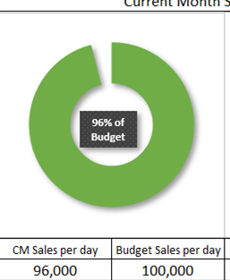
For my Project, I am working on creating a Donut Chart, something like this:
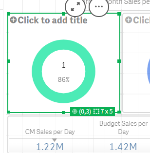
I want Donut to appear according to the percentage, but when i tried, though I am getting the percentage value after calculation, but Donut is not responding accordingly.
Below is what i am getting:
In my case I am getting the correct percentage, but the Donut should should not form complete circle, I want it to cover only till 86%.
Please suggest me how can I Achieve this?
Thankyou so much in Advance! 🙂
Akshaya
@marcus_sommer @Bill_Britt @GeorgePhilips23 @rwunderlich @MayilVahanan @durgesh22
Qlik Sense Business
- Mark as New
- Bookmark
- Subscribe
- Mute
- Subscribe to RSS Feed
- Permalink
- Report Inappropriate Content
Hi @Akshaya
I think that you want to use a Gauge chart because Donut will need a dimension. You have two measures and no one dimension to show the data.
Donut or Pie Chart: One dimension and one measure. The measure will sizing each dimension member of chart. Is possible to include second measure to give radius (you can call height also) of each dimension member also.
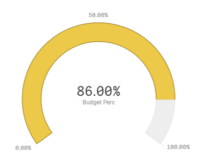
Gauge chart: One measure. The measure will be fill chart from lower to higher value.
In your case, higher value is 1 (or 100%) and lower value will be 0, so chart wil be presented like:
But if you still want to use Donut chart, please take a look onto this link: https://community.qlik.com/t5/Qlik-Sense-Documents/Top-10-Viz-tips-part-VI/ta-p/1889478
[],
Pedro
- Mark as New
- Bookmark
- Subscribe
- Mute
- Subscribe to RSS Feed
- Permalink
- Report Inappropriate Content
Thanks @pedrobergo , for quick turnaround, for now I am moving forward with Guage chart, will surely have a look at the link you mentioned and try to do this same using Donut Chart.
- Mark as New
- Bookmark
- Subscribe
- Mute
- Subscribe to RSS Feed
- Permalink
- Report Inappropriate Content
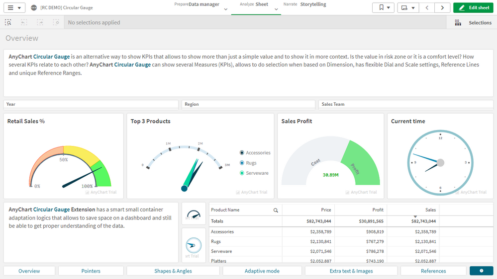
@Akshaya You may like to consider going with a circular gauge using the extension we've released these days:


