- Mark as New
- Bookmark
- Subscribe
- Mute
- Subscribe to RSS Feed
- Permalink
- Report Inappropriate Content
Employee tenure gantt like chart with department transfers
Hello,
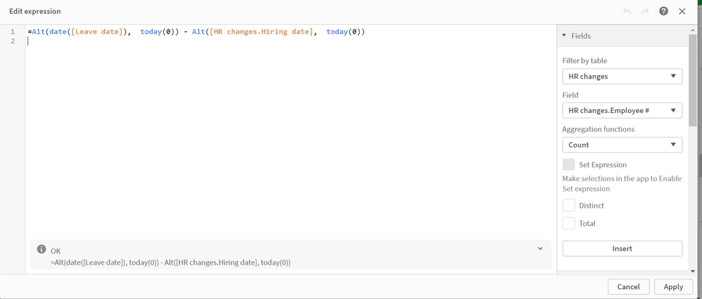
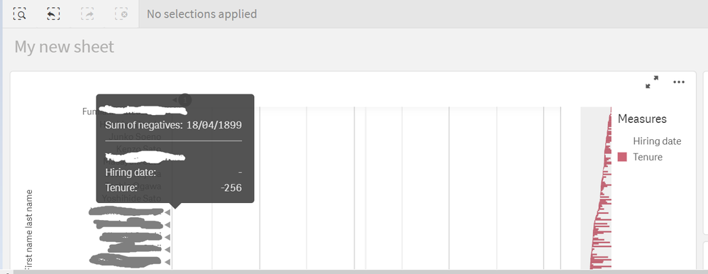
I'm currently trying to create Employee tenure gantt like chart, and in order to do that, I am using the fact table of HR charges which unlike the dimension table of employee table, has sometimes multiple rows for a single employee if that person changed departments throughout his tenure in the company. With the help of Qlik Community, I've managed to progress as far as putting together gantt chart for employees who did not get department transfers by using the measure expression below:
However, for the employees who have transferred departments and thus have multiple rows of data in HR change fact table, I am not able to get the gantt chart like visualization for the tenure measure. I'd greatly appreciate it if anyone can let me know how I can get the visualization working for employees who have changed departments and thus have multiple rows of data in the HR change fact table.
Thank you very much for your help!
- Mark as New
- Bookmark
- Subscribe
- Mute
- Subscribe to RSS Feed
- Permalink
- Report Inappropriate Content
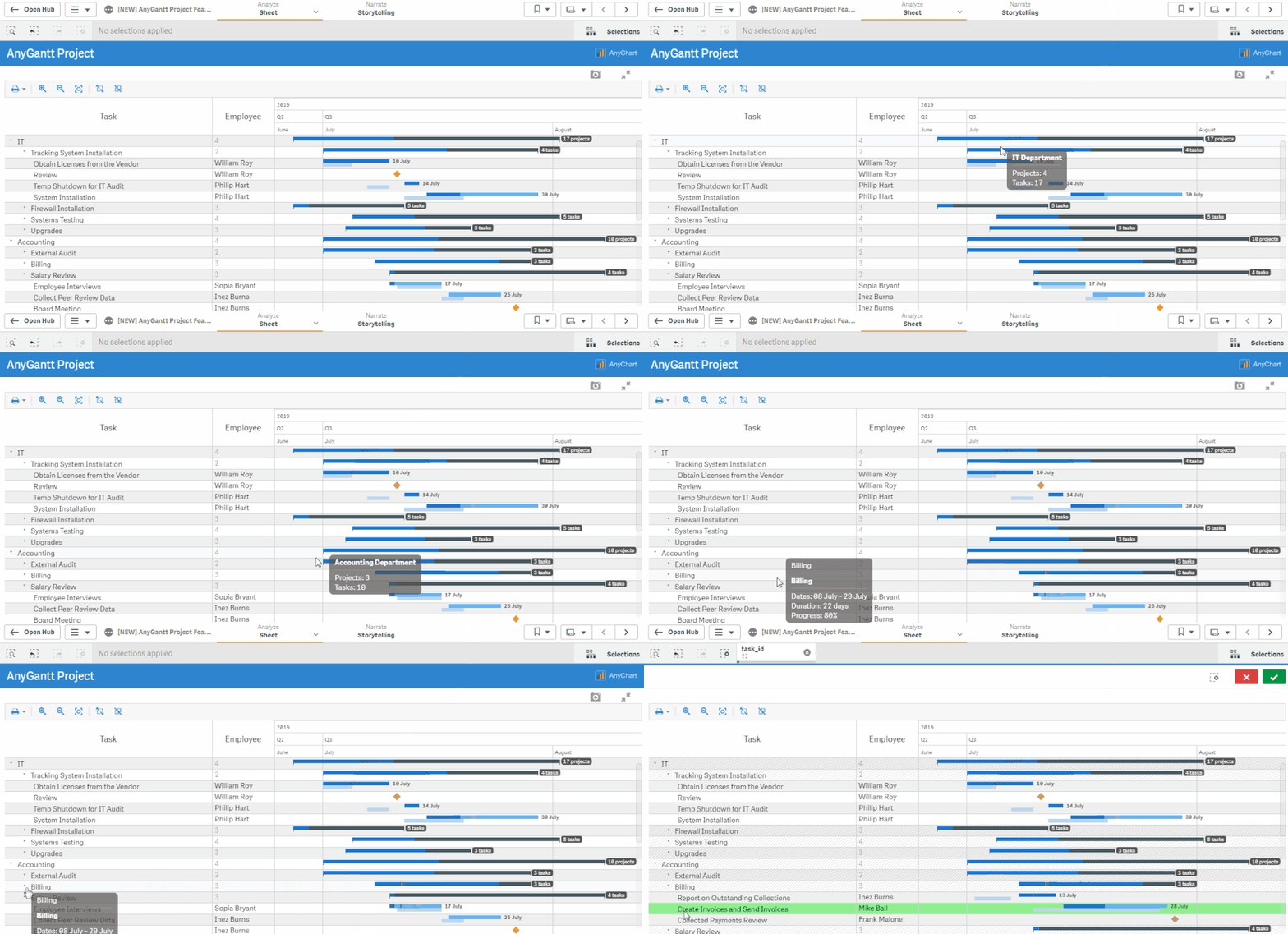
Such a Gantt chart can be built using any of the two Gantt Chart extensions by AnyChart, Qlik's Technology Partner: Project Gantt and Resource Gantt.
Feel free to try and check out our demo apps (view live or download QVF).


