Unlock a world of possibilities! Login now and discover the exclusive benefits awaiting you.
- Qlik Community
- :
- Forums
- :
- Analytics
- :
- New to Qlik Analytics
- :
- Re: Formatting bar chart?
- Subscribe to RSS Feed
- Mark Topic as New
- Mark Topic as Read
- Float this Topic for Current User
- Bookmark
- Subscribe
- Mute
- Printer Friendly Page
- Mark as New
- Bookmark
- Subscribe
- Mute
- Subscribe to RSS Feed
- Permalink
- Report Inappropriate Content
Formatting bar chart?
Hi,
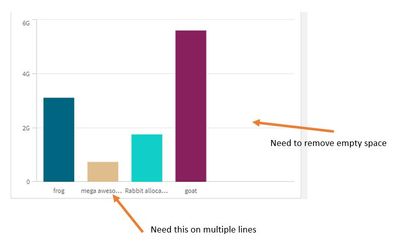
I'm making a bar chart. How do I:
1. Add a $ in front of the Y-axis numbers
2. Format the x-axis so the words can be on multiple lines
3. Remove empty space on the right side of the chart
- Mark as New
- Bookmark
- Subscribe
- Mute
- Subscribe to RSS Feed
- Permalink
- Report Inappropriate Content
1. switch off auto formatting for the measure for y axis. put this syntax: $#,##0
2. does not seem to be possible in qlik.. https://community.qlik.com/t5/Suggest-an-Idea/Text-wrapping-is-needed-in-Bar-Line-chart-dimension-la...
3. is this because the chart is showing nulls? or too wide perhaps?
- Mark as New
- Bookmark
- Subscribe
- Mute
- Subscribe to RSS Feed
- Permalink
- Report Inappropriate Content
Please like the idea @G3S has shared in issue no 2, we are not getting enough votes to let Qlik hear our voice. Text wrapping or improvement in Bar/label space assignment is much needed in qlik charts. No 3 issue needs attention as well, Bars should spread evenly, I am too getting similar requests from my users. In dashboards may be you could improve it by reducing the chart width but not that easy in nprinting reports.
- Mark as New
- Bookmark
- Subscribe
- Mute
- Subscribe to RSS Feed
- Permalink
- Report Inappropriate Content
Will this syntax work no matter how many digits my number is?
$#,##0
- Mark as New
- Bookmark
- Subscribe
- Mute
- Subscribe to RSS Feed
- Permalink
- Report Inappropriate Content
yes it will. it has a thousands separator.
100
1,000
10,000
100,000
