Unlock a world of possibilities! Login now and discover the exclusive benefits awaiting you.
- Qlik Community
- :
- Forums
- :
- Analytics
- :
- New to Qlik Analytics
- :
- How do I do this stacked bar chart
- Subscribe to RSS Feed
- Mark Topic as New
- Mark Topic as Read
- Float this Topic for Current User
- Bookmark
- Subscribe
- Mute
- Printer Friendly Page
- Mark as New
- Bookmark
- Subscribe
- Mute
- Subscribe to RSS Feed
- Permalink
- Report Inappropriate Content
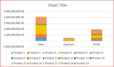
How do I do this stacked bar chart
Hi all
I am not sure how to do a graph like below, it's pretty easy to do it in Excel. What do I need to do, change the format of data? add some formula in QlikSense? use extension? so that I can do the stacked bar chart like I want. Thanks in advanced.
My data are like:
Sales, Expenses, Profit
Product 1 40, 20, 10
Product 2 30, 10, 15
Product 3 50, 5, 45
etc.
Phyllis
- Mark as New
- Bookmark
- Subscribe
- Mute
- Subscribe to RSS Feed
- Permalink
- Report Inappropriate Content
Hi Phyllis,
If you do a crosstable Load of that data, and then in the front end, you can just add two dimensions to the graph, and your value as a measure, it should appear as above.
I.e.:
CrossTable(Type, Product)
LOAD F1,
Sales,
Expenses,
Profit
FROM
INPUT FILE....
You can find more information regarding crosstable here:
CrossTable Load in Qlikview-Source
Hope this helps,
Shun