Unlock a world of possibilities! Login now and discover the exclusive benefits awaiting you.
- Qlik Community
- :
- Forums
- :
- Analytics
- :
- New to Qlik Analytics
- :
- Re: How to calculate cumulative data in Qlik Sense...
- Subscribe to RSS Feed
- Mark Topic as New
- Mark Topic as Read
- Float this Topic for Current User
- Bookmark
- Subscribe
- Mute
- Printer Friendly Page
- Mark as New
- Bookmark
- Subscribe
- Mute
- Subscribe to RSS Feed
- Permalink
- Report Inappropriate Content
How to calculate cumulative data in Qlik Sense?
Dear Qlik Sense Experts
I am new to Qlik Sense and I am a front end user
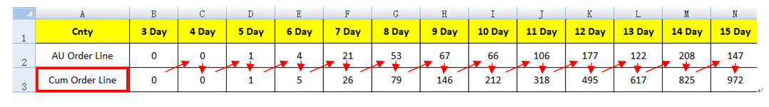
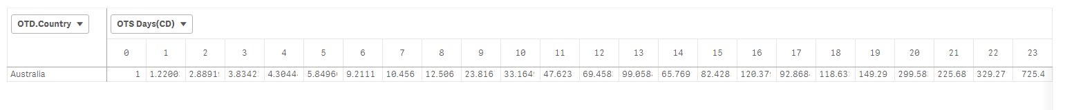
Now my raw data is as below. First line shows how many orders shipped in specific days
Take [E2] as an example, it means there are 4 orders take 6 days to ship from plant
Now I want to add 2nd line to calculate the cumulative orders which shipped within specific days
Take [F3] as an example, there are 26 orders ships within 7 days
These 26 orders include:
1 order takes 5 days to ship
4 orders take 6 days to ship
21 orders take 7 days to ship
So 26 [F3] = [B2]+[C2]+[D2]+[E2]+[F2]
May I know what expression I should use in Qlik Sense to make this request happen?
You could refer to raw data in attachment
Thank you for your advice in advance
Ivan
- Tags:
- cumulate
- « Previous Replies
-
- 1
- 2
- Next Replies »
Accepted Solutions
- Mark as New
- Bookmark
- Subscribe
- Mute
- Subscribe to RSS Feed
- Permalink
- Report Inappropriate Content
This?
Aggr(RangeSum(Above(Count([Order Line]), 0, RowNo())) / Count(TOTAL <[Sold to Country]> [Order Line]),[Sold to Country], ([OTS Days(CD)], (NUMERIC)))
- Mark as New
- Bookmark
- Subscribe
- Mute
- Subscribe to RSS Feed
- Permalink
- Report Inappropriate Content
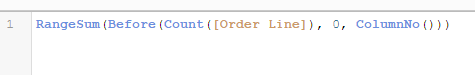
Try this (assuming you are doing this in a pivot table with your Cnty dimension pivoted)
RangeSum(Before(Count([Orders Shipped]), 0, ColumnNo()))
- Mark as New
- Bookmark
- Subscribe
- Mute
- Subscribe to RSS Feed
- Permalink
- Report Inappropriate Content
Dear Sunny
Thank you so much for your prompt, it works!
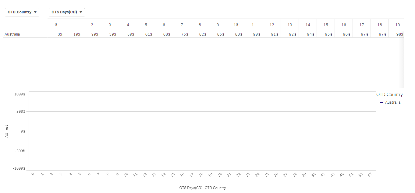
We have an additional request to calculate the cumulative percentage
I try to use below expression to calculate such percentage but it fails. I assume the data in RangeSum expression will change according to below formula
RangeSum(Before(Count([Order Line]), 0, ColumnNo())) / Count ([Order Line])
May I know if there is any way to achieve this request?
Correct Cum Data
Incorrect Cum Rate
Thanks again for your valuable reply
Ivan
- Mark as New
- Bookmark
- Subscribe
- Mute
- Subscribe to RSS Feed
- Permalink
- Report Inappropriate Content
May be this
RangeSum(Before(Count([Order Line]), 0, ColumnNo())) / Count(TOTAL [Order Line])
- Mark as New
- Bookmark
- Subscribe
- Mute
- Subscribe to RSS Feed
- Permalink
- Report Inappropriate Content
Dear Sunny
Thank you so much for the reply. It works again!
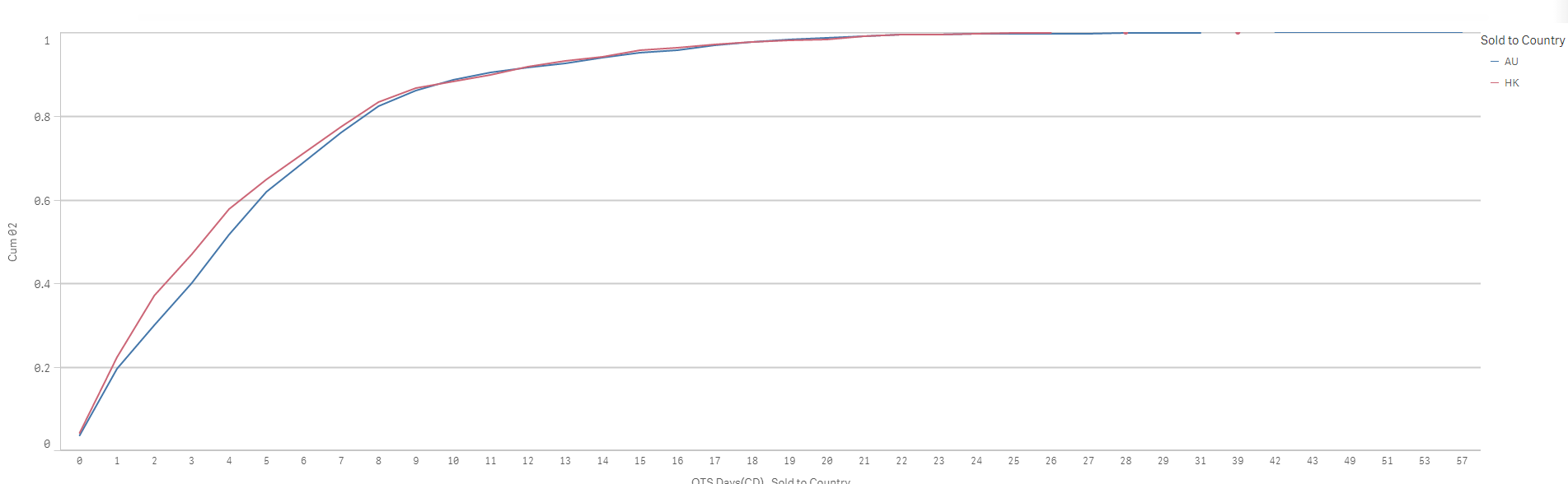
I am sorry that I have one last question, when I turn the pivot table into line chart, the measurement we set up in master item somehow turn to 0. It should shows the same percentage as the pivot tablet
Does line chart can't identify the data in pivot tablet as data in it are cumulative ones?
Ivan
- Mark as New
- Bookmark
- Subscribe
- Mute
- Subscribe to RSS Feed
- Permalink
- Report Inappropriate Content
RangeSum(Before (Count ( [ Orders Shipped ] ), 0 , ColumnNo() ) )
- Mark as New
- Bookmark
- Subscribe
- Mute
- Subscribe to RSS Feed
- Permalink
- Report Inappropriate Content
Try this for a line chart
RangeSum(Above(Count([Order Line]), 0, RowNo())) / Count(TOTAL [Order Line])
- Mark as New
- Bookmark
- Subscribe
- Mute
- Subscribe to RSS Feed
- Permalink
- Report Inappropriate Content
Dear Sunny
Sorry for my late response. I try your advise but it doesn't work in Qlik
The result in line chart should be as below but it turn out to be what shows in 2nd screenshot
Could you help advise?
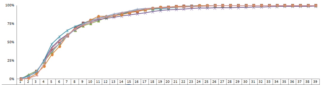

Thank you for your advise in advance
Ivan
- Mark as New
- Bookmark
- Subscribe
- Mute
- Subscribe to RSS Feed
- Permalink
- Report Inappropriate Content
You have two dimensions? Try this
1) Dimension1
2) Dimension2
Aggr(RangeSum(Above(Count([Order Line]), 0, RowNo())) / Count(TOTAL <Dimension2> [Order Line]), Dimension2, Dimension1)
Replace Dimension1 with your chart's dimension1 and replace Dimension2 with your chart's dimension2
- Mark as New
- Bookmark
- Subscribe
- Mute
- Subscribe to RSS Feed
- Permalink
- Report Inappropriate Content
Sunny
Thank you for your reply again.
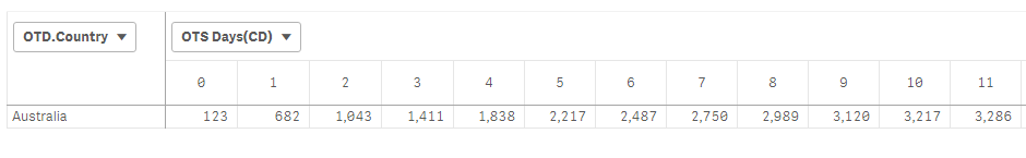
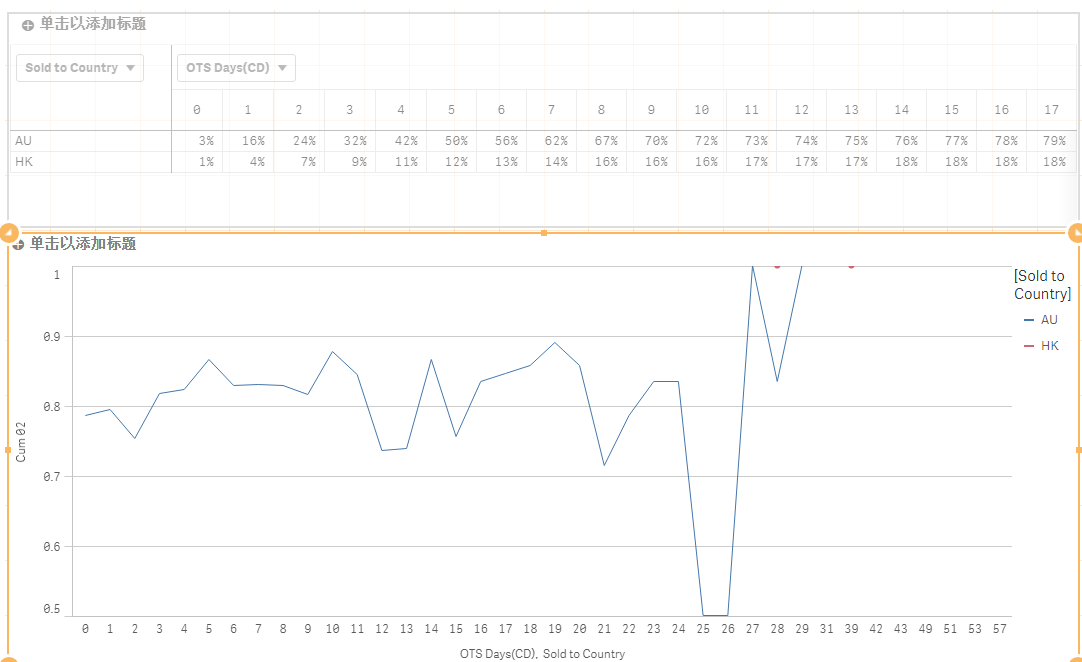
Yes there are 2 dimension in this app as below

I try your expression but the line chart doesn't have the correct result. The percentage in line chart should match the above pivot table
I have put the apps and raw data in the attachment, would you mind take a look?
Thank you for your advise in advance
Ivan
- « Previous Replies
-
- 1
- 2
- Next Replies »