Unlock a world of possibilities! Login now and discover the exclusive benefits awaiting you.
- Qlik Community
- :
- Forums
- :
- Analytics
- :
- New to Qlik Analytics
- :
- Re: How to change the color of differents column o...
- Subscribe to RSS Feed
- Mark Topic as New
- Mark Topic as Read
- Float this Topic for Current User
- Bookmark
- Subscribe
- Mute
- Printer Friendly Page
- Mark as New
- Bookmark
- Subscribe
- Mute
- Subscribe to RSS Feed
- Permalink
- Report Inappropriate Content
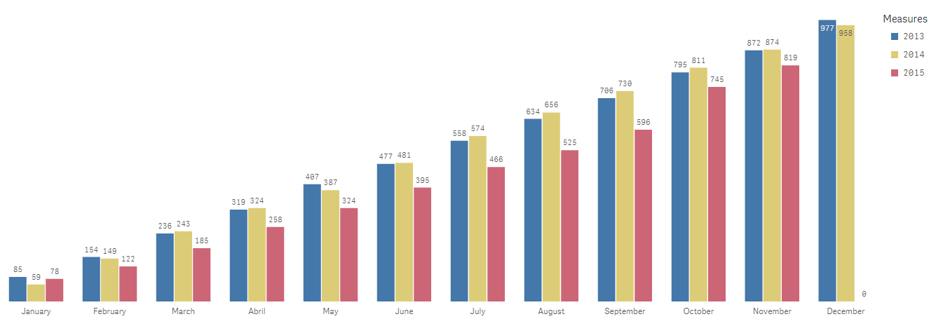
How to change the color of differents column of a Bar Chart
Hi guys,
I have a big issue in my Bar chart. It's setted as grouped and vertical.
As Dimention I have the months of the year, and as measures I have the total value of three years of sales (2013, 2014, 2015).
I'm trying to change the color of the year's columns on the chart.
I'm trying to set:
-2013's columns, intto grey.
-2014's columns into blue.
-2015 columns into yellow.
I tried this formula, but I changes all the cloumns of the chart to blue.
IF( Sum([2015]), yellow(), if( Sum([2014]), blue(), rgb(199, 199, 199)))
I would like to know what's wrong in my formula and if there is a better way to do it.
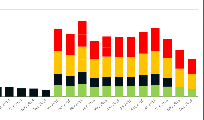
I attached a screenshot of the original chart( without the formula) and a screenshot with the formula to facilitate.
Thanks a lot in advance.
Best Regards,
Fernando
Accepted Solutions
- Mark as New
- Bookmark
- Subscribe
- Mute
- Subscribe to RSS Feed
- Permalink
- Report Inappropriate Content
Hi Fernando,
you can colour a bar chart/ Stacked bar chart the way you like to.
This possible by adding 2 dimensions and 1 Measure. Check the QVF attached for more details.
If you are facing any issues achieving this, please attach a sample QVF and I will help you achieve it.
Thanks and Regards,
Sangram Reddy.
- Mark as New
- Bookmark
- Subscribe
- Mute
- Subscribe to RSS Feed
- Permalink
- Report Inappropriate Content
Hi Sangram,
your example helped me a lot and now my charts are colorful with the colours I needed.
Thank you very much.
Best Regards,
Fernando
- Mark as New
- Bookmark
- Subscribe
- Mute
- Subscribe to RSS Feed
- Permalink
- Report Inappropriate Content
Always Welcome!