Unlock a world of possibilities! Login now and discover the exclusive benefits awaiting you.
- Qlik Community
- :
- Forums
- :
- Analytics
- :
- New to Qlik Analytics
- :
- Re: How to change the values in measure as percent...
- Subscribe to RSS Feed
- Mark Topic as New
- Mark Topic as Read
- Float this Topic for Current User
- Bookmark
- Subscribe
- Mute
- Printer Friendly Page
- Mark as New
- Bookmark
- Subscribe
- Mute
- Subscribe to RSS Feed
- Permalink
- Report Inappropriate Content
How to change the values in measure as percentage?
Hello All,
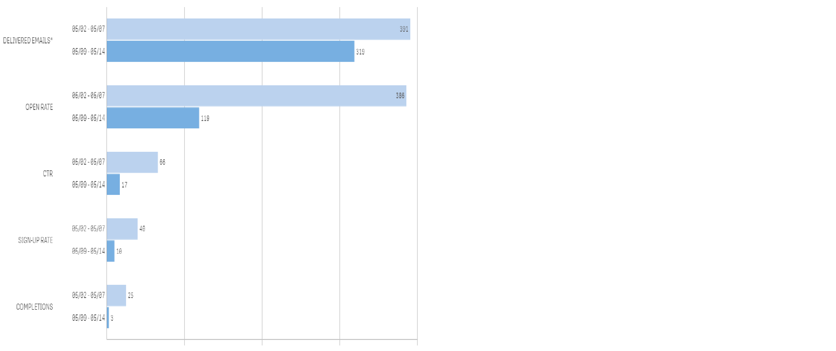
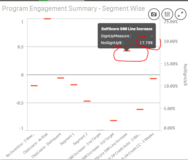
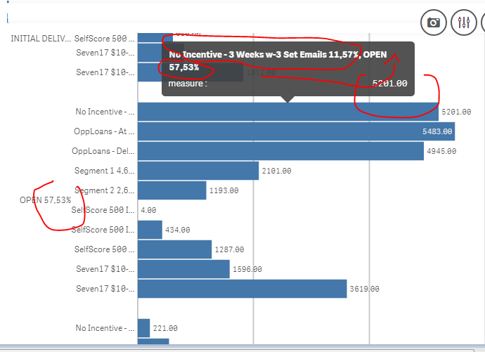
From the above graph
In delivered emails i have values but in open rate i need those values should be in percentage type as well as in signup rate too.
- « Previous Replies
-
- 1
- 2
- Next Replies »
Accepted Solutions
- Mark as New
- Bookmark
- Subscribe
- Mute
- Subscribe to RSS Feed
- Permalink
- Report Inappropriate Content
I found out 2 "solutions"; I don't know if it's appealing enough though..
1st one:
in the same graphic, having some dimensions having sum(Sum) and others as % (but you'll have to know what's the % because I couldn't show the % sign):
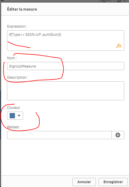
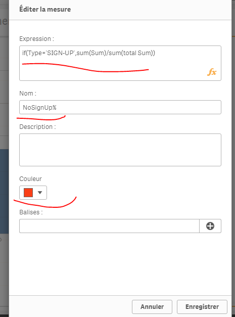
Measure :
if(Type='SIGN-UP',num(sum(Sum),'##0,00'), num((sum(Sum)/sum(total Sum))*100,'##0,00%'))
result:
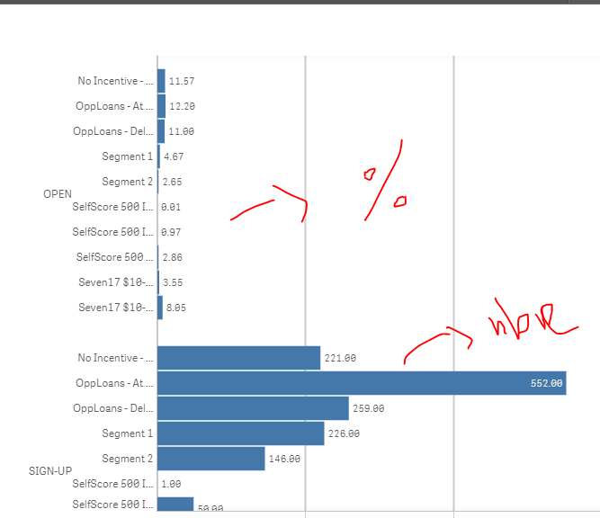
2) you'll have to use a combined chart and thus, you can't have 2 dimensions in your chart but only ONLY hiearchic dimension :
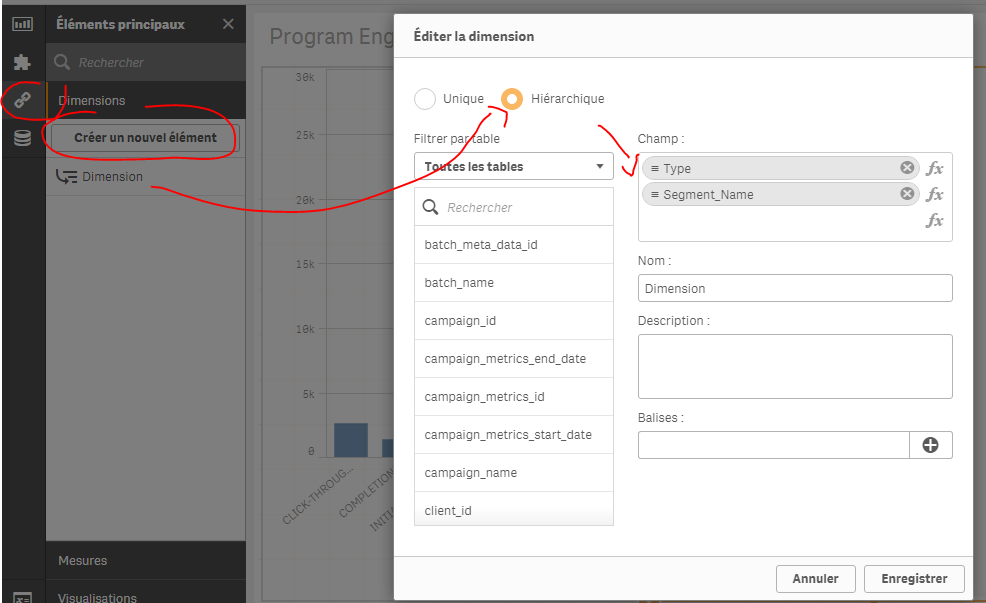
and create 2 master measures:
Now, in your chart, use these dimension and measures :
result:
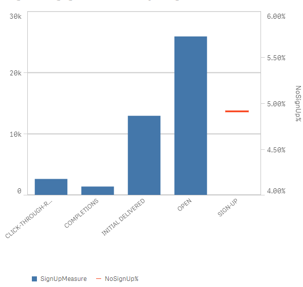
I click on open and confirm : I'll have sum(Sum) by segments of type open:
I click on Sign up, i'll have its segments by %:
see the attached app
You can also have the information of the % for juste the Type OPEN for example:
change your dimensions from :
Type to =Type& ' '&aggr( if(Type='OPEN',num((sum(Sum)/sum(total Sum))*100,'##0,00%')),Type)
Segment_Name to =Segment_Name& ' '&aggr( if(Type='OPEN',num((sum(Sum)/sum(total Sum))*100,'##0,00%')),Segment_Name,Type)
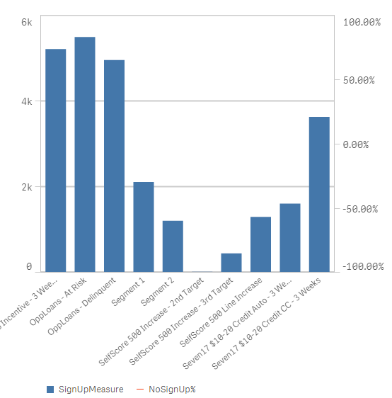
result :
- Mark as New
- Bookmark
- Subscribe
- Mute
- Subscribe to RSS Feed
- Permalink
- Report Inappropriate Content
I think this is not possible , but if you hover on the bars you will see the Value and Share
- Mark as New
- Bookmark
- Subscribe
- Mute
- Subscribe to RSS Feed
- Permalink
- Report Inappropriate Content
Unfortunately, it's not possible to control what's being seen in the pop up in Qlik Sense; the only way to do it is to color by expression, and the expression would be the %; in that case, when you hover on it, you'll see the percentage.
mto, in qlikView, we have the possibility to control what's being seen when we hover over a dimension; we could add a measure, make it invisible and it will only appear when we hover over an object.
Is such a possiblity or another direct way (like in tableau) is thought about in the next relase?
Thanks,
- Mark as New
- Bookmark
- Subscribe
- Mute
- Subscribe to RSS Feed
- Permalink
- Report Inappropriate Content
Hi Goutham
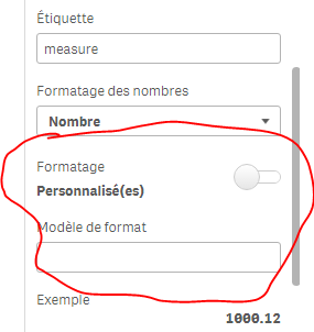
If you looking to convert in % here you are:
1. num((YourExpression), '#,##0%')
2. Number formatting should be Number
3. Formatting should be simple and select 12% from drop down
- Mark as New
- Bookmark
- Subscribe
- Mute
- Subscribe to RSS Feed
- Permalink
- Report Inappropriate Content
But for Open Rate it should be in percentage, and for delivered emails it must be in values
- Mark as New
- Bookmark
- Subscribe
- Mute
- Subscribe to RSS Feed
- Permalink
- Report Inappropriate Content
and for the others?
Can you share your app with just this chart on it? I'll try sthing
- Mark as New
- Bookmark
- Subscribe
- Mute
- Subscribe to RSS Feed
- Permalink
- Report Inappropriate Content
Okay bro,,
- Mark as New
- Bookmark
- Subscribe
- Mute
- Subscribe to RSS Feed
- Permalink
- Report Inappropriate Content
omarbensalem !
I want Delivered Emails as same(Values) and Open Rate in percentage
- Mark as New
- Bookmark
- Subscribe
- Mute
- Subscribe to RSS Feed
- Permalink
- Report Inappropriate Content
I found out 2 "solutions"; I don't know if it's appealing enough though..
1st one:
in the same graphic, having some dimensions having sum(Sum) and others as % (but you'll have to know what's the % because I couldn't show the % sign):
Measure :
if(Type='SIGN-UP',num(sum(Sum),'##0,00'), num((sum(Sum)/sum(total Sum))*100,'##0,00%'))
result:
2) you'll have to use a combined chart and thus, you can't have 2 dimensions in your chart but only ONLY hiearchic dimension :
and create 2 master measures:
Now, in your chart, use these dimension and measures :
result:
I click on open and confirm : I'll have sum(Sum) by segments of type open:
I click on Sign up, i'll have its segments by %:
see the attached app
You can also have the information of the % for juste the Type OPEN for example:
change your dimensions from :
Type to =Type& ' '&aggr( if(Type='OPEN',num((sum(Sum)/sum(total Sum))*100,'##0,00%')),Type)
Segment_Name to =Segment_Name& ' '&aggr( if(Type='OPEN',num((sum(Sum)/sum(total Sum))*100,'##0,00%')),Segment_Name,Type)
result :
- Mark as New
- Bookmark
- Subscribe
- Mute
- Subscribe to RSS Feed
- Permalink
- Report Inappropriate Content
First option i can implement, but i need one more clarification,
I need both OPEN and SIGN-UP should be in percentage
if(Type='OPEN',num((sum(Sum)/sum(total Sum))*100,'##0,00%'), num(sum(Sum),'##0,00'))
Above formula works only for OPEN, but in the same formula can i insert SIGN-Up.
Is it correct=if(Type='OPEN' AND 'SIGN-UP',num((sum(Sum)/sum(total Sum))*100,'##0,00%'), num(sum(Sum),'##0,00'))
- « Previous Replies
-
- 1
- 2
- Next Replies »