Unlock a world of possibilities! Login now and discover the exclusive benefits awaiting you.
- Qlik Community
- :
- Forums
- :
- Analytics
- :
- New to Qlik Analytics
- :
- Re: How to create a stacked bar chart coming from ...
- Subscribe to RSS Feed
- Mark Topic as New
- Mark Topic as Read
- Float this Topic for Current User
- Bookmark
- Subscribe
- Mute
- Printer Friendly Page
- Mark as New
- Bookmark
- Subscribe
- Mute
- Subscribe to RSS Feed
- Permalink
- Report Inappropriate Content
How to create a stacked bar chart coming from 2 tables - Qlik sense
Hi All!
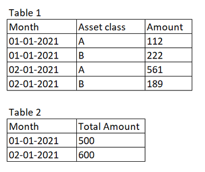
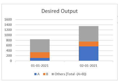
I have a two tables. I have created stacked bar chart from 1 table. I want to add one more on this stacked bar chart and the amount is coming from a different table.
Stacked bar chart from table 1:
Desired Output:
Thank you!
Accepted Solutions
- Mark as New
- Bookmark
- Subscribe
- Mute
- Subscribe to RSS Feed
- Permalink
- Report Inappropriate Content
Hi ,
the bar chart has this limitation :
you can either use 2 dimensions and 1 measure or 1 dimension and as many measures you want.
you have 2 options:
1 concatenate the two tables in the load script :
Table1:
Load Month,
     [Asset class],
     Amount
From XXX;
concatenate (Table1)
Load Month,
     'Others' as [Asset class]
      [Total Amount] as Amount
From YYY;
Then you'll have a simple chart :
1st dimension: Month
2nd dimension: Asset class
measure: Sum(Amount)
your second option is to leave the table as they are and to build this chart.
dimension: Month
1st measure: sum(if([Asset class]='A', Amount)
2nd measure: sum(if([Asset class]='B', Amount)
3rd measure: sum([Total Amount])
- Mark as New
- Bookmark
- Subscribe
- Mute
- Subscribe to RSS Feed
- Permalink
- Report Inappropriate Content
Hi @lironbaram thank you for the solution!! I used combo chart and added 3 measures with 3 different colours.


