Unlock a world of possibilities! Login now and discover the exclusive benefits awaiting you.
- Qlik Community
- :
- Forums
- :
- Analytics
- :
- New to Qlik Analytics
- :
- Re: How to find the most occurring value in the pa...
- Subscribe to RSS Feed
- Mark Topic as New
- Mark Topic as Read
- Float this Topic for Current User
- Bookmark
- Subscribe
- Mute
- Printer Friendly Page
- Mark as New
- Bookmark
- Subscribe
- Mute
- Subscribe to RSS Feed
- Permalink
- Report Inappropriate Content
How to find the most occurring value in the particular year
Hello!
I'm trying to make a bar chart that could show me the most popular music genre in a particular year.
I have a dataset of 6000 songs (100 per year starting from 1960 up to 2019). My goal is just to show that in a particular year the most popular/most occurring music genre was "x".
I know it has to do something with the MODE function. However, I'm struggling with finding a solution to the issue.
Any help would be appreciated.
- Tags:
- expression
- « Previous Replies
-
- 1
- 2
- Next Replies »
Accepted Solutions
- Mark as New
- Bookmark
- Subscribe
- Mute
- Subscribe to RSS Feed
- Permalink
- Report Inappropriate Content
attached qliksense file
Dimension : Year
Measure1 : count
Max(Aggr(count(Genre), Year,Genre))Measure 2:Genre
FirstSortedValue(Genre, -Aggr(count(Genre), Year,Genre))output :
Taoufiq ZARRA
"Please LIKE posts and "Accept as Solution" if the provided solution is helpful "
(you can mark up to 3 "solutions") 😉
- Mark as New
- Bookmark
- Subscribe
- Mute
- Subscribe to RSS Feed
- Permalink
- Report Inappropriate Content
we can use FirstSortedValue for this type of problem,
if you share a sample data and the column on which you want to apply the max, we can propose the exact script
Taoufiq ZARRA
"Please LIKE posts and "Accept as Solution" if the provided solution is helpful "
(you can mark up to 3 "solutions") 😉
- Mark as New
- Bookmark
- Subscribe
- Mute
- Subscribe to RSS Feed
- Permalink
- Report Inappropriate Content
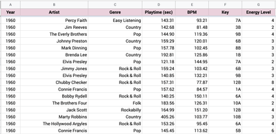
Here is the sample data in the attachment. Basically, I just need to find the most popular genre in each year. Then I want to build a bar chart with "year" as a dimension and "genre" or "key" as a measure. But I'm struggling to write the expression for measure properly.
- Mark as New
- Bookmark
- Subscribe
- Mute
- Subscribe to RSS Feed
- Permalink
- Report Inappropriate Content
how can we measure e the most popular/most occurring music, i.e. which column in the sent sample allows to deduce this information, ...
Taoufiq ZARRA
"Please LIKE posts and "Accept as Solution" if the provided solution is helpful "
(you can mark up to 3 "solutions") 😉
- Mark as New
- Bookmark
- Subscribe
- Mute
- Subscribe to RSS Feed
- Permalink
- Report Inappropriate Content
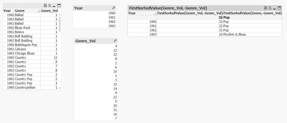
One solution is.
tab1:
LOAD Year,
     Artist,
     Genre,
     [Playtime (sec)],
     BPM,
     Key,
     [Energy Level]
FROM
[C:\Users\sarav\Downloads\Sample Data.xlsx]
(ooxml, embedded labels, table is Sheet1);

tab2:
LOAD Year, Genre, Count(Genre) As Genre_Vol
Resident tab1
Group By Year, Genre;

Drop Table tab1;- Tags:
- lutio
- Mark as New
- Bookmark
- Subscribe
- Mute
- Subscribe to RSS Feed
- Permalink
- Report Inappropriate Content
Output
- Mark as New
- Bookmark
- Subscribe
- Mute
- Subscribe to RSS Feed
- Permalink
- Report Inappropriate Content
Thank you mate for quick replies.
No, the goal is just to return the most occurring value (genre) in a given year. So basically I need to return the most popular genre in 1960, 1961, 1962, 1963, and so on. Energy Level is another dimension that has nothing to do with genres. It's just the song's "danceability" level (the higher it is, the more danceable the song is).
The most popular genre is measured by the number of times a certain genre appears in a given year.
I have Billboard Hot 100 chart data in the sample. So there I have end-year positions of each year starting from 1960. The task is to build a bar chart that will show how the most popular genre was changing over the years.
P.S. sorry if my language is dumb, I'm just trying to describe the issue as simple as it's possible.
- Mark as New
- Bookmark
- Subscribe
- Mute
- Subscribe to RSS Feed
- Permalink
- Report Inappropriate Content
Thank you mate.
Is this the script for Qlik Sense or Excel? As I understood you just made a script in Excel.
- Mark as New
- Bookmark
- Subscribe
- Mute
- Subscribe to RSS Feed
- Permalink
- Report Inappropriate Content
This is Qlik Sense Script.
You have replace the File and its path in the Script.
- Mark as New
- Bookmark
- Subscribe
- Mute
- Subscribe to RSS Feed
- Permalink
- Report Inappropriate Content
attached qliksense file
Dimension : Year
Measure1 : count
Max(Aggr(count(Genre), Year,Genre))Measure 2:Genre
FirstSortedValue(Genre, -Aggr(count(Genre), Year,Genre))output :
Taoufiq ZARRA
"Please LIKE posts and "Accept as Solution" if the provided solution is helpful "
(you can mark up to 3 "solutions") 😉
- « Previous Replies
-
- 1
- 2
- Next Replies »


