Unlock a world of possibilities! Login now and discover the exclusive benefits awaiting you.
- Qlik Community
- :
- Forums
- :
- Analytics
- :
- New to Qlik Analytics
- :
- Re: How to make the selection below the bar charts...
- Subscribe to RSS Feed
- Mark Topic as New
- Mark Topic as Read
- Float this Topic for Current User
- Bookmark
- Subscribe
- Mute
- Printer Friendly Page
- Mark as New
- Bookmark
- Subscribe
- Mute
- Subscribe to RSS Feed
- Permalink
- Report Inappropriate Content
How to make the selection below the bar charts disappear
Hi All.
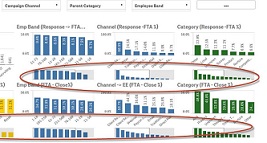
I have lots of bar charts on the UI page in Qlik sense App. And the dashboard page has become so busy that it has become really difficult to understand. Can someone help in letting me know of how to make the selection at the bottom of chart disappear. See attached image that I have highlighted.
Thanks in advance for your time
Regards,
Monica
- Mark as New
- Bookmark
- Subscribe
- Mute
- Subscribe to RSS Feed
- Permalink
- Report Inappropriate Content
Change it to combo chart and select the plot as Bar. `

- Mark as New
- Bookmark
- Subscribe
- Mute
- Subscribe to RSS Feed
- Permalink
- Report Inappropriate Content
Thank you so much for your help! Is it possible to have value labels turned on combo chart as in the bar chart? This is very important for our business
Thanks
Monica
- Mark as New
- Bookmark
- Subscribe
- Mute
- Subscribe to RSS Feed
- Permalink
- Report Inappropriate Content
I don't think there is option to tun on Value labels for Combo charts in current release.
- Mark as New
- Bookmark
- Subscribe
- Mute
- Subscribe to RSS Feed
- Permalink
- Report Inappropriate Content
Any other working solution to show the value labels and selection at the bottom of the chart disappear?
Thanks a bunch 
- Mark as New
- Bookmark
- Subscribe
- Mute
- Subscribe to RSS Feed
- Permalink
- Report Inappropriate Content
I don't think we have any out of the box solutions in current release. But you can always create a custom extension object to fulfill your needs.
Some examples can be found here. http://branch.qlik.com
- Mark as New
- Bookmark
- Subscribe
- Mute
- Subscribe to RSS Feed
- Permalink
- Report Inappropriate Content
Thanks a bunch
- Mark as New
- Bookmark
- Subscribe
- Mute
- Subscribe to RSS Feed
- Permalink
- Report Inappropriate Content
If your question is now answered, please flag the Correct Answer (via the big "Correct Answer" button near every post) and Helpful Answers (found under the Actions menu under every post).
If not, please make clear what part of this topic you still need help with .