Unlock a world of possibilities! Login now and discover the exclusive benefits awaiting you.
- Qlik Community
- :
- Forums
- :
- Analytics
- :
- New to Qlik Analytics
- :
- I need a suggestion
- Subscribe to RSS Feed
- Mark Topic as New
- Mark Topic as Read
- Float this Topic for Current User
- Bookmark
- Subscribe
- Mute
- Printer Friendly Page
- Mark as New
- Bookmark
- Subscribe
- Mute
- Subscribe to RSS Feed
- Permalink
- Report Inappropriate Content
I need a suggestion
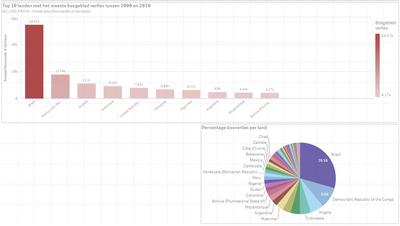
I'm showing alot of countries in a pie chart and it shows the percentage of how many a country has lost forest area. (in the sceenshot you can see an example).
Now i have soo much countries that it is so hard to read.
What should i do? Should i use another chart or?
Thanks for any suggestions!
- Mark as New
- Bookmark
- Subscribe
- Mute
- Subscribe to RSS Feed
- Permalink
- Report Inappropriate Content
Pie chart is good to show shares in my opinion. First option is to show it splited into continents - other piechart for each continent.
- Mark as New
- Bookmark
- Subscribe
- Mute
- Subscribe to RSS Feed
- Permalink
- Report Inappropriate Content
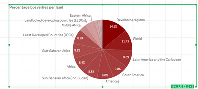
In my pie chart i can change the dimension to this:
- =if(GeoType = 'Region', GeoAreaName)
Than i will get all the regions but when i get soo many regions (look screenshot)
This is also not good.
- Mark as New
- Bookmark
- Subscribe
- Mute
- Subscribe to RSS Feed
- Permalink
- Report Inappropriate Content
Hi @EliasGPS
The TreeMap is a similar chart type which handles small values better, but be careful as you should only use either of those charts if all the wedges (or boxes) add up to 100%. If you are saying that Brazil has lost 20% of its forest and DRC has lost 12% of its forest they should not go into a pie chart or a treemap. If you are saying of the forest lost in the world Brazil is 20% of that total and DRC is 12% of that total that is fine.
The bar chart is always a good answer in Sense, not least because of the scroll to get to the long tail of the data, and the fact that it doesn't have to be the share of a total.
Hope that makes sense.
Steve

