Unlock a world of possibilities! Login now and discover the exclusive benefits awaiting you.
- Qlik Community
- :
- Forums
- :
- Analytics
- :
- New to Qlik Analytics
- :
- Ignore selection in Aggr rank statement
- Subscribe to RSS Feed
- Mark Topic as New
- Mark Topic as Read
- Float this Topic for Current User
- Bookmark
- Subscribe
- Mute
- Printer Friendly Page
- Mark as New
- Bookmark
- Subscribe
- Mute
- Subscribe to RSS Feed
- Permalink
- Report Inappropriate Content
Ignore selection in Aggr rank statement
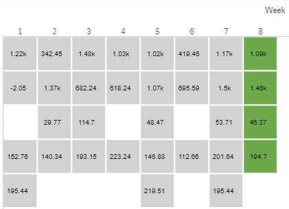
I have a heatmap where I am displaying customers sales per week where it ignores the week selection and displays for example every week in the year.
This part is working fine, however I want to colour by a measure which ranks the sales per customer per week and colours depending on this. I have done this previously on another app, but this time I don't want the users to manually have to select all weeks for the colours to display properly.
I have tried something like this, but not having any luck:
={1<Week = P(${Week})>}Aggr(RANK({1<Week = P(${Week})>}aggr((sum({1<Week = P(${Week})>}[Sales])*-1), [Customer Name]),0,0), [Customer Name])
The one I have on another app which works when they select the relevant weeks is:
Aggr(Rank(Aggr((SUM([Sales])*-1), [Customer Name],[Week]), 0, 0), [Customer Name],[Week])
Below shows the issue where the user has selected week 8 and therefore it is the only coloured cell.
- Mark as New
- Bookmark
- Subscribe
- Mute
- Subscribe to RSS Feed
- Permalink
- Report Inappropriate Content
Try this, I removed redundant set analysis within the Rank function since you already have set analysis at the beginning of the expression. Also, make sure that the field names and data model match your actual setup.
Aggr(
Rank(
aggr(
sum({1<Week = P(Week)>}[Sales]) * -1,
[Customer Name]
),
0,
0
),
[Customer Name]
)
