Unlock a world of possibilities! Login now and discover the exclusive benefits awaiting you.
- Qlik Community
- :
- Forums
- :
- Analytics
- :
- New to Qlik Analytics
- :
- Re: Line Graph X-Axis Issue, Missing Lines
- Subscribe to RSS Feed
- Mark Topic as New
- Mark Topic as Read
- Float this Topic for Current User
- Bookmark
- Subscribe
- Mute
- Printer Friendly Page
- Mark as New
- Bookmark
- Subscribe
- Mute
- Subscribe to RSS Feed
- Permalink
- Report Inappropriate Content
Line Graph X-Axis Issue, Missing Lines
Hi there,
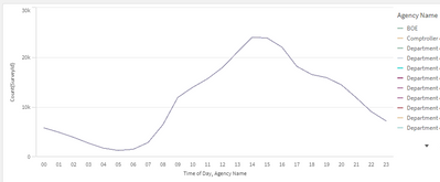
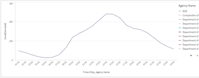
I have a line graph that is meant to show the number of surveys different agencies have received and at what time of day. After loading the data and assigning the [Agency Name] to the Line section, the [Time of Day] to the Groups section, and the Count([Survey ID]) to the Height of Line section, my chart looks like this:
The shape is correct; most agencies get surveys around the mid-point of the day, and that [Time of Day] field comes from a timestamp where 1:00pm is written as 13:00:00, 2:00pm is written as 14:00:00, etc. I want to do two things:
1. Re-label the values along the x-axis as 12:00am, 1:00am, 2:00am, etc., and 12:00pm, 1:00pm, 2:00pm, etc.
2. Figure out why I've only got one line in the graph, but a legend that depicts all of the agencies.
For the re-labelling issue: I started by trying to put a nested if statement in the expression field of the [Time of Day] field. It looks like this:
=if(Subfield([Time of Day], ':',1)=00,'12:00am',
if(Subfield([Time of Day], ':',1)=01,'1:00am',
if(Subfield([Time of Day], ':',1)=02,'2:00am', and so on.
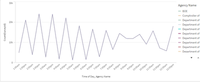
Which unfortunately results in this:
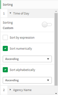
I understand why it's doing that: It's being sorted alpha-numerically. When I uncheck those boxes in the Sorting section on the right side of the screen:
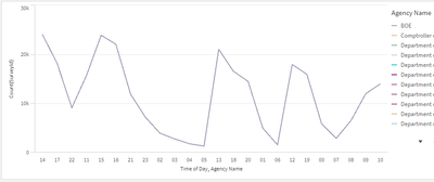
It does this instead:
Any advice for solving either of these two issues is greatly appreciated. Please let me know if I need to clarify anything.
Thanks!
- Subscribe by Topic:
-
Chart
-
Data Load Editor
-
dimension
-
expression
-
General Question
-
Script
-
Variables
-
Visualization
Accepted Solutions
- Mark as New
- Bookmark
- Subscribe
- Mute
- Subscribe to RSS Feed
- Permalink
- Report Inappropriate Content
Try below
time([Time Of Day],'h:mm tt')
OR
time(time#([Time Of Day],'h:mm'),'h:mm tt')
If a post helps to resolve your issue, please accept it as a Solution.
- Mark as New
- Bookmark
- Subscribe
- Mute
- Subscribe to RSS Feed
- Permalink
- Report Inappropriate Content
Try below
time([Time Of Day],'h:mm tt')
OR
time(time#([Time Of Day],'h:mm'),'h:mm tt')
If a post helps to resolve your issue, please accept it as a Solution.
- Mark as New
- Bookmark
- Subscribe
- Mute
- Subscribe to RSS Feed
- Permalink
- Report Inappropriate Content
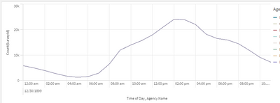
Thanks for getting back to me! Plugging in time(time#(Subfield([Time of Day],':',1),'hh'), 'hh') worked pretty well:
In the bottom left corner, there's a little stamp that seems to indicate that all the data was collected on December 30th of 1899, but I'm not really too concerned with it. If we can't figure out how to get rid of that, I can keep it as is, or I could use military time in my if statement, which solves the issue for some reason:
Now I just need to figure out why I only have one line in my line chart when the legend shows all of the agencies. Any ideas? Let me know if you need to see my script or provide more detail.
- Mark as New
- Bookmark
- Subscribe
- Mute
- Subscribe to RSS Feed
- Permalink
- Report Inappropriate Content
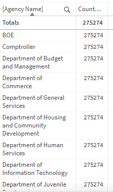
Update: it might just be a problem with my data. Here's what it looks like in a table view:
But, in the Power BI sheet I'm transferring my data over from, the chart looks like this, with clearly different numbers of surveys for each agency:
I should be pulling from the same data source, so I'll have to figure out if I'm using the wrong field or something.
