Unlock a world of possibilities! Login now and discover the exclusive benefits awaiting you.
- Qlik Community
- :
- Forums
- :
- Analytics
- :
- New to Qlik Analytics
- :
- Re: Logaritmic scale, values disapear?
- Subscribe to RSS Feed
- Mark Topic as New
- Mark Topic as Read
- Float this Topic for Current User
- Bookmark
- Subscribe
- Mute
- Printer Friendly Page
- Mark as New
- Bookmark
- Subscribe
- Mute
- Subscribe to RSS Feed
- Permalink
- Report Inappropriate Content
Logaritmic scale, values disapear?
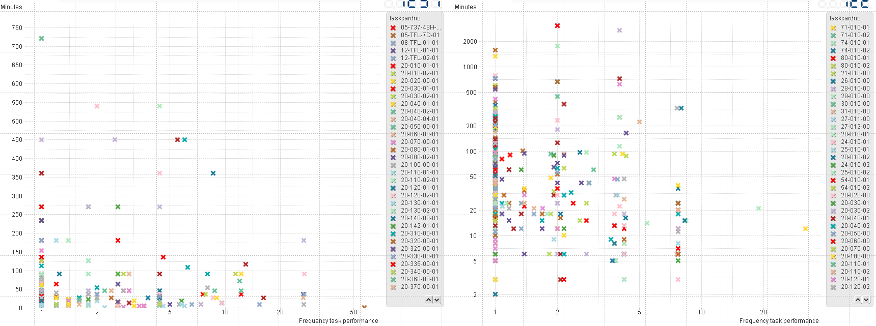
Hi guys, I've got a little issue with a scatter chart. I want to use a log scale for a scatter chart, it works for the x-axis. But when I gottle it for the y-axis all the values within my graph disappear. Any idea what could cause this behaviour?
For another graph, exactly the same, only data from another sample. It does work.
Accepted Solutions
- Mark as New
- Bookmark
- Subscribe
- Mute
- Subscribe to RSS Feed
- Permalink
- Report Inappropriate Content
Can you change the y-axis expression to
Y-Axis: i=if(operator= 'AAA' AND total_hours>0 , total_hours , null())
And see if suppressing the zeroes works? (If the expression above doesn't work you might just add a filter and see if manually suppressing the zeroes is the answer - or even taking them out of your data set to test).
- Mark as New
- Bookmark
- Subscribe
- Mute
- Subscribe to RSS Feed
- Permalink
- Report Inappropriate Content
Hello,
Could you share your app/data/screenshots?
- Mark as New
- Bookmark
- Subscribe
- Mute
- Subscribe to RSS Feed
- Permalink
- Report Inappropriate Content
Left and right are exactly the same constructed. Same data source etc. The ONLY difference is that Operator is different for the other graph...
Expresions:
X-Axis: Count({<operator={'AAA'}>} DISTINCT status_remarks)/count({<operator={'AAA'}>}DISTINCT ac_registr)
Y-Axis: i=if(operator= 'AAA',total_hours)
dimension:
taskcardno
Calendaryear
total_hours are numbers. Status_remarks is a unique code which I use to count what task is performed on what aircraft and what date.
Now the left graph its Y-axis does not go logarithmic. When I check that box, the scatter points disappear. (no, they dont just go out of range  )
)
- Mark as New
- Bookmark
- Subscribe
- Mute
- Subscribe to RSS Feed
- Permalink
- Report Inappropriate Content
What do you mean "all the values within my graph disappear"? I can see values in both your screenshots.
Can you show just the left-hand chart data before & after log-axis is applied? One thing might be zeroes in the data, but I don't think that will affect all the data points.
- Mark as New
- Bookmark
- Subscribe
- Mute
- Subscribe to RSS Feed
- Permalink
- Report Inappropriate Content
Yes because the Y-axis on the left graph is not set on a logarithmic scale.
If I do this, it will not go logaritmic. The axis stays the same. But the data points disapear.
- Mark as New
- Bookmark
- Subscribe
- Mute
- Subscribe to RSS Feed
- Permalink
- Report Inappropriate Content
Can you change the y-axis expression to
Y-Axis: i=if(operator= 'AAA' AND total_hours>0 , total_hours , null())
And see if suppressing the zeroes works? (If the expression above doesn't work you might just add a filter and see if manually suppressing the zeroes is the answer - or even taking them out of your data set to test).
- Mark as New
- Bookmark
- Subscribe
- Mute
- Subscribe to RSS Feed
- Permalink
- Report Inappropriate Content
It works, thanks! What is the explanation behind this?
No null values are allowed or empty values?
- Mark as New
- Bookmark
- Subscribe
- Mute
- Subscribe to RSS Feed
- Permalink
- Report Inappropriate Content
I think zero values are not allowed (null values are allowed - they are ignored).
Log(0) is undefined, so the chart is just dropping all the data, not just the invalid data points. (Excel would just drop the invalid data points in this situation, you would still see the valid ones).
The formula just says "if total hours is zero, replace it will NULL()" and the NULL() is ignored on the chart.
- Mark as New
- Bookmark
- Subscribe
- Mute
- Subscribe to RSS Feed
- Permalink
- Report Inappropriate Content
How can i change below expression to suppress zero values:
sum({$<DateType = {completion}, final_test_status={'passed'},
MonthPeriod1 = {"<$(=Max(MonthPeriod1))"}>}course_completed)
- Mark as New
- Bookmark
- Subscribe
- Mute
- Subscribe to RSS Feed
- Permalink
- Report Inappropriate Content
I'm not very good at set expressions, so I will assume your expression is giving you the numerically correct results.
You have to wrap your expression in an IF() statement;
IF (Expression = 0 , null() , Expression) (If Expression equals zero, then give a null, otherwise give the expression)
In your case it would be;
IF (sum({$<DateType = {completion}, final_test_status={'passed'},
MonthPeriod1 = {"<$(=Max(MonthPeriod1))"}>}course_completed) = 0 , null() ,
sum({$<DateType = {completion}, final_test_status={'passed'},
MonthPeriod1 = {"<$(=Max(MonthPeriod1))"}>}course_completed))