Unlock a world of possibilities! Login now and discover the exclusive benefits awaiting you.
- Qlik Community
- :
- Forums
- :
- Analytics
- :
- New to Qlik Analytics
- :
- Re: Multi Dimension Columns in QLIK SENSE Bar Char...
- Subscribe to RSS Feed
- Mark Topic as New
- Mark Topic as Read
- Float this Topic for Current User
- Bookmark
- Subscribe
- Mute
- Printer Friendly Page
- Mark as New
- Bookmark
- Subscribe
- Mute
- Subscribe to RSS Feed
- Permalink
- Report Inappropriate Content
Multi Dimension Columns in QLIK SENSE Bar Charts
Hi All,
Hope you guys are doing fantastic. I have a simple requirement . How to Create Multi Dimension Bar chart with the sample data below.
| Year | Product | Amount |
| 2010 | Apple | 10 |
| 2011 | Apple | 20 |
| 2012 | Apple | 30 |
| 2010 | Bat | 50 |
| 2011 | Bat | 60 |
| 2012 | Bat | 70 |
| 2010 | Cake | 15 |
| 2011 | Cake | 20 |
| 2012 | Cake | 25 |
Bar Chart should look like this Qlik Sense.
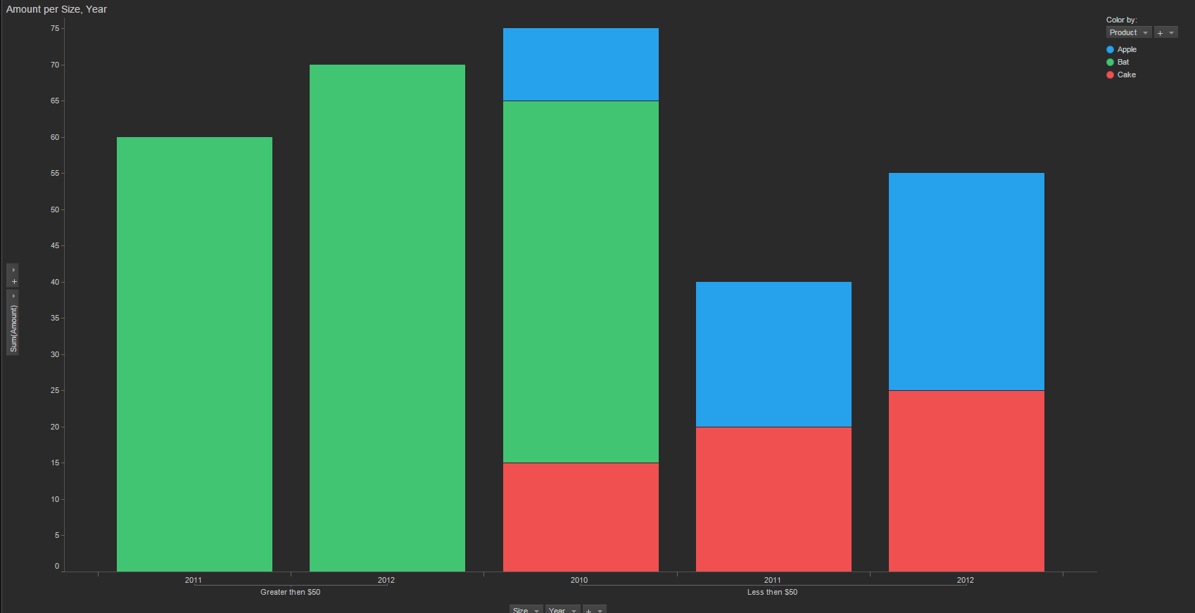
Y- axis : Sum(Amount)
X-axis : 1. Year
2. Size.
"Size" is a Dimension expression which is :
=if(Aggr(Sum(Amount),Year,Product)>50 ,'Greater Than $50',
if(Aggr(Sum(Amount),Year,Product)<=50 ,'Less Than $50',
if(Aggr(Sum(Amount),Year,Product)>100,'Greater then $100' )))
Color Legend: Product.
Issue I am facing is : There is no option to add 3 dimensional columns in Qlik sense. Maximum I can create only 2.
If we cant achieve the same bar chart what would be the alternate solution for this?.
Thanks in advance.
-Vidya
- Mark as New
- Bookmark
- Subscribe
- Mute
- Subscribe to RSS Feed
- Permalink
- Report Inappropriate Content
Bar charts only allows you to use 2 dimensions as max with one measure. Unfortunately, this kind of chart is not possible with the native object. Maybe try to review the way you visualize the data.
By the way, the sample image was generate by which software ?
Kind Regards,
Pablo
- Mark as New
- Bookmark
- Subscribe
- Mute
- Subscribe to RSS Feed
- Permalink
- Report Inappropriate Content
Thanks for the Quick response Pablo. Got it I will try different options. The Bar chart which I have attached is from Tibco Spotfire BI tool.
Thanks,
-Vidya
- Mark as New
- Bookmark
- Subscribe
- Mute
- Subscribe to RSS Feed
- Permalink
- Report Inappropriate Content
When applicable please mark the appropriate replies as CORRECT. This will help community members and Qlik Employees know which discussions have already been addressed and have a possible known solution. Please mark threads as HELPFUL if the provided solution is helpful to the problem, but does not necessarily solve the indicated problem. You can mark multiple threads as HELPFUL if you feel additional info is useful to others.