Unlock a world of possibilities! Login now and discover the exclusive benefits awaiting you.
- Qlik Community
- :
- Forums
- :
- Analytics
- :
- New to Qlik Analytics
- :
- Multiple variable dimensions and two measures in a...
- Subscribe to RSS Feed
- Mark Topic as New
- Mark Topic as Read
- Float this Topic for Current User
- Bookmark
- Subscribe
- Mute
- Printer Friendly Page
- Mark as New
- Bookmark
- Subscribe
- Mute
- Subscribe to RSS Feed
- Permalink
- Report Inappropriate Content
Multiple variable dimensions and two measures in a single chart
Hi all,
I have the following problem. In my company we have 4 locations which all have to achieve a certain benchmark. The problem is that there is one location which is under-performing and we are trying to figure out why this is the case. To do this we are checking several factors.
I have created multiple charts (mainly line charts) which compares a measure between all the locations over time. So far so good, then there was the desire to be able to switch in the same graph between a line for all locations and a single line for the under-performing location and the average of the three other locations in a single line.
I was able to do this by making the dimension of the chart dependent on the variable picker. So it is either a variable off all 4 locations or an aggregation of that dimension variable based on an if statement.
But now I want to add the benchmark in the same graph as well so that is clear whether a potential cause shows the same pattern as the benchmark performance. This would make it easier to see which potential causes seem to actually impact the benchmark.
But this means that I want to show two dimensions and two measures (as the basic reference line doesn't fluctuate over time but shows the average) in the same graph. After some searching on the Qlik forums I came across the option to make a measure and use set analysis to specify the location and just make a measure for each location. However this will not work for me because of the variable dimension which can contain out of either two or four locations.
So my question is, is there a way to show two dimensions and two measures in a single line graph whilst still maintaining the ability to change the dimension based on a variable picker.
Many thanks in advance,
Kind regards.
- Tags:
- chart
- Mark as New
- Bookmark
- Subscribe
- Mute
- Subscribe to RSS Feed
- Permalink
- Report Inappropriate Content
not sure if I understand you correctly,
but if you want a measure that ignores existing dimension, you can use TOTAL
avg(TOTAL sales) for example
you can also use your variable to assign location in set analysis as well
if that is not what you need, can you share images ,existing dimension, measure of chart? so that we can understand it in a better way
- Mark as New
- Bookmark
- Subscribe
- Mute
- Subscribe to RSS Feed
- Permalink
- Report Inappropriate Content
Thanks for your reply, that unfortunately wouldn't work. See my examples below:
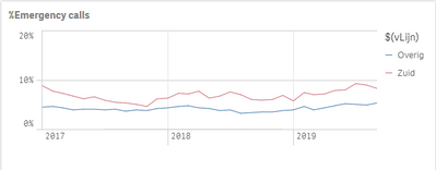
In the first image I am looking at the amount of emergency calls for Location 'Zuid' vs the other aggregated locations 'Overig'. In the second image I'm looking at the benchmark which should be achieved. My desired end result is to be able to show benchmark line in the same graph as the emergency calls. Then it would be easier to see the potential impact of emergency calls on the benchmark performance.
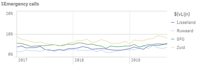
And the analist should still be able to switch to the same graph but then with 4 lines for all locations as shown in the third image.
Image 1:
Image 2:
Image 3:


