Unlock a world of possibilities! Login now and discover the exclusive benefits awaiting you.
- Qlik Community
- :
- Forums
- :
- Analytics
- :
- New to Qlik Analytics
- :
- Re: Need Help in Coloring Expression based on Rule
- Subscribe to RSS Feed
- Mark Topic as New
- Mark Topic as Read
- Float this Topic for Current User
- Bookmark
- Subscribe
- Mute
- Printer Friendly Page
- Mark as New
- Bookmark
- Subscribe
- Mute
- Subscribe to RSS Feed
- Permalink
- Report Inappropriate Content
Need Help in Coloring Expression based on Rule
I am trying to calculate the Variance % YTD of the total spend against total projected for the year, for that I am putting this expression: sum([Actual Spend])/(sum([AOP CapEx]+[AOP OpEx]))
Results are appearing fine.
Now I want to go one step ahead and color code the value based on condition, like if Variance % is greater than 100% show RED else Green, for that I am changing the above code like this:
if((Sum([Actual Spend]))/(Sum([AOP CapEx]+[AOP OpEx]))>1,red(255),green(255))
This expressions run without any error, but :
1. The Variance % is not properly calculating , the # should be 15% , but its showing 46.2345566777 which is not correct
2. The # didn't get any color
I am not sure what wrong I am doing, can someone please help me in solving this.
Thx
Ankit
- « Previous Replies
-
- 1
- 2
- Next Replies »
- Mark as New
- Bookmark
- Subscribe
- Mute
- Subscribe to RSS Feed
- Permalink
- Report Inappropriate Content
What's the object you're using?
Table? Kpi?
- Mark as New
- Bookmark
- Subscribe
- Mute
- Subscribe to RSS Feed
- Permalink
- Report Inappropriate Content
It's a Text & Image
Where I am showing Variance % as a Measure.
- Mark as New
- Bookmark
- Subscribe
- Mute
- Subscribe to RSS Feed
- Permalink
- Report Inappropriate Content
I don't think It's possible to colour the measure by condition in a text and image object.
So, Here's what I would propose:
1) Use a KPI Object
2) As a measure : sum([Actual Spend])/(sum([AOP CapEx]+sum([AOP OpEx]))) and format it as %
3) in Colour, just add a limit which would be 1 in your case
4) For your description of the situation, instead of using text object, you can use the Title and subtitle of the KPI object to add a significant description.
It would come to sthing like this:
Hope this helps; if not, please tell me and we'll try to figure out another solution
- Mark as New
- Bookmark
- Subscribe
- Mute
- Subscribe to RSS Feed
- Permalink
- Report Inappropriate Content
Actually what you saying is correct, but the reason I am using Text & Image object because I am adding multiple information into it and minimizing the KPI object sometimes didnt show the tittle and Sub-tittle. But Text and Image has no such limitation, so thinking if I apply color condition here only so it will be great.
- Mark as New
- Bookmark
- Subscribe
- Mute
- Subscribe to RSS Feed
- Permalink
- Report Inappropriate Content
Unfortunaterly, I don't think this is possible with the Text object of Qlik Sense:
You can use the Advanced Vizlib extension:
http://branch.qlik.com/#!/project/57881118637877f40865b5cc
But you have to use multiple objects and put them under each other :
For example,
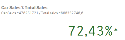
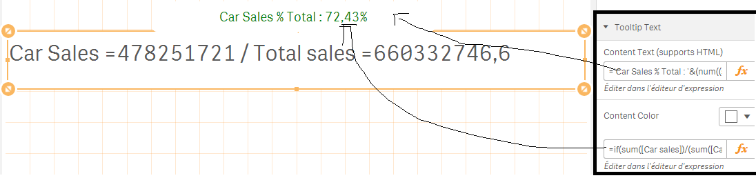
Let's suppose I have Car Sales / Total Sales:
It would be something like this:
You can play with the Tooltip Text to show you colored variances (its position, appear on hover or click, It's size, conditional coloring etc...)
With hopes that this helps !
Omar,
- Mark as New
- Bookmark
- Subscribe
- Mute
- Subscribe to RSS Feed
- Permalink
- Report Inappropriate Content
Thanks Omar for the help, looks its a limitation with this object.
On the other note , have you ever tried Gantt chart in Qlik Sense, I was watching a blog on Qlik Branch , but didnt understand what need to be done. If you know and can share how to start for that.
- Mark as New
- Bookmark
- Subscribe
- Mute
- Subscribe to RSS Feed
- Permalink
- Report Inappropriate Content
- Mark as New
- Bookmark
- Subscribe
- Mute
- Subscribe to RSS Feed
- Permalink
- Report Inappropriate Content
Yeah the same one you shared in the link:
Actually I want to create a Dashboard to show Patients Journey... E,G once Patient enrolled into a therapy S/he need to go from many stages before the medicines delivered to him. For E.G
Post Enrollment in a Therapy, he should go with Insurance Process (to understand whats the cost and how much insurance will pay), then some times his details in the form not completed so teams have to back and forth to complete those, like that there are 3-4 more steps.
What I want to show and tell from on Gantt chart:
Like in:
Row 1 : from Step 1 to Step 2 how many days it took and if its completed
Row 2: From Step 2 to Step 3 how many days it took and if its completed or not (Let say not)
Row 3: What will be the next Step and approximate days it took
.
.
.
and so on
If I am in Customer shoes and want to understand Post enrollment when I got the medicine and and in which stage I am so I can check.
Being a Support guy from a company stand point I want to analyze which is the most crucial stage of a process which takes more time
and questions like this.
Hope I am making sense here and not confusing.
Thx
Ankit
- Mark as New
- Bookmark
- Subscribe
- Mute
- Subscribe to RSS Feed
- Permalink
- Report Inappropriate Content
Can you provide sample data so I can see what I can do?
- « Previous Replies
-
- 1
- 2
- Next Replies »