Unlock a world of possibilities! Login now and discover the exclusive benefits awaiting you.
- Qlik Community
- :
- Forums
- :
- Analytics
- :
- New to Qlik Analytics
- :
- Re: Need help on Charting
- Subscribe to RSS Feed
- Mark Topic as New
- Mark Topic as Read
- Float this Topic for Current User
- Bookmark
- Subscribe
- Mute
- Printer Friendly Page
- Mark as New
- Bookmark
- Subscribe
- Mute
- Subscribe to RSS Feed
- Permalink
- Report Inappropriate Content
Need help on Charting
Hi All,
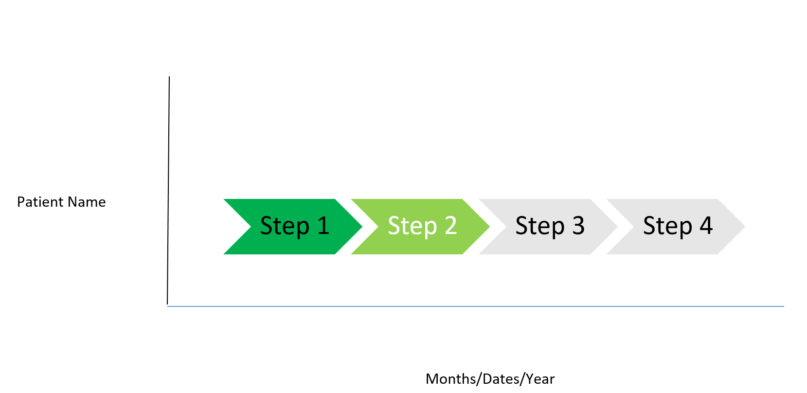
I am dealing with a situation where I need to plot a chart to show the steps user need to take to reach from Point Start to finish. E.g
Lets say I have a Patient A, from enrolling into a Therapy till Delivering the medicine he need to go through say 4 steps.
Patient Name Steps Start Date End Date
A Step 1 1-Jan-2017 10-Jan-2017
Step 2 11-Jan-2017
Step 3 Not Started
Step 4 Not Started
The idea is to show to user that what all levels he already passed and where he is standing today, and post that how many more steps will be coming.

Can someone please help in letting me know which Chart or Extension should I pick to achieve this.
Thx
Ankit
- Tags:
- mike tarallo
- « Previous Replies
-
- 1
- 2
- Next Replies »
- Mark as New
- Bookmark
- Subscribe
- Mute
- Subscribe to RSS Feed
- Permalink
- Report Inappropriate Content
Hi Ankit,
This looks like a fit-case for developing a custom visualization using an extension (using a library like D3.js).
If extension is not possible, you could explore using a stacked bar chart, where the dimensions are patient and stages.
Using set analysis and a combination of conditional coloring you maybe able to reach close to a view that shows different stages for each patient.
- Mark as New
- Bookmark
- Subscribe
- Mute
- Subscribe to RSS Feed
- Permalink
- Report Inappropriate Content
Maybe something like this?
See the attached App
- Mark as New
- Bookmark
- Subscribe
- Mute
- Subscribe to RSS Feed
- Permalink
- Report Inappropriate Content
Thanks Omar, but the problem is I want to show all the Steps on Chart regardless of if they have dates or not and then show what steps are completed and what coming across... if data in the back-end changes then the chart will also required to be adjusted accordingly. E.G If Step 2 is completed then chart will show it as Dark Green and make Step 3 as Light Green.
If you can see my data.
Thx
Ankit
- Mark as New
- Bookmark
- Subscribe
- Mute
- Subscribe to RSS Feed
- Permalink
- Report Inappropriate Content
Or if you think some other way which helps me solving the problem so please suggest
- Mark as New
- Bookmark
- Subscribe
- Mute
- Subscribe to RSS Feed
- Permalink
- Report Inappropriate Content
Hi Karthik, I referred some charts in Qlik Branch but didnt get something that suits to my need. I tried Gantt Chart but there are limitations to it, your cant change the Bar colors, it will only show data which have start and End dates and like that.
Thx
Ankit
- Mark as New
- Bookmark
- Subscribe
- Mute
- Subscribe to RSS Feed
- Permalink
- Report Inappropriate Content
Sorry,
This is as far as I can go.
Hope I helped
- Mark as New
- Bookmark
- Subscribe
- Mute
- Subscribe to RSS Feed
- Permalink
- Report Inappropriate Content
If you want to have date on one of the axis then surely you will need to have dates in the data to plot onto the chart.
I understand the dates are not available so its not so straight forward.
What i would suggest is you populate these NULL fields with a date that is greater than the previous step.
I bit like i suggested in a previous re-incarnation of the same query ![]()
- Mark as New
- Bookmark
- Subscribe
- Mute
- Subscribe to RSS Feed
- Permalink
- Report Inappropriate Content
Thanks Omar, its a great thought you put on the table, appreciate it.
Thx
Ankit
- Mark as New
- Bookmark
- Subscribe
- Mute
- Subscribe to RSS Feed
- Permalink
- Report Inappropriate Content
Hi Daniel, yes we can go that way but now we need Color as well on Bars, and one more thing on the last discussion, how do you add Titles on the Bar in Gantt chart you showed me as an e.g. , I am not able to replicate it, if you can plz help.
Thx
Ankit
- « Previous Replies
-
- 1
- 2
- Next Replies »