Unlock a world of possibilities! Login now and discover the exclusive benefits awaiting you.
Announcements
Accelerate Your Success: Fuel your data and AI journey with the right services, delivered by our experts.
Learn More
- Qlik Community
- :
- Forums
- :
- Analytics
- :
- New to Qlik Analytics
- :
- Re: Pie Chart Totals in 3.1...
Options
- Subscribe to RSS Feed
- Mark Topic as New
- Mark Topic as Read
- Float this Topic for Current User
- Bookmark
- Subscribe
- Mute
- Printer Friendly Page
Turn on suggestions
Auto-suggest helps you quickly narrow down your search results by suggesting possible matches as you type.
Showing results for
Creator
2016-11-23
08:11 AM
- Mark as New
- Bookmark
- Subscribe
- Mute
- Subscribe to RSS Feed
- Permalink
- Report Inappropriate Content
Pie Chart Totals in 3.1...
Hi all,
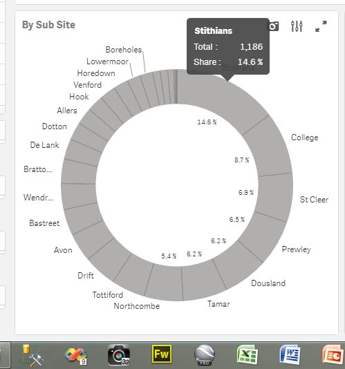
Not sure if this is a bug or interesting 'quirk' in Qlik Sense 3.1. I've created a pie chart and have added a measure. If I leave the pie as the default colour I get a sensible hover over label:
However, If I colour it up by a dimension I now get 3 total values:
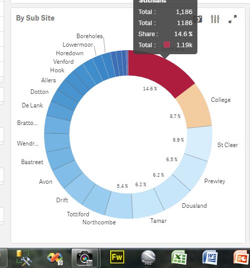
Any way I can turn some of these totals off?
Cheer
Neil
709 Views
3 Replies
Specialist
2016-11-23
09:17 AM
- Mark as New
- Bookmark
- Subscribe
- Mute
- Subscribe to RSS Feed
- Permalink
- Report Inappropriate Content
Are you using any Equation for the Color?
619 Views
Creator
2016-11-23
09:27 AM
Author
- Mark as New
- Bookmark
- Subscribe
- Mute
- Subscribe to RSS Feed
- Permalink
- Report Inappropriate Content
No - none at all.
619 Views
Master II
2016-11-23
09:45 AM
- Mark as New
- Bookmark
- Subscribe
- Mute
- Subscribe to RSS Feed
- Permalink
- Report Inappropriate Content
Check how you're defining the Custom color?
Is it by Dimension/Measure/Expression
Try Custom Color by Dimension & my guess is you are defining by Measure (which is labeled as 'Total') hence it is showing you twice.
619 Views
Community Browser