- Mark as New
- Bookmark
- Subscribe
- Mute
- Subscribe to RSS Feed
- Permalink
- Report Inappropriate Content
Process Control Charts in Qlik Sense
Hi all,
To make a statistical process control chart (SPC), or similar in Qlik Sense, it seems like we should have several options to make attractive-looking charts, but I'm having some trouble getting the colors set-up.
There are some interesting posts on doing these with QlikView, and so I'd really like to get one working with Sense. Here's a couple of posts from here on the Community Forums that are related:
- My Fav (used below) --> Control Chart
- QlikView Experts: Control Chart Challenge
- QlikView Control (SPC) Chart
I went ahead and used the Qlik Sense Converter for the "Control Chart" (downloaded .qvf file), and it's got some basic data, as well as having a few variables defined. ...Notably, there's a "vLCL", "vAvgLine", and "vUCL", which are defined for the Lower, Average, and Upper Control Limits, respectively based on a couple of standard deviations.
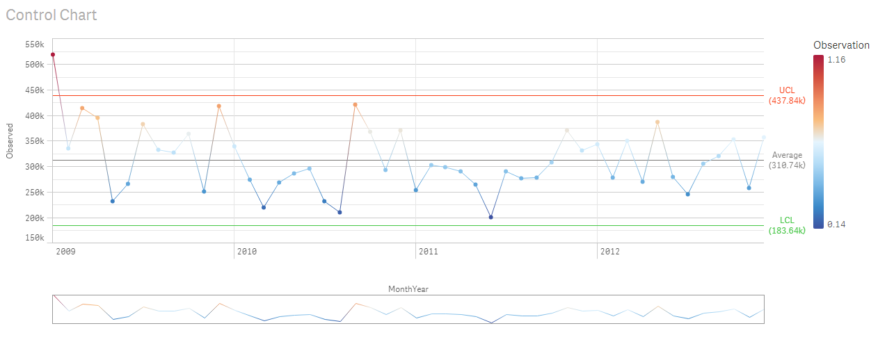
So, I've been able to use these to set up the Line Chart below, but (A.) when I use the Color By Expression with Colormix1(), it doesn't seem to work to assign colors to the datapoints across the line, and (B.) the Diverging Gradient is not user-configurable (at least don't think it is).
Is there any way to assign a gradient-based color to the datapoints on an SPC chart like this? It looks a lot neater with a gradient, IMHO. ...In the example below, you can see the UCL in RED and the LCL in GREEN, but the datapoints only in the BLUE-to-RED default diverging gradient. ...Specifically, is there anyway to assign (for instance), Green-to-Red gradient to the datapoints?
Does anyone know if this is possible?
Alternately, if there are any stats gurus out there that can say that it's practice to have Green/Red, or two-color-only, please let me know.

Edit: Currently, working on a colormix1() formula like this, but no version of it seems to work (it assigns either full-green or full-red or another straight color to all datapoints):
=colormix1(
if( ((((sum(Sales)-vAvgLine)/vAvgLine) + 1) >1, 1,
if( ((sum(Sales)-vAvgLine)/vAvgLine + 1) < 0 , 0,
(sum(Sales)-vAvgLine)/vAvgLine + 1 ))))
green() ),
red() )
- Mark as New
- Bookmark
- Subscribe
- Mute
- Subscribe to RSS Feed
- Permalink
- Report Inappropriate Content
Just ask johnmackintosh - he's a guru in this area. See this post: Re: SPC / Run Chart
- Mark as New
- Bookmark
- Subscribe
- Mute
- Subscribe to RSS Feed
- Permalink
- Report Inappropriate Content
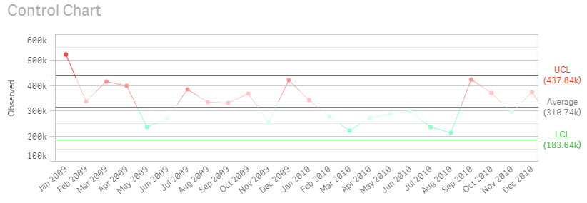
I am not sure I have understood you correctly. If you have to have red and green, maybe you can try this workaround to define the colour with expression:

The chart will look like this:

I only made the change in your first chart in the app attached. Hope it can help?
Fei !
- Mark as New
- Bookmark
- Subscribe
- Mute
- Subscribe to RSS Feed
- Permalink
- Report Inappropriate Content
Hi tedemang
I'm not going to be able to help much with formatting options for Qlik Sense, there seem to be natural limits to what it lets you edit.
But, I have built various SPC charts in QlikView, as well as in other software, and have some experience with their use.
Firstly, there are various charts and the correct chart is dependent on the nature of the data you wish to plot.
If in doubt, then an individuals chart is an acceptable default - however that uses different calculations to the example you used.
If you are able to get hold of Stephen Redmond's QlikView Cookbook you will find an example in there.
One benefit of this chart is that you do not need a large number of data points to begin to calculate limits.
jaw linked to a session I did a few months back, and there are some example expressions there for each type of chart. You will see that my approach is to calcuate limits over an initial period, then "lock" those limits for future data points.
The reason for this is if you are calculating limits over your entire dataset, then you are essentially moving the goalposts each time a new point is added. The impact of this may not be obvious initially, but you will can potentially find points being outside limits and then suddenly back inside the limits when new data is added.
To address you questions about formatting - I've not seen colour gradients used to colour individual data points before.
It's down to personal preference or the preference of your end users.
Often the Upper/ Lower Control lines are formatted (e.g. red) to stand out but the points themselves usually remain consistent.
I'm beginning to move away from that and instead just highlighting individual points outside limits.
I do find it helpful to remove the background gridlines from the chart so that only the centre line, warning lines and control limits are shown - I think its easier to spot the patterns without the distraction of irrelevant gridlines
Happy to help further if I can - I've got the originals of the presentation that I used for my session if you'd like those.
John
- Mark as New
- Bookmark
- Subscribe
- Mute
- Subscribe to RSS Feed
- Permalink
- Report Inappropriate Content
Your presentation is excellent. Any materials you would release would be very much appreciated.I am very much looking forward bringing SPC charts w/ Nelson's rules to our BI team.
- Mark as New
- Bookmark
- Subscribe
- Mute
- Subscribe to RSS Feed
- Permalink
- Report Inappropriate Content
Hi John,
I received similar questions about SPC charts in Qlik Sense. The webinar seems not to be available anymore.
Would it be possible to share your presentation material as suggested in your previous post?
Thank you!
Nicolas
- Mark as New
- Bookmark
- Subscribe
- Mute
- Subscribe to RSS Feed
- Permalink
- Report Inappropriate Content
We have also released a Control Chart extension for Qlik Sense. More information and a 60 day trial can be downloaded from here.
Key features include: • Outliers Highlighted • Runs ‘above’ and ‘below’ the average highlighted • Trends up and down highlighted • Moving average based on Runs and/ or Trend triggers
Key configuration options include: • Customise Labels for Dimensions, Measures and Rules • Customise Line and point style for Dimensions, Measures and Rules • Pick the number of points to set the highlighting criteria for both Runs and Trends
For more information email: extensions@acumenbi.co.nz .
- Mark as New
- Bookmark
- Subscribe
- Mute
- Subscribe to RSS Feed
- Permalink
- Report Inappropriate Content
I know that this is now quite an old post, however with Themes in Qlik Sense, you can change your colour gradients, and therefore could set one to be green to grey gradients.
- Mark as New
- Bookmark
- Subscribe
- Mute
- Subscribe to RSS Feed
- Permalink
- Report Inappropriate Content
Hi Daniel,
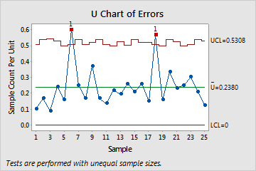
One question, is it possible to design a kind of control chart in qlik sense, U-Chart, as Minitab does?
Thank you so much,
Wanghui
- Mark as New
- Bookmark
- Subscribe
- Mute
- Subscribe to RSS Feed
- Permalink
- Report Inappropriate Content
Hi Wanghui, yes we have developed and sell an extension for this. you can find more information here: https://acumenbi.co.nz/technologies/acumen-control-charts/
If you would like a free trial please email me at extensions@acumenbi.co.nz
