Unlock a world of possibilities! Login now and discover the exclusive benefits awaiting you.
- Qlik Community
- :
- Forums
- :
- Analytics
- :
- New to Qlik Analytics
- :
- Qlik Sense - Bar Chart - change bar color based on...
- Subscribe to RSS Feed
- Mark Topic as New
- Mark Topic as Read
- Float this Topic for Current User
- Bookmark
- Subscribe
- Mute
- Printer Friendly Page
- Mark as New
- Bookmark
- Subscribe
- Mute
- Subscribe to RSS Feed
- Permalink
- Report Inappropriate Content
Qlik Sense - Bar Chart - change bar color based on Column name
Hello,
I have a bar chart, and 2 table columns with figures.
How can I manually choose color for each of bars?
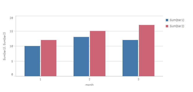
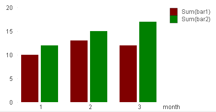
Load * Inline [
month, bar1, bar2
1, 10, 12
2, 13, 15
3, 12, 17
];
I'm looking for expression like =if(FieldName='bar1', rgb(87,87,150), rgb(150,100,100) )
But there is no function to get fieldname (column name) in Sense, right?
So, how can we solve the problem?
- « Previous Replies
-
- 1
- 2
- Next Replies »
Accepted Solutions
- Mark as New
- Bookmark
- Subscribe
- Mute
- Subscribe to RSS Feed
- Permalink
- Report Inappropriate Content
Thanks bro loveisfail for recommendation. @qluser01 you can try Valuelist Function Like this
First dimension:
Field: Segment
Label: Segment
Added a second dimension:
Field: ValueList('Sales','Quota','Expenses')
Label: Account Type
Added a measure:
Field:
if(ValueList('Sales','Quota','Expenses')='Sales'
,Sum(Sales)
,if(ValueList('Sales','Quota','Expenses')='Quota'
,Sum(Quota)
,Sum(Expenses)
)
)
Label: Amount
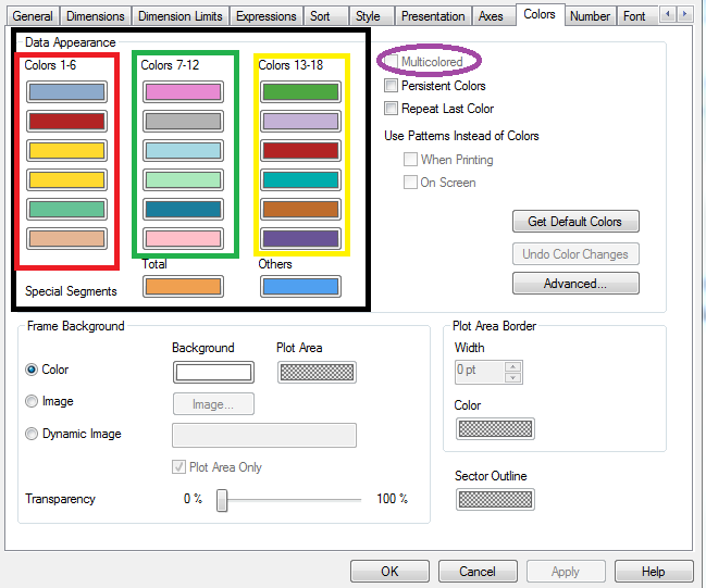
Sorting in this example is by Segment then by Account Type then by Amount, with Account Type as descending alphabetical.
Now to set the colors. I went to "Appearance" then "Colors and Legend", then turned off Auto for Colors. In the dropdown, selected "By expression". I entered this expression:
if(ValueList('Sales','Quota','Expenses')='Sales'
,rgb(0,192,0)
,if(ValueList('Sales','Quota','Expenses')='Quota'
,rgb(0,0,192)
,rgb(192,0,0)
)
)
I made sure the check box was checked for "The expression is a color code".
Please note: You will not able to show the chart's legend. This is a known limitation. For right now in Qlik Sense, the color legend is not displayed when using "The expression is a color code".
- Mark as New
- Bookmark
- Subscribe
- Mute
- Subscribe to RSS Feed
- Permalink
- Report Inappropriate Content
i am not 100% sure i follow your intend, Can you share the snap to check the same
GetCurrentSelections() will give the field Name
- Mark as New
- Bookmark
- Subscribe
- Mute
- Subscribe to RSS Feed
- Permalink
- Report Inappropriate Content
here it is
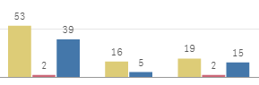
I have a table with 3 different columns with values (measures), and month as dimension.
I need to be able to manually specify which color to use for each of 3 bars...
like in excel or thinkcell you just point-click on bar and select a color to assign to that bar....
So I need yellow bars (bar1) to be green for example, blue bars(bar3) to be red etc....
- Mark as New
- Bookmark
- Subscribe
- Mute
- Subscribe to RSS Feed
- Permalink
- Report Inappropriate Content
As i assume, You must need related on this
Go to Object Properties --> Colors Tab --> And then change accordingly
- Mark as New
- Bookmark
- Subscribe
- Mute
- Subscribe to RSS Feed
- Permalink
- Report Inappropriate Content
are you kidding?
qlik sense , please read message title and forum name )))
- Mark as New
- Bookmark
- Subscribe
- Mute
- Subscribe to RSS Feed
- Permalink
- Report Inappropriate Content
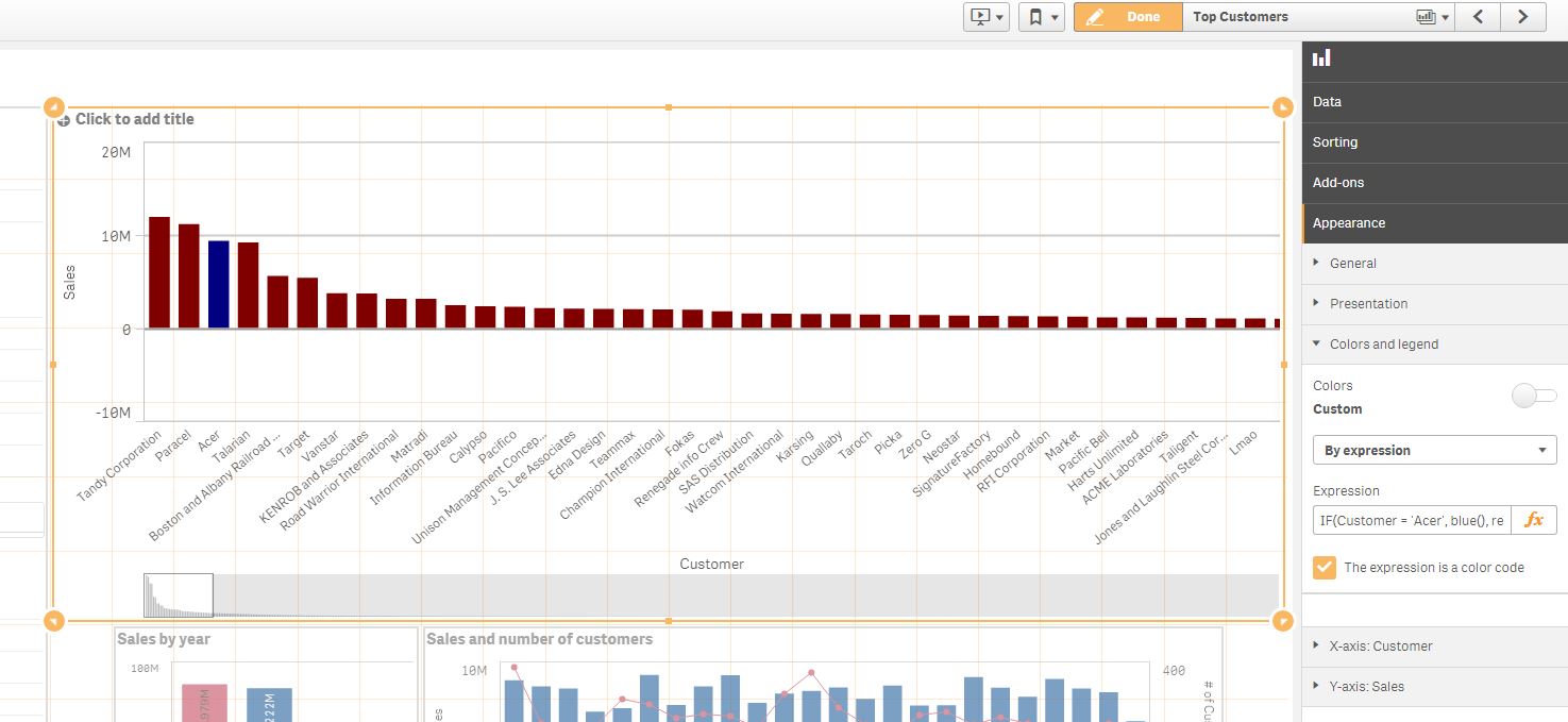
What is your dimension here?
See this example. Here the Dimension is Customer and there is an IF statement specifying:
IF(Customer = 'Acer', blue(), red())
could be:
IF(BAR= 'BAR1', blue(),
IF(BAR= 'BAR2', green(), yellow()
))
- Mark as New
- Bookmark
- Subscribe
- Mute
- Subscribe to RSS Feed
- Permalink
- Report Inappropriate Content
no, doesn't work
here is an example test.qvf attached...
- Mark as New
- Bookmark
- Subscribe
- Mute
- Subscribe to RSS Feed
- Permalink
- Report Inappropriate Content
I aplogise to unread this Title due to lazy. I don't in qlik sense. But i did in qlikview for same way as you expected
Expressions used for bar1 & bar2
If(Sum(bar1)=bar1, Red())
If(Sum(bar2)=bar2, Green())
May be same thing options are there in QlikSense. I am recommending one person who used long ago mohitd910
- Mark as New
- Bookmark
- Subscribe
- Mute
- Subscribe to RSS Feed
- Permalink
- Report Inappropriate Content
Is this an optiin you can consider , it will work
Script
Fact:
Crosstable (BarIS,Value,1)
Load * Inline [
month, bar1, bar2
1, 10, 12
2, 13, 15
3, 12, 17
];
Chart Dimension
MONTH , BarIS
Chart Expression
SUM (Value)
Then go to appearance >> color by expression >> if (BarIS ='Bar1', red () , blue () )
If a post helps to resolve your issue, please accept it as a Solution.
- Mark as New
- Bookmark
- Subscribe
- Mute
- Subscribe to RSS Feed
- Permalink
- Report Inappropriate Content
Thanks bro loveisfail for recommendation. @qluser01 you can try Valuelist Function Like this
First dimension:
Field: Segment
Label: Segment
Added a second dimension:
Field: ValueList('Sales','Quota','Expenses')
Label: Account Type
Added a measure:
Field:
if(ValueList('Sales','Quota','Expenses')='Sales'
,Sum(Sales)
,if(ValueList('Sales','Quota','Expenses')='Quota'
,Sum(Quota)
,Sum(Expenses)
)
)
Label: Amount
Sorting in this example is by Segment then by Account Type then by Amount, with Account Type as descending alphabetical.
Now to set the colors. I went to "Appearance" then "Colors and Legend", then turned off Auto for Colors. In the dropdown, selected "By expression". I entered this expression:
if(ValueList('Sales','Quota','Expenses')='Sales'
,rgb(0,192,0)
,if(ValueList('Sales','Quota','Expenses')='Quota'
,rgb(0,0,192)
,rgb(192,0,0)
)
)
I made sure the check box was checked for "The expression is a color code".
Please note: You will not able to show the chart's legend. This is a known limitation. For right now in Qlik Sense, the color legend is not displayed when using "The expression is a color code".
- « Previous Replies
-
- 1
- 2
- Next Replies »