Unlock a world of possibilities! Login now and discover the exclusive benefits awaiting you.
- Qlik Community
- :
- Forums
- :
- Analytics
- :
- New to Qlik Analytics
- :
- Qlik sense; color by dimension in combination with...
- Subscribe to RSS Feed
- Mark Topic as New
- Mark Topic as Read
- Float this Topic for Current User
- Bookmark
- Subscribe
- Mute
- Printer Friendly Page
- Mark as New
- Bookmark
- Subscribe
- Mute
- Subscribe to RSS Feed
- Permalink
- Report Inappropriate Content
Qlik sense; color by dimension in combination with point in time reporting
Hi all,
I made a simple example data set;
| Vendor | Spend | Contract | Date from | Date to |
| A | 100 | J | 01-01-2020 | 31-01-2020 |
| A | 100 | N | 01-02-2020 | 31-12-9999 |
| B | 200 | J | 01-01-2020 | 31-12-9999 |
| C | 300 | N | 01-01-2020 | 31-12-9999 |
Based on this data set a want to make a bar chart.
As the dimension I take the vendor and as meassure i take the sum of spend.
I made a button to report actual data and a button to pick a date in the past.
So actual the spend for vendor A = 100 without contract but on, for example, the 15th of januari the spend for vendor is 100 with contract.
I color the bars by the dimension 'contract'.
The bar for vendor A is always grey. No matter what date i select.
I want the bar to be yellow in january (contract = J) and red in, for example march (contract =N).
How do i fix this? Please see the attached qvf file.
Thanks in advance.
Kind Regards,
Lars
- Mark as New
- Bookmark
- Subscribe
- Mute
- Subscribe to RSS Feed
- Permalink
- Report Inappropriate Content
I have managed to do this in my app, but your app has date limitations, so does not show all the data.
I first created a Master dimension for Contract and customized the colors to be yellow and red for J and N
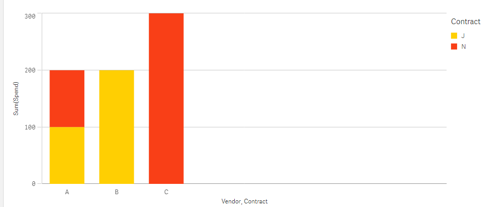
Then I added Contract as a second dimension in the chart, made it stacked and colored by the Master dimension Contract.
- Mark as New
- Bookmark
- Subscribe
- Mute
- Subscribe to RSS Feed
- Permalink
- Report Inappropriate Content
Hi Lisa_P,
Thanks for your reply. In your solution it looks like the spend for vendor A is 200.
This is not correct. The spend for vendor A is 100. Its just that there is a contract until 31-01-2020 and no contract after that date.
So depending no matter what date i select in my app, the spend for vendor A must Always be 100.
De color of vendor A should switch depending on the date selected in my app.
