Unlock a world of possibilities! Login now and discover the exclusive benefits awaiting you.
- Qlik Community
- :
- Forums
- :
- Analytics
- :
- New to Qlik Analytics
- :
- Re: Question about creating groups of measures in ...
- Subscribe to RSS Feed
- Mark Topic as New
- Mark Topic as Read
- Float this Topic for Current User
- Bookmark
- Subscribe
- Mute
- Printer Friendly Page
- Mark as New
- Bookmark
- Subscribe
- Mute
- Subscribe to RSS Feed
- Permalink
- Report Inappropriate Content
Question about creating groups of measures in alternate in a line chart?
Hello friends,
I'm relatively new to QlikSense, having worked mostly in Tableau and a little bit in QlikView.
I have a very specific question, which may or may not be possible in QlikSense. If not that's okay, but it would be good to know so I can continue with this project.
I created the below sheet in QlikView:
My question is simple: using the alternate measures/dimensions functionality in QlikSENSE, would it be possible to make each chart an alternate measure, so that I could flick quickly between them? For example, select Agg 1-5 and the other 5 lines come with it, then select Agg 6-9 as an alternate and also get lines 6-9 as well?
Thanks!
Accepted Solutions
- Mark as New
- Bookmark
- Subscribe
- Mute
- Subscribe to RSS Feed
- Permalink
- Report Inappropriate Content
Hi Zayd,
Analyze the file qvf.
The script editor.
Dates:
LOAD
AddMonths(Date('01.01.2016'), RecNo()-1) as Period,
rand() as Rule1,
rand() as Rule2,
rand() as Rule3,
rand() as Rule4,
rand() as Rule5,
rand() as Rule6,
rand() as Rule7,
rand() as Rule8,
rand() as Rule9,
rand() as Rule10,
rand() as Rule11,
rand() as Rule12,
rand() as Rule13,
rand() as Rule14,
rand() as Rule15,
rand() as Rule16,
rand() as Rule17,
rand() as Rule18,
rand() as Rule19
autogenerate(12);
This part of the code that forms the following table analysis.

Structure your data can be different, but it does not affect the proposed approach.
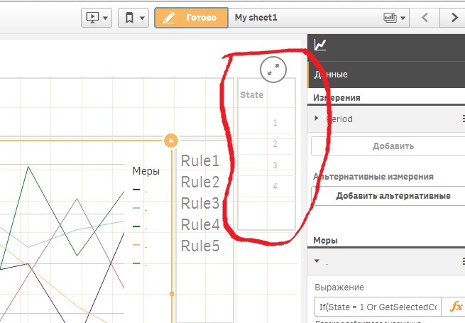
Then we form our state table.
State:
LOAD * INLINE [
State
1
2
3
4
];
The number of rows in the table corresponds to the number of chats options, in your case, the above four.
Then we go to the line chats in the application.
Dimension line chat - Period, Expressions five (the number of lines in one chat). Each expression defines the line depending on the state of.
For example, first line
If(State = 1 Or GetSelectedCount(State)=0, Sum(Rule1),
If(State = 2, Sum(Rule6),
If(State = 3, Sum(Rule11),
If(State = 4, Sum(Rule16),
)))).
For second line
If(State = 1 Or GetSelectedCount(State)=0, Sum(Rule2),
If(State = 2, Sum(Rule7),
If(State = 3, Sum(Rule12),
If(State = 4, Sum(Rule17),
))))
and etc.
Selecting the state is determined by the object "Filter", which is placed next to a line chart and has a dimension of "State"

Legend line chart displays the value of the label or expression itself, if the label is empty. It is not comfortable. To fix this, the label of each expression contains the point and near line chat is placed text box.

The expression of the text box
If(State = '1' Or GetSelectedCount(State)=0, 'Rule1 '&'Rule2 '& 'Rule3 '& 'Rule4 '&'Rule5 ',
If(State = '2' Or GetSelectedCount(State)=0, 'Rule6 '&'Rule7 '& 'Rule8 '& 'Rule9 '&'Rule10 ',
If(State = '3' Or GetSelectedCount(State)=0, 'Rule11 '&'Rule12 '& 'Rule13 '& 'Rule14 '&'Rule15 ',
If(State = '4' Or GetSelectedCount(State)=0, 'Rule16 '&'Rule17 '& 'Rule18 '& 'Rule19 ',
))))
As seen text also depends on the state of.
In general, all.
Regards,
Andrey
- Mark as New
- Bookmark
- Subscribe
- Mute
- Subscribe to RSS Feed
- Permalink
- Report Inappropriate Content
Hello Zayd!
Maybe as an option next idea?
The script loads an additional table with one field and the number of rows by the number of alternative states. Element 'Filter' to place near to the chart on the sheet. The filter measuring will only field eXtra loaded table.
Chart expressions linked to the selections in the filter. Changing the selections change the type of chart.
An example of the proposed options can be seen in the attached file qvf.
Regards,
Andrey
- Mark as New
- Bookmark
- Subscribe
- Mute
- Subscribe to RSS Feed
- Permalink
- Report Inappropriate Content
Hi Andrey,
This looks great, and is exactly what I'm looking for! I am trying to look at your file to see how you did it, but I am getting caught up in the 'State' field. I do not have such a field in my data, and am not sure how to add it in the data itself: each 'rule' is a column. All the rows are individual entries. Do I have to add 'State' as a separate column? I'm not sure how that would work because each individual entry will tick multiple rules.
Is 'State' something I can add within Qlik specifically for this purpose? Maybe you can walk me through the process you used for this, because as it is, it is exactly what I am looking for.
Thanks again!
- Mark as New
- Bookmark
- Subscribe
- Mute
- Subscribe to RSS Feed
- Permalink
- Report Inappropriate Content
Hi Zayd,
Analyze the file qvf.
The script editor.
Dates:
LOAD
AddMonths(Date('01.01.2016'), RecNo()-1) as Period,
rand() as Rule1,
rand() as Rule2,
rand() as Rule3,
rand() as Rule4,
rand() as Rule5,
rand() as Rule6,
rand() as Rule7,
rand() as Rule8,
rand() as Rule9,
rand() as Rule10,
rand() as Rule11,
rand() as Rule12,
rand() as Rule13,
rand() as Rule14,
rand() as Rule15,
rand() as Rule16,
rand() as Rule17,
rand() as Rule18,
rand() as Rule19
autogenerate(12);
This part of the code that forms the following table analysis.

Structure your data can be different, but it does not affect the proposed approach.
Then we form our state table.
State:
LOAD * INLINE [
State
1
2
3
4
];
The number of rows in the table corresponds to the number of chats options, in your case, the above four.
Then we go to the line chats in the application.
Dimension line chat - Period, Expressions five (the number of lines in one chat). Each expression defines the line depending on the state of.
For example, first line
If(State = 1 Or GetSelectedCount(State)=0, Sum(Rule1),
If(State = 2, Sum(Rule6),
If(State = 3, Sum(Rule11),
If(State = 4, Sum(Rule16),
)))).
For second line
If(State = 1 Or GetSelectedCount(State)=0, Sum(Rule2),
If(State = 2, Sum(Rule7),
If(State = 3, Sum(Rule12),
If(State = 4, Sum(Rule17),
))))
and etc.
Selecting the state is determined by the object "Filter", which is placed next to a line chart and has a dimension of "State"

Legend line chart displays the value of the label or expression itself, if the label is empty. It is not comfortable. To fix this, the label of each expression contains the point and near line chat is placed text box.

The expression of the text box
If(State = '1' Or GetSelectedCount(State)=0, 'Rule1 '&'Rule2 '& 'Rule3 '& 'Rule4 '&'Rule5 ',
If(State = '2' Or GetSelectedCount(State)=0, 'Rule6 '&'Rule7 '& 'Rule8 '& 'Rule9 '&'Rule10 ',
If(State = '3' Or GetSelectedCount(State)=0, 'Rule11 '&'Rule12 '& 'Rule13 '& 'Rule14 '&'Rule15 ',
If(State = '4' Or GetSelectedCount(State)=0, 'Rule16 '&'Rule17 '& 'Rule18 '& 'Rule19 ',
))))
As seen text also depends on the state of.
In general, all.
Regards,
Andrey
- Mark as New
- Bookmark
- Subscribe
- Mute
- Subscribe to RSS Feed
- Permalink
- Report Inappropriate Content
Andrey,
This is perfect, thank you so much.
Final question: is it possible so that the labels Rule1 Rule2 etc. can be color coded according to the lines on the chart? Because currently it is not clear which line is for which rule.
But all the rest is perfection.
Thanks!
- Mark as New
- Bookmark
- Subscribe
- Mute
- Subscribe to RSS Feed
- Permalink
- Report Inappropriate Content
Hi Zayd,
As I know, unfortunately, in the current version of Qlik Sense, there is no possibility of such a flexible color settings as in QlikView. Indirectly conclusion is confirmed by the discussions on the forum Qlik Community:
color by expression - QlikSense
How to set this colour set up with custom colours on a line graph
In our case, the problem may be to try to get around the following way.
Set in the legend visibility settings. This allows you to see the colors transcript on the line chart. The legend displays the label expression tag value (or the expression itself, if the label is empty). It does not suit us, but there is no settings. No and tools to apply to a particular line chart for the use functions of color in expressions. At this point and try to get around.
In the lebels of expressions set point or any other sign (unfortunately sign space does not work). Inscriptions in the legend are cleared, leaving only the line to determine the color and our sign in the label expression. The order of the legends line the order of entered expressions. To decrypt the chart lines, next to the line chart placed text box.

The expression of the text box looks like this
If(State = '1' Or GetSelectedCount(State)=0, 'Rule1 '&'Rule2 '& 'Rule3 '& 'Rule4 '&'Rule5 ',
If(State = '2', 'Rule6 '&'Rule7 '& 'Rule8 '& 'Rule9 '&'Rule10 ',
If(State = '3', 'Rule11 '&'Rule12 '& 'Rule13 '& 'Rule14 '&'Rule15 ',
If(State = '4', 'Rule16 '&'Rule17 '& 'Rule18 '& 'Rule19 ',
))))
Perhaps just have to tinker with the selection of the size of the text box (platform Qlik Sense this is done automatically). Signs of spaces can help in the text line names.
In general, all.
Regards,
Andrey
- Mark as New
- Bookmark
- Subscribe
- Mute
- Subscribe to RSS Feed
- Permalink
- Report Inappropriate Content
Thanks for your help! I will find a workaround.