Unlock a world of possibilities! Login now and discover the exclusive benefits awaiting you.
- Qlik Community
- :
- Forums
- :
- Analytics
- :
- New to Qlik Analytics
- :
- Re: Rank High,Medium and Low
- Subscribe to RSS Feed
- Mark Topic as New
- Mark Topic as Read
- Float this Topic for Current User
- Bookmark
- Subscribe
- Mute
- Printer Friendly Page
- Mark as New
- Bookmark
- Subscribe
- Mute
- Subscribe to RSS Feed
- Permalink
- Report Inappropriate Content
Rank High,Medium and Low
Hi I'm in new in Qlik Sense.In my attachment, in excel named Phase & Cat is the Top Risk for every Phase.
3 = Low Risk
2 = Medium Risk
1 = High Risk
I used bar chart to show the risk for every risk. My question is what is the best visualization to show these risks?
I want to replace the number 3 to Low, 2 to Medium and 1 for High. Can anyone show the step by step for me? Thank you
- Tags:
- highest rank
- Mark as New
- Bookmark
- Subscribe
- Mute
- Subscribe to RSS Feed
- Permalink
- Report Inappropriate Content
Hi,
If i understand your requirement correctly you will have to do an Inline Load.
- Mark as New
- Bookmark
- Subscribe
- Mute
- Subscribe to RSS Feed
- Permalink
- Report Inappropriate Content
Hi Izzat,
Make a inline mapping table that you can use to replace the numbers with the label that you want:
RiskLabelMapping:
Mapping LOAD * INLINE [
RankID, Label
1, High
2, Medium
3, Low
];
And then you apply this to the field with the RankIDs
Applymap('RiskLabelMapping', FieldIdName) AS RiskLabel
- Mark as New
- Bookmark
- Subscribe
- Mute
- Subscribe to RSS Feed
- Permalink
- Report Inappropriate Content
Use below code in Script.
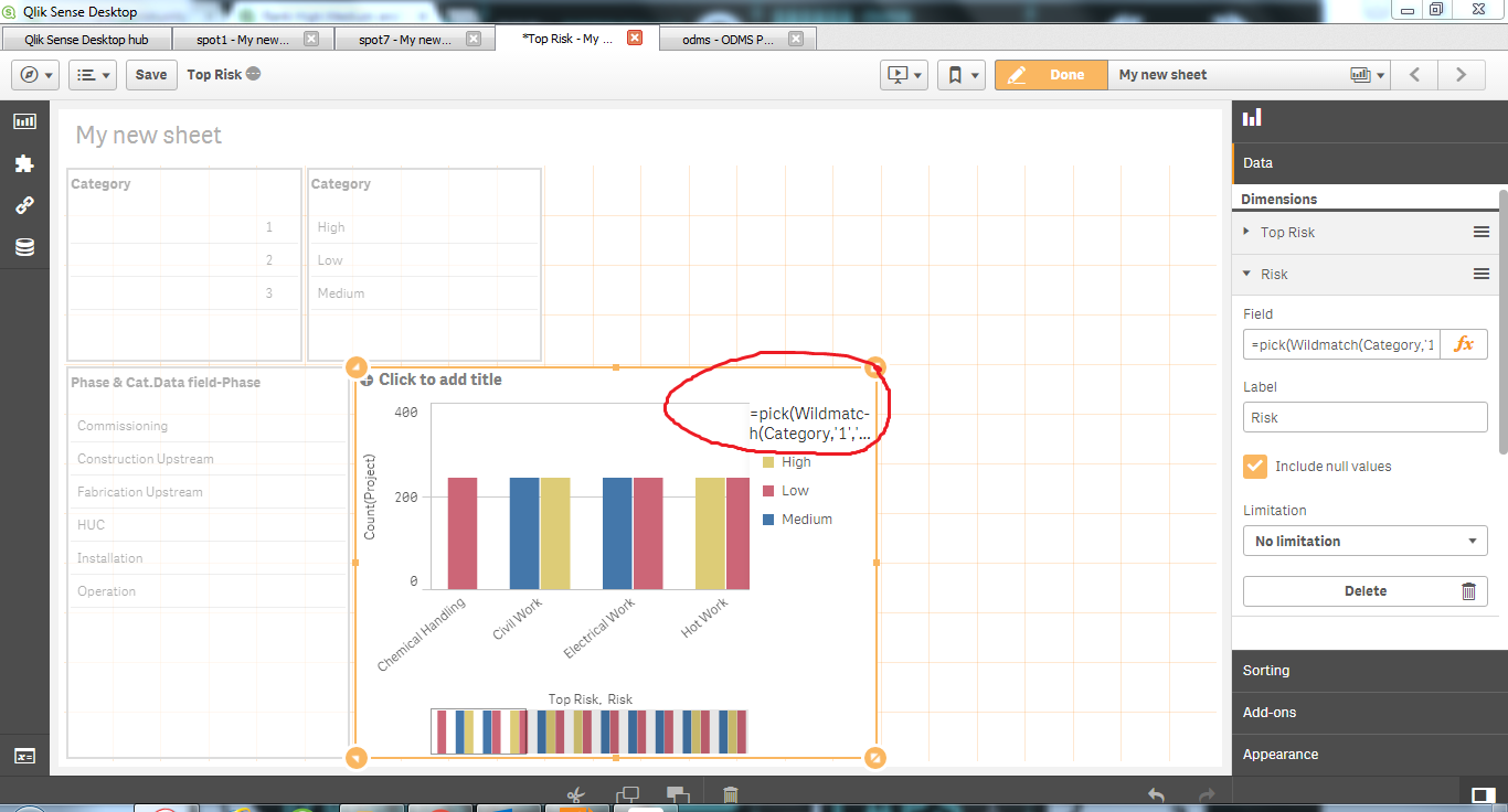
pick(Wildmatch(Category,'1','2','3'),'High','Medium','Low') as NewCategory
Use NewCategory as field
- Mark as New
- Bookmark
- Subscribe
- Mute
- Subscribe to RSS Feed
- Permalink
- Report Inappropriate Content
put that script at which line?
- Mark as New
- Bookmark
- Subscribe
- Mute
- Subscribe to RSS Feed
- Permalink
- Report Inappropriate Content
which line to put
Mapping LOAD * INLINE [
RankID, Label
1, High
2, Medium
3, Low
];
and which line to put
Applymap('RiskLabelMapping', FieldIdName) AS RiskLabel
- Mark as New
- Bookmark
- Subscribe
- Mute
- Subscribe to RSS Feed
- Permalink
- Report Inappropriate Content
The line table goes above the table where you have the data and the script line goes in the table that specifies columns from the data table.
- Mark as New
- Bookmark
- Subscribe
- Mute
- Subscribe to RSS Feed
- Permalink
- Report Inappropriate Content
Hi, how do I edit the legend title?
- Mark as New
- Bookmark
- Subscribe
- Mute
- Subscribe to RSS Feed
- Permalink
- Report Inappropriate Content
It should show title as Risk because you have given 2nd dinension label as Risk.
That will be used as Title for Legend