Unlock a world of possibilities! Login now and discover the exclusive benefits awaiting you.
- Qlik Community
- :
- Forums
- :
- Analytics
- :
- New to Qlik Analytics
- :
- Re: Request for 3D -looking stoplight chart
- Subscribe to RSS Feed
- Mark Topic as New
- Mark Topic as Read
- Float this Topic for Current User
- Bookmark
- Subscribe
- Mute
- Printer Friendly Page
- Mark as New
- Bookmark
- Subscribe
- Mute
- Subscribe to RSS Feed
- Permalink
- Report Inappropriate Content
Request for 3D -looking stoplight chart
Hi all,
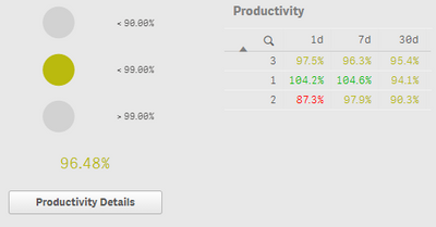
I have received a request to create a red-yellow-green chart that "looks like a traffic light." This is the closest I got using pie charts since I could not find any extensions that would accomplish what was needed. There was feedback that they didn't look enough like traffic lights, so,
- Is there an extension out there I am missing that will help accomplish this?
- Is there a way to make these pie charts look grouped together, more 3D or like traffic lights?
Server version is November 2018
Thanks
Accepted Solutions
- Mark as New
- Bookmark
- Subscribe
- Mute
- Subscribe to RSS Feed
- Permalink
- Report Inappropriate Content
Dear Elisabth,
for this use case, we provide a traffic light extension. It can downloaded in the Garden Branch:
https://developer.qlik.com/garden/5fa315a3495c3700115f38b5
In case of questions or further requirements, please contact me.
Regards,
Bjoern
- Mark as New
- Bookmark
- Subscribe
- Mute
- Subscribe to RSS Feed
- Permalink
- Report Inappropriate Content
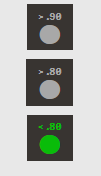
For anyone who may be having a similar problem, this is what I came up with. I think it may be the closest I can get unless anyone here has further ideas.
These are Climber KPI elements. The numbers are the labels and the measures are chr(11044). Everything is centered and the background image is the dark square. And there is a conditional color code like you would expect
- Mark as New
- Bookmark
- Subscribe
- Mute
- Subscribe to RSS Feed
- Permalink
- Report Inappropriate Content
Dear Elisabth,
for this use case, we provide a traffic light extension. It can downloaded in the Garden Branch:
https://developer.qlik.com/garden/5fa315a3495c3700115f38b5
In case of questions or further requirements, please contact me.
Regards,
Bjoern
- Mark as New
- Bookmark
- Subscribe
- Mute
- Subscribe to RSS Feed
- Permalink
- Report Inappropriate Content
Hello,
This extension is exactly what I was wishing for -- thank you for sharing. I am excited to review this with our team.
Elizabeth


