Unlock a world of possibilities! Login now and discover the exclusive benefits awaiting you.
- Qlik Community
- :
- Forums
- :
- Analytics
- :
- New to Qlik Analytics
- :
- Re: Sankey Chart - color by dimension
- Subscribe to RSS Feed
- Mark Topic as New
- Mark Topic as Read
- Float this Topic for Current User
- Bookmark
- Subscribe
- Mute
- Printer Friendly Page
- Mark as New
- Bookmark
- Subscribe
- Mute
- Subscribe to RSS Feed
- Permalink
- Report Inappropriate Content
Sankey Chart - color by dimension
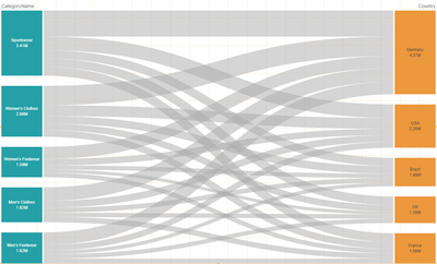
I am testing out the Sankey chart custom object from the Qlik Visualization bundle, and I am having some issues with the link coloring. The default look of the chart gives all links in the same color, making the chart a little difficult to read, see image below:
Default Sankey chart look
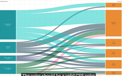
According to this video from Qlik Help , it is possible to give the different dimension values different colors, making the chart much easier to interpret. At 2:05 in the video, the narrator uses a color code string, "color_hex", in the Link color option under Presentation, and as a result the links are colored according to the source dimension values, see image below:
Multicolored Sankey chart
This "color_hex"-command does not work for me, it is invalid and only results in all the links disappearing. Using single quotes ('color_hex') results in all the links being colored black. Other common color strings like 'blue()', 'lightgreen()' etc works fine, but again, it gives all the links the same color.
I do understand that a possible solution would be a nested IF-statement along the lines of IF(CategoryName = 'Sportswear', blue() .....) for each CategoryName, and then go on to color the links using the 'SOURCE'-command in Link color, but this is not a very good solution, and I would like to avoid it.
Does anyone have a solution for this, am I missing something? I could not find anything in the documentation relating to this either. Thanks!
Accepted Solutions
- Mark as New
- Bookmark
- Subscribe
- Mute
- Subscribe to RSS Feed
- Permalink
- Report Inappropriate Content
"color_hex" is a field in the example video data model. Each value is therefore associated with a value in the CategoryName field, and when choosing to color the graph in this way, all values with the same origin end up having the same color. If the color_hex values were associated with the Country field, the chart would be colored differently.
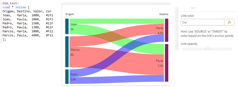
In any case, what is expected in the "Link Color" property is an expression that results in a valid color. If you already have this in your data model (as is the case in the video), even better, but you can also use an expression to obtain this color.
I've put an example below.
Hope this helps.


