Unlock a world of possibilities! Login now and discover the exclusive benefits awaiting you.
- Qlik Community
- :
- Forums
- :
- Analytics
- :
- New to Qlik Analytics
- :
- Re: Set colours (of which one is transparent) on s...
- Subscribe to RSS Feed
- Mark Topic as New
- Mark Topic as Read
- Float this Topic for Current User
- Bookmark
- Subscribe
- Mute
- Printer Friendly Page
- Mark as New
- Bookmark
- Subscribe
- Mute
- Subscribe to RSS Feed
- Permalink
- Report Inappropriate Content
Set colours (of which one is transparent) on stacked bar chart
Hi there experts
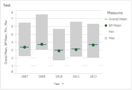
I have a requirement to show the range of a value as combo chart with the min and max as a bar and two points for averages. I managed to save the min, ma, BP mean and Overall Mean as master measures, set colours for each and use them to build my graph. The Min and Max are shown as stacked bar charts where the colour of the Min bar is white and the colour of the max bar (=max(value) - min(value)) is grey which shows my range. This works great, but my white Min bar covers the horizontal reference lines as is shown below:
Does anyone have an idea of how this can be solved? I would like to use something like argb(0,255,255,255) for the colour, but it seems like I can only use HEX codes for my master measures and the opacity is not contained in a hex colour code. I don't know if something like colour by expression can be used? I inherited the data load and formulas so would like not to go and change anything there.
Regards,
Mauritz
- Tags:
- combo
- master items
- Mark as New
- Bookmark
- Subscribe
- Mute
- Subscribe to RSS Feed
- Permalink
- Report Inappropriate Content
Hi Maurizz
Did you try this?
Hex Opacity Values
- 100% — FF
- 95% — F2
- 90% — E6
- 85% — D9
- 80% — CC
- 75% — BF
- 70% — B3
- 65% — A6
- 60% — 99
- 55% — 8C
- 50% — 80
- 45% — 73
- 40% — 66
- 35% — 59
- 30% — 4D
- 25% — 40
- 20% — 33
- 15% — 26
- 10% — 1A
- 5% — 0D
- 0% — 00
The format is #AARRGGBB
best
JK1
- Mark as New
- Bookmark
- Subscribe
- Mute
- Subscribe to RSS Feed
- Permalink
- Report Inappropriate Content
Hi JK1
Unfortunately the master measure colours only give me space for 6 letters/numbers whereas #AARRGGBB needs 8 so that won't work. I ended up creating a custom colour (which was transparent) in the theme file which was then available as an option in the colour palette.
Thanks for trying though👍.
Regards,
Mauritz
- Mark as New
- Bookmark
- Subscribe
- Mute
- Subscribe to RSS Feed
- Permalink
- Report Inappropriate Content
Hi Mauritz,
I meet the same issue that I want to create a transparency color for master measure.
May you share the information/Script that you create a custom colour in the theme file?
It's really appreciated
Kate
- Mark as New
- Bookmark
- Subscribe
- Mute
- Subscribe to RSS Feed
- Permalink
- Report Inappropriate Content
I've tried using a custom palette and added the HEX # that includes the alpha(transparency) component. The new colours do show up on QlikSense but it cannot be selected. Can you provide more details on how you got it to work?
