Unlock a world of possibilities! Login now and discover the exclusive benefits awaiting you.
- Qlik Community
- :
- Forums
- :
- Analytics
- :
- New to Qlik Analytics
- :
- Show/Sort certain rows in pivot table depending on...
- Subscribe to RSS Feed
- Mark Topic as New
- Mark Topic as Read
- Float this Topic for Current User
- Bookmark
- Subscribe
- Mute
- Printer Friendly Page
- Mark as New
- Bookmark
- Subscribe
- Mute
- Subscribe to RSS Feed
- Permalink
- Report Inappropriate Content
Show/Sort certain rows in pivot table depending on measures
Hi,
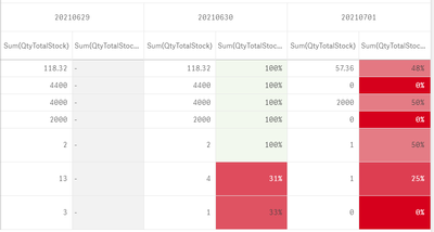
I am using the pivot table to display the inventory qty over several date, and calculate the increases/decreases using the measure in the table.
| 20210629 | 20210629 | 20210630 | 20210630 | 20210701 | 20210701 | |
| Sum(QtyTotalStock) | Sum(QtyTotalStock) / BEFORE(Sum(QtyTotalStock)) | Sum(QtyTotalStock) | Sum(QtyTotalStock) / BEFORE(Sum(QtyTotalStock)) | Sum(QtyTotalStock) | Sum(QtyTotalStock) / BEFORE(Sum(QtyTotalStock)) | |
| A1 | 118.32 | - | 118.32 | 100% | 57.36 | 48% |
| A2 | 4400 | - | 4400 | 100% | 0 | 0% |
| A3 | 4000 | - | 4000 | 100% | 2000 | 50% |
| A4 | 2000 | - | 2000 | 100% | 0 | 0% |
| A5 | 2 | - | 2 | 100% | 1 | 50% |
| A6 | 13 | - | 4 | 31% | 1 | 25% |
| A7 | 3 | - | 1 | 33% | 0 | 0% |
I highlighted the part that has significant reduction over the previous day. So far so good.
The problem is that there are thousands of rows in this table, and it is difficult to spot those parts with signification reduction.
What is the best way to highlight theses parts? It can be through sorting by measure (in ascending order) or show only the part number if the reduction % is lower than 50%).
Any other advise/suggestion is welcome.
- Tags:
- pivot
- Mark as New
- Bookmark
- Subscribe
- Mute
- Subscribe to RSS Feed
- Permalink
- Report Inappropriate Content
Here is the raw data. Appreciate if someone can help. Thank you in advance.
| Date | Material | QtyTotalStock |
| 20210629 | A1 | 118.32 |
| 20210630 | A1 | 118.32 |
| 20210701 | A1 | 57.36 |
| 20210629 | A2 | 4400 |
| 20210630 | A2 | 4400 |
| 20210701 | A2 | 0 |
| 20210629 | A3 | 4000 |
| 20210630 | A3 | 4000 |
| 20210701 | A3 | 2000 |
| 20210629 | A4 | 2000 |
| 20210630 | A4 | 2000 |
| 20210701 | A4 | 0 |
| 20210629 | A5 | 2 |
| 20210630 | A5 | 2 |
| 20210701 | A5 | 1 |
| 20210629 | A6 | 13 |
| 20210630 | A6 | 4 |
| 20210701 | A6 | 1 |
| 20210629 | A7 | 3 |
| 20210630 | A7 | 1 |
| 20210701 | A7 | 0 |
| 20210629 | A8 | 193 |
| 20210630 | A8 | 191 |
| 20210701 | A8 | 191 |
| 20210629 | A9 | 106 |
| 20210630 | A9 | 106 |
| 20210701 | A9 | 106 |
