Unlock a world of possibilities! Login now and discover the exclusive benefits awaiting you.
- Qlik Community
- :
- Forums
- :
- Analytics
- :
- New to Qlik Analytics
- :
- Re: Stacked and Clustered Column
- Subscribe to RSS Feed
- Mark Topic as New
- Mark Topic as Read
- Float this Topic for Current User
- Bookmark
- Subscribe
- Mute
- Printer Friendly Page
- Mark as New
- Bookmark
- Subscribe
- Mute
- Subscribe to RSS Feed
- Permalink
- Report Inappropriate Content
Stacked and Clustered Column
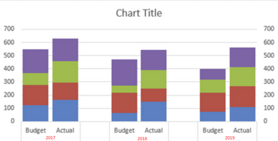
So I am having trouble with visualizing data in a certain way. I'd like to produce something similar to this, except just the actual is stacked.
I have the following tables
1. The Sales Table- https://prnt.sc/10fqy10
2. The Budget Table which stores the year and the target date, and the connection to the store hierarchy https://prnt.sc/10fr03l
3/4. the store and department tables which link the budget to the store/department
What I am hoping to achieve is the following.
on the X axis, i'd like the Budget Year (eg. 2017/2018)
I would like two columns per year
1. The sum of the Budget Amount for the Year
2. A stacked column of the contract_amount, broken down into stage.
My problem is that when I try to make a stacked chart, it also adds the budgeted amount sum, when I want that in a separate column and just stack the contract_amount. I have made this data up to illustrate the problem in the attached excel file.
Is there some way to achieve this? I would be happy to solve with a paid extension if it makes it easier to produce these, I can do it in Excel.
- Mark as New
- Bookmark
- Subscribe
- Mute
- Subscribe to RSS Feed
- Permalink
- Report Inappropriate Content
Unfortunately a stacked and grouped bar chart is not an available visualization.
- Mark as New
- Bookmark
- Subscribe
- Mute
- Subscribe to RSS Feed
- Permalink
- Report Inappropriate Content
please watch the below video:
