Unlock a world of possibilities! Login now and discover the exclusive benefits awaiting you.
- Qlik Community
- :
- Forums
- :
- Analytics
- :
- New to Qlik Analytics
- :
- Standard Deviation in bar chart
- Subscribe to RSS Feed
- Mark Topic as New
- Mark Topic as Read
- Float this Topic for Current User
- Bookmark
- Subscribe
- Mute
- Printer Friendly Page
- Mark as New
- Bookmark
- Subscribe
- Mute
- Subscribe to RSS Feed
- Permalink
- Report Inappropriate Content
Standard Deviation in bar chart
Hi all,
I'm new to Qlik community so I hopefully address my questions appropriate.
We want to display the results of a survey.
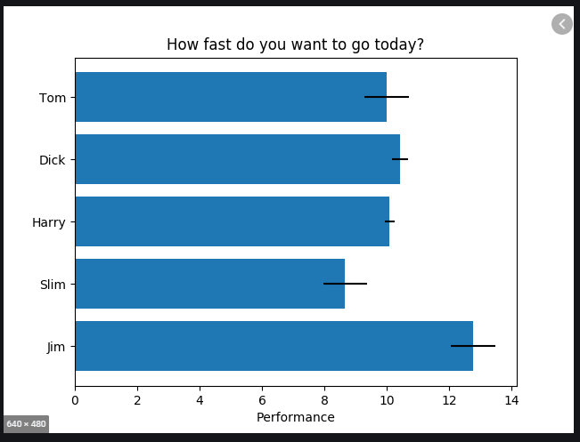
I'm struggling with a horizontal bar chart including standard deviation as attached in the example.
The dimension is "Frage", measure is "Antwort". I also calculated the standard deviation before which is named "Standardabweichung" as measure but I don't know if that is even necessary.
I tried bar chart, combo chart and the charts from visualization bundle but nothing seems to do the work for me.
Added to that, is there a possibility to kind of "overwrite" the axis labeling? As I needed to transform the written answers to numbers from 1 to 4, this is the scale that is shown in the bar chart but would not be sufficient to show.
So it would be nice if there was a possibilty to change it to eg 1 = agree.
Thanks you guys.
Best regards,
Thorsten