- Mark as New
- Bookmark
- Subscribe
- Mute
- Subscribe to RSS Feed
- Permalink
- Report Inappropriate Content
Sum a field to a variable (x axis is time)
Hello,
I have a Data file (attached to this post) which informs when (3rd and 4th field in the data file) users (1st field) have opened a software (2nd field) and thus are using a network license of that software. +1 stands for licence being in use and -1 stands for licence no longer in use (5th field). This means that between a +1 and a -1, there is a period of time when the user was using the licence of that software.
I want to create a graphic with Qlik Sense which represents the number of licences being used at each moment in time. This graphic should look something like this:
In regard to the data in the attached file, each line represents a moment in time when the software was either launched or closed (and thus the user starts using a licence or freeing a licence for network use).
Because this data is only telling me when the value is changed, and not the value at each moment given in time, I thought about creating a variable, starting at 0, which will either go up or down, when a user opens or closes the software.
How can I do so? Thank you very much for your help.
- « Previous Replies
- Next Replies »
- Mark as New
- Bookmark
- Subscribe
- Mute
- Subscribe to RSS Feed
- Permalink
- Report Inappropriate Content
@ritaaguiar Attaching the QVF as well. Do a reload and check the chart once. I guess that's what you need.
Let me know.
Regards
Pradosh
- Mark as New
- Bookmark
- Subscribe
- Mute
- Subscribe to RSS Feed
- Permalink
- Report Inappropriate Content
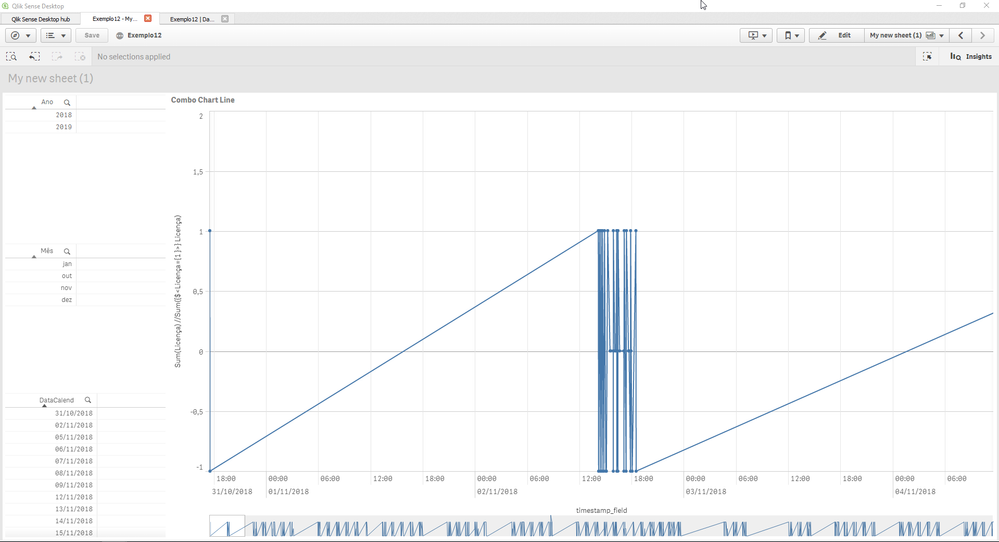
@pradosh_thakur I realoaded the data and this is what I obtained. Now it represents all entrances on the Data3 file. However, the graphic lost the continuous time scale and the values on the y axis are not being added nor subtracted at each given Data3 entrance.
- Mark as New
- Bookmark
- Subscribe
- Mute
- Subscribe to RSS Feed
- Permalink
- Report Inappropriate Content
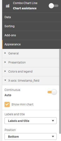
@ritaaguiarI have changed the continous x-axis as i was thinking you need it for each instance. If you need continous x-axis do the following.
- Mark as New
- Bookmark
- Subscribe
- Mute
- Subscribe to RSS Feed
- Permalink
- Report Inappropriate Content
Hey @pradosh_thakur. Almost there!
The graphic seems to be adopting the values for each entrance from Data3 at each given time. I was hoping I could get to the point where the values are added or subtracted, and not just having a kind of histrogram of each entrace of the Data3 file.
- Mark as New
- Bookmark
- Subscribe
- Mute
- Subscribe to RSS Feed
- Permalink
- Report Inappropriate Content
@ritaaguiar what do you mean by added or subtracted ? If you mean cumulative sum
try
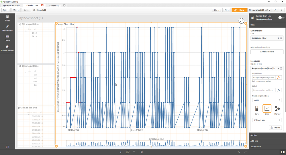
Rangesum(above(Sum(Licença),0,rowno()))
Thanks
Pradosh
- Mark as New
- Bookmark
- Subscribe
- Mute
- Subscribe to RSS Feed
- Permalink
- Report Inappropriate Content
Yes, that's it @pradosh_thakur ! I did not know the appropriate term cumulative sum.
Now I only need is to make this cumulative sum be continuos scale too, like the red lines here represented, instead of having the lines jumping from a value to the other as in blue.
- « Previous Replies
- Next Replies »


