Unlock a world of possibilities! Login now and discover the exclusive benefits awaiting you.
- Qlik Community
- :
- Forums
- :
- Analytics
- :
- New to Qlik Analytics
- :
- Re: Using Row Captions as a dimension
- Subscribe to RSS Feed
- Mark Topic as New
- Mark Topic as Read
- Float this Topic for Current User
- Bookmark
- Subscribe
- Mute
- Printer Friendly Page
- Mark as New
- Bookmark
- Subscribe
- Mute
- Subscribe to RSS Feed
- Permalink
- Report Inappropriate Content
Using Row Captions as a dimension
Dear Qlik community,
I am facing a problim with displaying a pie (or donut chart) in Qlik Sense and hope one of you can help me out:
My table looks like this
| Part name | Vendor |
| Production Cost | Overhead | Margin | ||
|---|---|---|---|---|---|---|---|
| Coffe bin | A | 11 | 5 | 2 | 3 | ||
| Glass | B | 12 | 6 | 1 | 4 | ||
| Spoon | C | 13 | 3 | 1 | 2 | ||
| Plate | D | 11 | 4 | 1 | 5 | ||
| Knife | E | 12 | 7 | 2 | 2 |
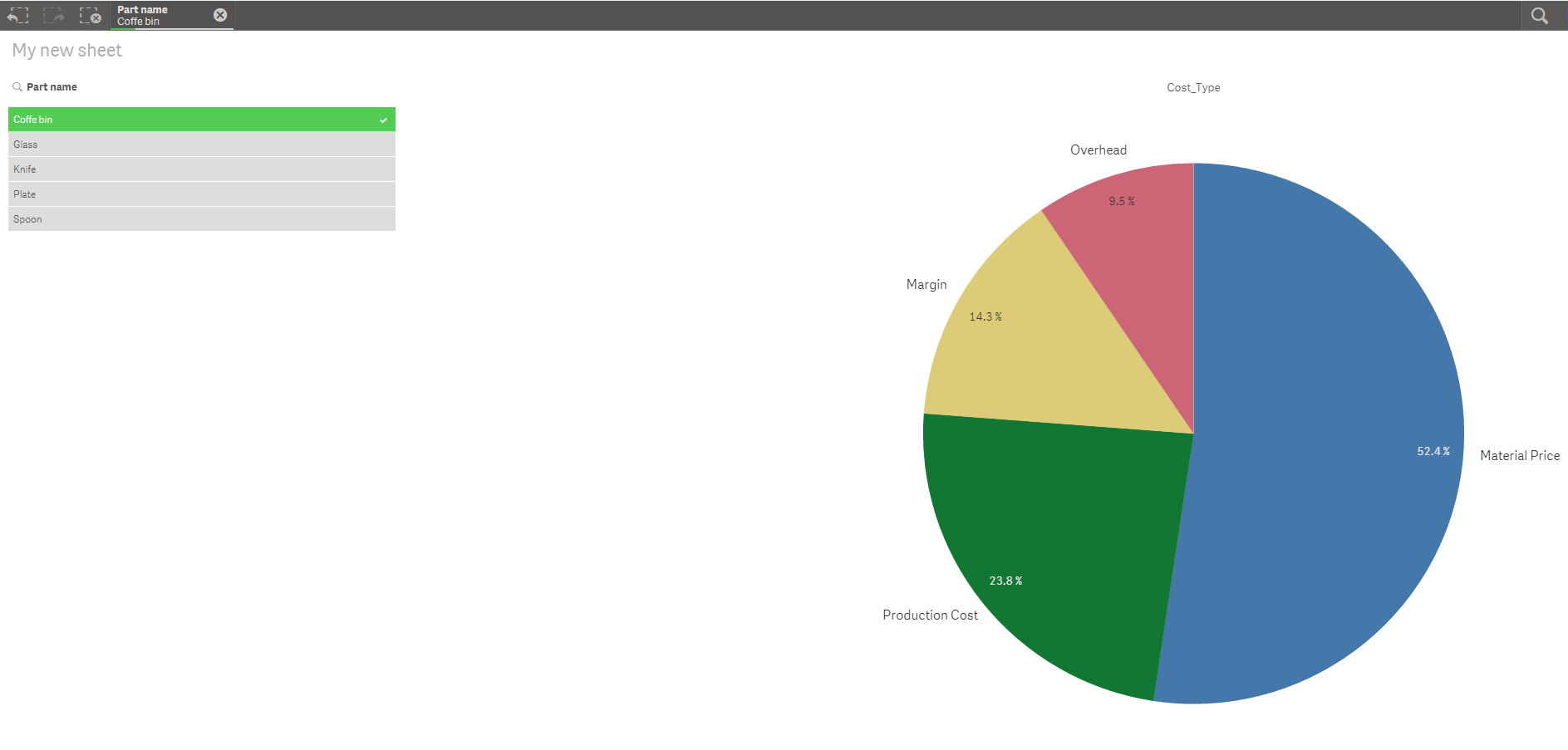
In my first table I select the Part name. For example the Coffee bin. Now I want to display a pie chart after this selection, which spits out the price teardown. Unfortunately I cannot figure out how to do that.
Can anyone give me a hint?
Thank you so much!
Tobias
- Tags:
- pie chart %
- Mark as New
- Bookmark
- Subscribe
- Mute
- Subscribe to RSS Feed
- Permalink
- Report Inappropriate Content
May be use The Crosstable Load to transform all your costs into a single cost column....
- Mark as New
- Bookmark
- Subscribe
- Mute
- Subscribe to RSS Feed
- Permalink
- Report Inappropriate Content
Check attached
- Mark as New
- Bookmark
- Subscribe
- Mute
- Subscribe to RSS Feed
- Permalink
- Report Inappropriate Content
Dear Sunny,
thank you so much! This is exactly what I Need. I now understand the data Format I have to feed into Qlik to reach this result. Unfortunately I still do not understand how to use the load function in the Syntax. I checked your code and it seems to me you typed every agrument manually....which surely is not the case:
CrossTable(Cost_Type, Cost, 2)
LOAD * INLINE [
Part name , Vendor , Material Price , Production Cost , Overhead, Margin
Coffe bin, A, 11, 5, 2, 3
Glass, B, 12, 6, 1, 4
Spoon, C, 13, 3, 1, 2
Plate, D, 11, 4, 1, 5
Knife, E, 12, 7, 2, 2
In this code you already refer to new Collum designations as Cost_Type. I still do not see where those are introduced and linked to the original table.
The help until here is already highly aprreciated! If you can give me further hints I would be very happy!
Thank you so much!
Tobias
- Mark as New
- Bookmark
- Subscribe
- Mute
- Subscribe to RSS Feed
- Permalink
- Report Inappropriate Content
So, all you need is to do like this
CrossTable(Cost_Type, Cost, 2)
LOAD ...
FROM ....;
Look here on how The Crosstable Load works