Unlock a world of possibilities! Login now and discover the exclusive benefits awaiting you.
- Qlik Community
- :
- Forums
- :
- Analytics
- :
- New to Qlik Analytics
- :
- Re: What does a color gray represents in a pie cha...
- Subscribe to RSS Feed
- Mark Topic as New
- Mark Topic as Read
- Float this Topic for Current User
- Bookmark
- Subscribe
- Mute
- Printer Friendly Page
- Mark as New
- Bookmark
- Subscribe
- Mute
- Subscribe to RSS Feed
- Permalink
- Report Inappropriate Content
What does a color gray represents in a pie chart?
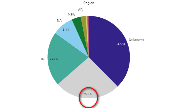
Being new to QlikSense I would like to understand what represents the gray color in a pie chart shown below. It does not have any label except '-' and cannot be selected as filter either.

Thanks
Alex
Accepted Solutions
- Mark as New
- Bookmark
- Subscribe
- Mute
- Subscribe to RSS Feed
- Permalink
- Report Inappropriate Content
This means the null values. I supose that you have some rows that the field Regions is not informed.
- Mark as New
- Bookmark
- Subscribe
- Mute
- Subscribe to RSS Feed
- Permalink
- Report Inappropriate Content
This means the null values. I supose that you have some rows that the field Regions is not informed.
- Mark as New
- Bookmark
- Subscribe
- Mute
- Subscribe to RSS Feed
- Permalink
- Report Inappropriate Content
I think in this instance, it means 'Null' because of the dash, but sometimes it can mean 'Others'. Try clicking it and seeing what happens to your dimension. Does every data point have a Region value?
- Mark as New
- Bookmark
- Subscribe
- Mute
- Subscribe to RSS Feed
- Permalink
- Report Inappropriate Content
You could be right. It seems to be a 'Null' value but in my load script I have already set 'Null'values to 'Unknown' as already represented on the chart. So i'm unsure where could this value be coming from.
- Mark as New
- Bookmark
- Subscribe
- Mute
- Subscribe to RSS Feed
- Permalink
- Report Inappropriate Content
I would suggest doing a if(len(trim(Region)) = 0, 1, 0) as field in load script on the field in question. Then, sum the field. This will tell you if you have any null values. I know there is also an ISNULL function, but it will not work if your field has space for a value. The trim will eliminate the spaces, giving you a true null count.
The chart means you do not have a value in the region category to display.
- Mark as New
- Bookmark
- Subscribe
- Mute
- Subscribe to RSS Feed
- Permalink
- Report Inappropriate Content
You could also exclude null values in chart options.
- Mark as New
- Bookmark
- Subscribe
- Mute
- Subscribe to RSS Feed
- Permalink
- Report Inappropriate Content
Having excluded the null values from the chart options cleared it. This values could have resulted from a 'join' where a record does not exist. I will post a follow-up question handling null data from a 'join' if none exist.