Unlock a world of possibilities! Login now and discover the exclusive benefits awaiting you.
- Qlik Community
- :
- Forums
- :
- Analytics
- :
- New to Qlik Analytics
- :
- Re: bar Chart with two dimensions
- Subscribe to RSS Feed
- Mark Topic as New
- Mark Topic as Read
- Float this Topic for Current User
- Bookmark
- Subscribe
- Mute
- Printer Friendly Page
- Mark as New
- Bookmark
- Subscribe
- Mute
- Subscribe to RSS Feed
- Permalink
- Report Inappropriate Content
bar Chart with two dimensions
Hi all,
I need to create a bar chart for displaying the stats of question and answers.
X-axis ---> Number of questions and bars should represent the count of answers for that question.
Y-axis ---> Count of answers.
For Example:
In Filter pane i will select a topic, that topic consists 2 Questions
Q1: Is Qlik sense useful?
Ans1: Yes
Ans2: No
Q2: Is Qlik Sense better than QlikView?
Ans1: Yes
Ans2: No
Ans3: Both
X-axis should display Question numbers bars must represent the count of answer. As in the image.

Regards,
Pramod
- Tags:
- bar chart
Accepted Solutions
- Mark as New
- Bookmark
- Subscribe
- Mute
- Subscribe to RSS Feed
- Permalink
- Report Inappropriate Content
Drag a bar chart onto the canvas and add Question as dimension. Then go to the properties panel on the right and add Answer as the second dimension. Next add a measure for the count of the answers. I don't now your data model so I don't know if you need to use a count or a sum.
talk is cheap, supply exceeds demand
- Mark as New
- Bookmark
- Subscribe
- Mute
- Subscribe to RSS Feed
- Permalink
- Report Inappropriate Content
What is your question?
If you want to know if such a bar chart can be created then the answer is yes:
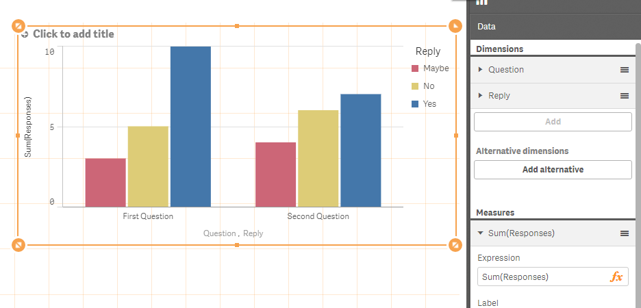
see attached example
talk is cheap, supply exceeds demand
- Mark as New
- Bookmark
- Subscribe
- Mute
- Subscribe to RSS Feed
- Permalink
- Report Inappropriate Content
How t take the Question and answer in dimensions?
- Mark as New
- Bookmark
- Subscribe
- Mute
- Subscribe to RSS Feed
- Permalink
- Report Inappropriate Content
Drag a bar chart onto the canvas and add Question as dimension. Then go to the properties panel on the right and add Answer as the second dimension. Next add a measure for the count of the answers. I don't now your data model so I don't know if you need to use a count or a sum.
talk is cheap, supply exceeds demand
- Mark as New
- Bookmark
- Subscribe
- Mute
- Subscribe to RSS Feed
- Permalink
- Report Inappropriate Content
Thanks, gysbert it worked
- Mark as New
- Bookmark
- Subscribe
- Mute
- Subscribe to RSS Feed
- Permalink
- Report Inappropriate Content
Hi Gysbert,
I need to show two dimensions in the X-Axis Bar chart in Qliksense. which was attached to my reply.
Looking forward for your reply.
Thanks
Chandu
- Mark as New
- Bookmark
- Subscribe
- Mute
- Subscribe to RSS Feed
- Permalink
- Report Inappropriate Content
If you disable the legend then the labels of both dimensions will be shown on the x-axis.
talk is cheap, supply exceeds demand