Unlock a world of possibilities! Login now and discover the exclusive benefits awaiting you.
- Qlik Community
- :
- Forums
- :
- Analytics
- :
- New to Qlik Analytics
- :
- Re: creating multiple lines using values in a dime...
- Subscribe to RSS Feed
- Mark Topic as New
- Mark Topic as Read
- Float this Topic for Current User
- Bookmark
- Subscribe
- Mute
- Printer Friendly Page
- Mark as New
- Bookmark
- Subscribe
- Mute
- Subscribe to RSS Feed
- Permalink
- Report Inappropriate Content
creating multiple lines using values in a dimension field
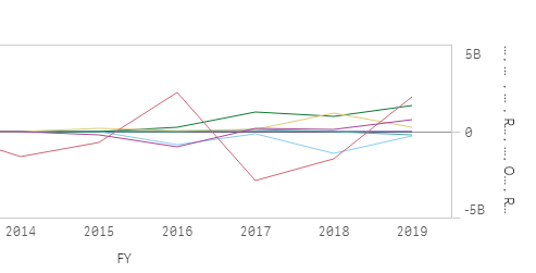
I have created a line chart manually by creating lines using set expressions. Picture below.
The lines represent many different departments and their respective costs within the company.
Example - expression to create each line:
Sum({<DEPT = {"HR"}>} COST)
Sum({<DEPT = {"ACCOUTING"}>} COST)
Sum({<DEPT = {"IT"}>} COST)
....
Is there a way to add another dimension so that Qlik can take care of this for me? I already have YEAR as a dimension to show a trend but would like qlik to auto generate lines based on values within my DEPARTMENT dimension. This way users can slice and dice the data. When I manually create these lines for DEPARTMENT COST, I cannot drill down/across to my other charts within the dashboard.
- Tags:
- line chart
Accepted Solutions
- Mark as New
- Bookmark
- Subscribe
- Mute
- Subscribe to RSS Feed
- Permalink
- Report Inappropriate Content
Why not have both year and department in the dimension and cost as the measure. Put year before department and year should be on the x-axis and department should be on the legend.
- Mark as New
- Bookmark
- Subscribe
- Mute
- Subscribe to RSS Feed
- Permalink
- Report Inappropriate Content
Why not have both year and department in the dimension and cost as the measure. Put year before department and year should be on the x-axis and department should be on the legend.
- Mark as New
- Bookmark
- Subscribe
- Mute
- Subscribe to RSS Feed
- Permalink
- Report Inappropriate Content
Thanks for refreshing my brain seriously.. the solution was right in front of me yet I wanted to do a huge loop around ![]() .
.
