Unlock a world of possibilities! Login now and discover the exclusive benefits awaiting you.
- Qlik Community
- :
- Forums
- :
- Analytics
- :
- New to Qlik Analytics
- :
- Re: highlighting highest numbers
- Subscribe to RSS Feed
- Mark Topic as New
- Mark Topic as Read
- Float this Topic for Current User
- Bookmark
- Subscribe
- Mute
- Printer Friendly Page
- Mark as New
- Bookmark
- Subscribe
- Mute
- Subscribe to RSS Feed
- Permalink
- Report Inappropriate Content
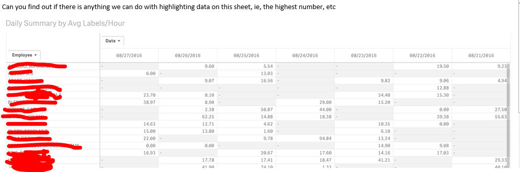
highlighting highest numbers
Any way to be able to do this?
- Tags:
- highlighting
- Mark as New
- Bookmark
- Subscribe
- Mute
- Subscribe to RSS Feed
- Permalink
- Report Inappropriate Content
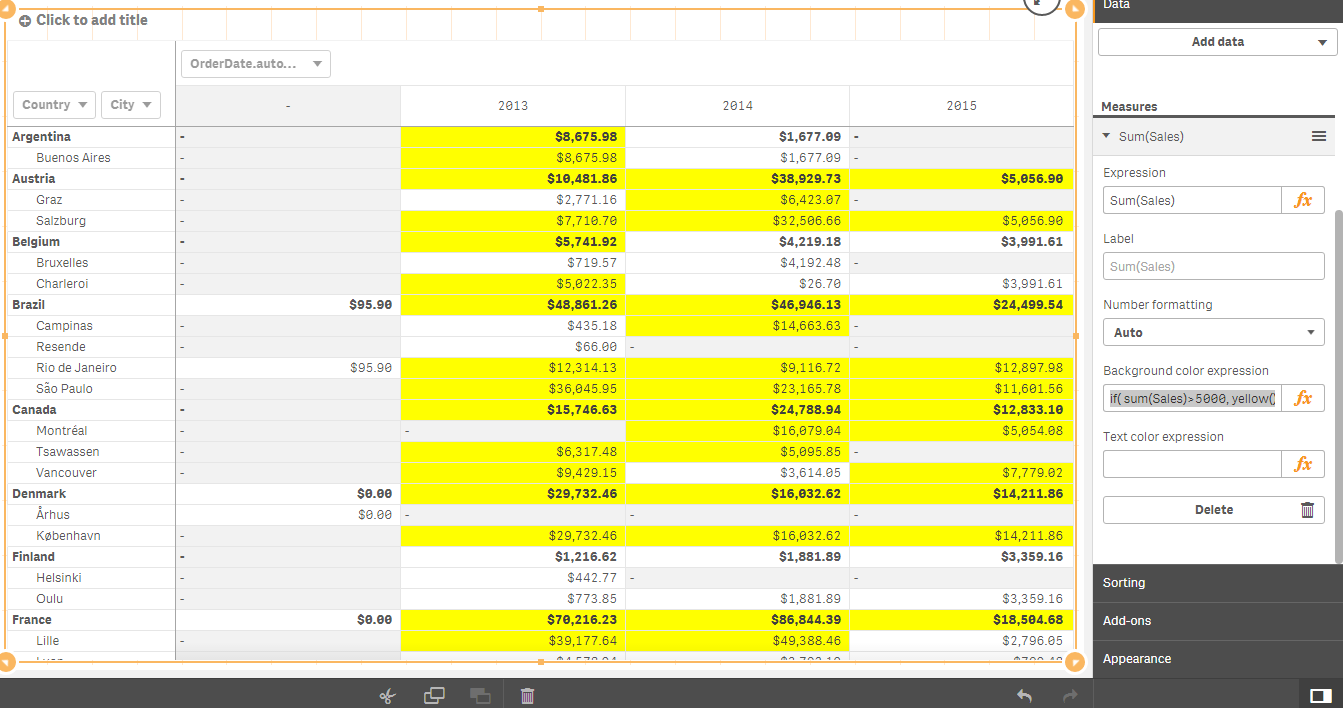
With Qlik Sense Pivot Tables - You can highlight the Cell Values based on your criteria.
This example shows highlighting the cells for all sales over $5000.
This type of color expression needs to be placed in the Background Color Expression area of the Measure details on the right side of sense.
- Mark as New
- Bookmark
- Subscribe
- Mute
- Subscribe to RSS Feed
- Permalink
- Report Inappropriate Content
To highlight the max value, you can use something as background color expression like
=If( Sum(Value)=Max(TOTAL Aggr( Sum(Value), Product, Customer)),Yellow())
Sum(Value) being the expression in the chart and Product, Customer the dimensions.
- Mark as New
- Bookmark
- Subscribe
- Mute
- Subscribe to RSS Feed
- Permalink
- Report Inappropriate Content
Hi,
Maybe try this below expression, select EDIT (little pencil icon at top right) then select Appearance then Colors then change the colors to By Expression.
IF(Sum([Value])=RANGEMAX(TOP(TOTAL Sum([Value]),1,NOOFROWS(TOTAL))),YELLOW())
Where YELLOW() is whatever color you want.
Here is the full function for Top and Bottom
IF(Sum([Value])=RANGEMAX(TOP(TOTAL Sum([Value]),1,NOOFROWS(TOTAL))),YELLOW()
,IF(Sum([Value]) = RANGEMIN(TOP(TOTAL Sum([Value]),1,NOOFROWS(TOTAL))),RED()))